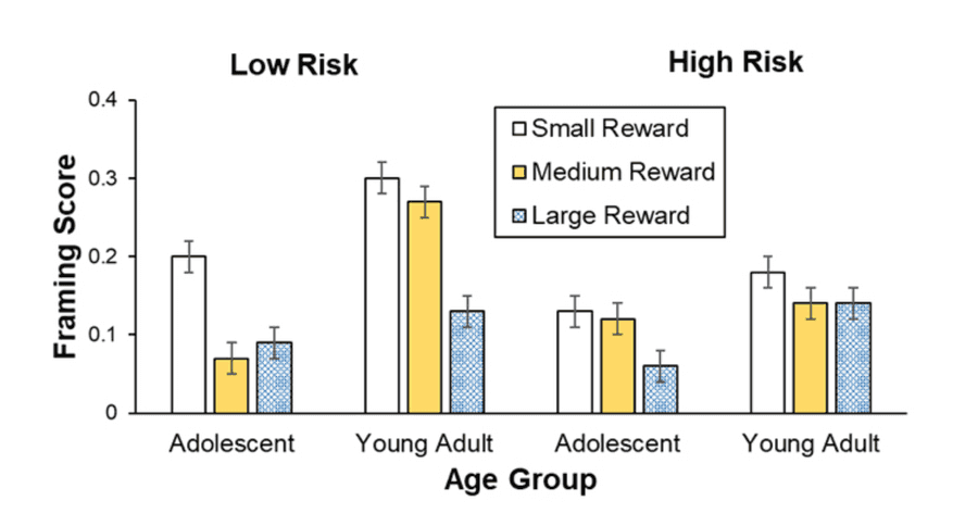
The latest APA 7 manual has released new sample figures that provide guidance to researchers on how to create certain charts. Here you can see what a typical bar graph should look like:
In the following video I will show you how to create an apa-style bar graph in ggplot2 by yourself. Here are the main links for the video tutorial:
- APA sample figures
- Stackoverflow: Is there a way to change the spacing between legend items in ggplot2?
- Custom colors from tailwindcss
- ggplot2tor - aesthetics finder
You find the code below the video.
library(tidyverse)

viz_data_one <- tibble(
  age_group = c(rep("Adolescent", 3), rep("Young Adult", 3)),
  framing_score = c(0.2, 0.08, 0.09, 0.3, 0.28, 0.15),
  upper = framing_score + .02,
  lower = framing_score - .02,
  reward = rep(c("Small Reward", "Medium Reward", "Large Reward"), 2)
) %>%
  mutate(
    reward = as_factor(reward) %>% fct_relevel("Small Reward",
                                               "Medium Reward",
                                               "Large Reward")
  )

viz_data_one %>%
  ggplot(aes(x = age_group,
             y = framing_score,
             fill = reward,
             ymin = lower,
             ymax = upper)) +
  geom_col(width = .5, position = position_dodge(.6),
           color = "black", key_glyph = "polygon3") +
  geom_errorbar(width = .1, position = position_dodge(.6)) +
  scale_fill_manual(values = c("#FAFAFA", "#D4D4D4", "#737373")) +
  scale_y_continuous(expand = expansion(0),
                     limits = c(0, 0.4),
                     breaks = seq(0, .4, .1)) +
  labs(
    x = "Age Group",
    y = "Framing Score",
    fill = NULL,
    title = "Low Risk"
  ) +
  theme(
    plot.margin = unit(c(1, 1, 1, 1), "cm"),
    panel.background = element_blank(),
    plot.title = element_text(size = 22, face = "bold",
                              hjust = 0.5,
                              margin = margin(b = 15)),
    axis.line = element_line(color = "black"),
    axis.title = element_text(size = 22, color = "black",
                              face = "bold"),
    axis.text = element_text(size = 22, color = "black"),
    axis.text.x = element_text(margin = margin(t = 10)),
    axis.text.y = element_text(size = 17),
    axis.title.y = element_text(margin = margin(r = 10)),
    axis.ticks.x = element_blank(),
    legend.position = c(0.20, 0.8),
    legend.background = element_rect(color = "black"),
    legend.text = element_text(size = 15),
    legend.margin = margin(t = 5, l = 5, r = 5, b = 5),
    legend.key = element_rect(color = NA, fill = NA)
  ) +
  guides(
    fill = guide_legend(
      keywidth = 1.2,
      keyheight = 1.2,
      default.unit= "cm"
    )
  )


ggsave("barchart_apa.png", width = 10, height = 7, dpi = 300)
