As a scientist you have to report on your findings at conferences from time to time. Your audience expects to be informed about your main findings, at best through a simple visualization that depicts these findings. Usually, statistical tests examine group differences, which can be depicted as barcharts. Statistical significance tests are usually represented in these barcharts with horizontal lines on which the p-values are displayed. Therefore, in this tutorial, you will create a custom barchart from a dataset of the sleep duration of different animals.
Getting and wrangling the data
We will work with a datset that is already inclueded in the ggplot2 package. The dataset is called msleep and includes the sleep duration of mammals. Let's first load our packages and look at the data:
library(tidyverse)
glimpse(msleep, width = 50)
Observations: 83
Variables: 11
$ name <chr> "Cheetah", "Owl monkey",...
$ genus <chr> "Acinonyx", "Aotus", "Ap...
$ vore <chr> "carni", "omni", "herbi"...
$ order <chr> "Carnivora", "Primates",...
$ conservation <chr> "lc", NA, "nt", "lc", "d...
$ sleep_total <dbl> 12.1, 17.0, 14.4, 14.9, ...
$ sleep_rem <dbl> NA, 1.8, 2.4, 2.3, 0.7, ...
$ sleep_cycle <dbl> NA, NA, NA, 0.1333333, 0...
$ awake <dbl> 11.9, 7.0, 9.6, 9.1, 20....
$ brainwt <dbl> NA, 0.01550, NA, 0.00029...
$ bodywt <dbl> 50.000, 0.480, 1.350, 0....Since we are interested in the sleep duration of different animals, our variables of interest are vore and sleep_total. First, we need to refactor the data so that we have the mean sleep duration of these animals and the standard deviation of the sleep duration:
msleep %>%
  group_by(vore) %>%
  summarise(
    mean_sleep = mean(sleep_total),
    sd_sleep   = sd(sleep_total)
  )
# A tibble: 5 x 3
vore mean_sleep sd_sleep
<chr> <dbl> <dbl>
1 carni 10.4 4.67
2 herbi 9.51 4.88
3 insecti 14.9 5.92
4 omni 10.9 2.95
5 NA 10.2 3.00To obtain this data, we first grouped the data with group_by and then calculated the summary statistics with summarise.
But the data is not yet perfect. We have missing values in the dataset and the animal names are abbreviated. Let's solve these problems:
(sleep_mean_values <- msleep %>%   group_by(vore) %>%
  summarise(
    mean_sleep = mean(sleep_total),
    sd_sleep   = sd(sleep_total)
  ) %>%   drop_na() %>%   mutate(    vore = case_when(      vore == "insecti" ~ "insectivore",      vore == "omni" ~ "omnivore",      vore == "carni" ~ "carnivore",      vore == "herbi" ~ "herbivore"    ) %>%       as.factor %>%       fct_relevel("insectivore", "omnivore",                  "carnivore", "herbivore")  ))
# A tibble: 4 x 3
vore mean_sleep sd_sleep
<fct> <dbl> <dbl>
1 carnivore 10.4 4.67
2 herbivore 9.51 4.88
3 insectivore 14.9 5.92
4 omnivore 10.9 2.95First, we change the names of the vore variable with the function case_when. Before the tilde ~ we specify the match of a certain case (here the respective string), to the right of the tilde we specify the new value. Second, we convert the variable vore into a factor. We need to do this because the factor allows us the define the order in which the barplots are displayed in the visualization. Hence, we use the function fct_relevel to make sure the insectivores come first, then the omnivores, then the carnivores and last the herbivores. We choose this order because it corresponds to the mean differences of the animals. Finally, we use the function drop_na to get rid of the NA value.
Creating the first barchart
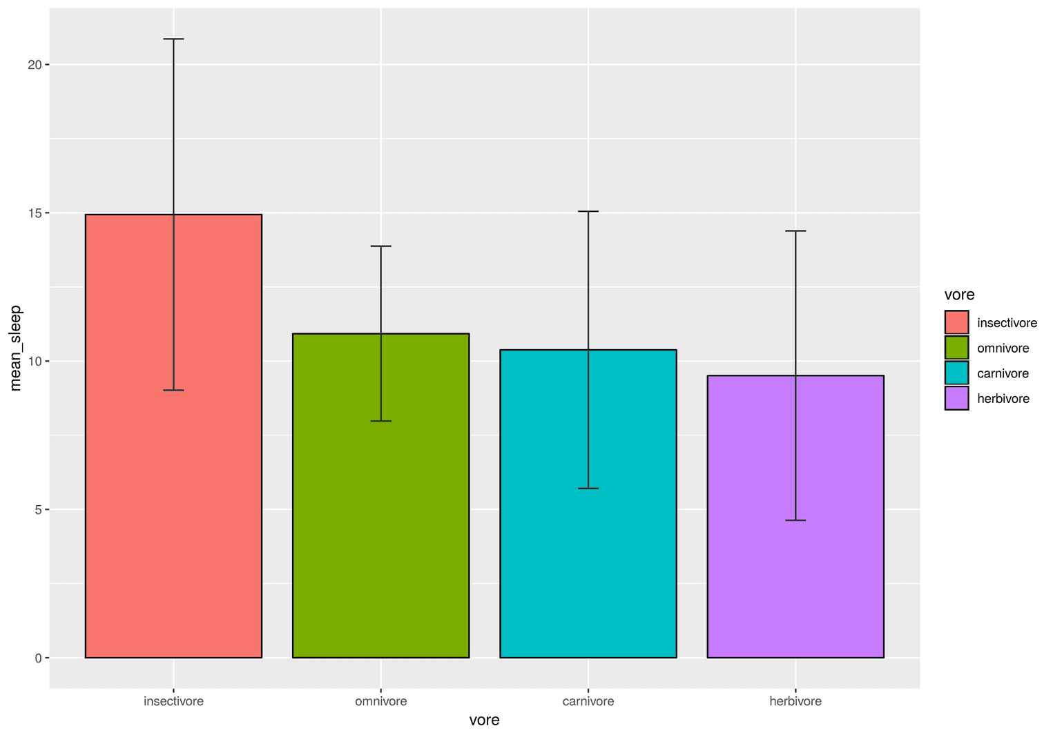
Now we are in place to create the first barchart:
sleep_mean_values %>%
  ggplot(aes(vore, mean_sleep)) +
    geom_col(aes(fill = vore), color = "black", width = 0.85) +
    geom_errorbar(aes(ymin = mean_sleep - sd_sleep,
                      ymax = mean_sleep + sd_sleep),
                  color = "#22292F",
                  width = .1)
The visualization is a good first step, but there are still some problems. For example, the legend is redundant. We already know that the red barplot depicts insectivores. Also, the x and y values are not really meaningful. We need to rename them and make them more meaningful. And we do not have a title or caption to tell our readers what the error bars mean. Another problem is that the colors of the barchart might be misleading. Why should insectivores be red? Let's apply these changes in the next visualization:
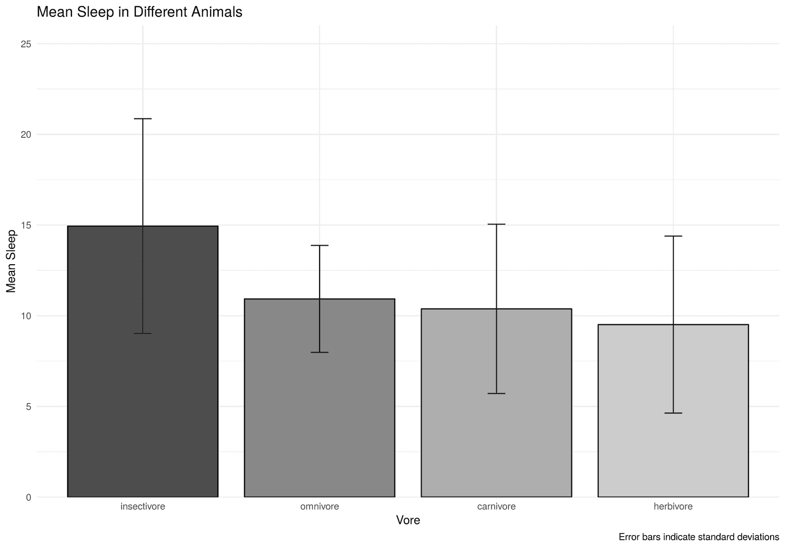
Getting the basics right
sleep_mean_values %>%
  ggplot(aes(vore, mean_sleep)) +
  geom_col(aes(fill = vore), color = "black", width = 0.85) +
  geom_errorbar(aes(ymin = mean_sleep - sd_sleep,
                    ymax = mean_sleep + sd_sleep),
                color = "#22292F",
                width = .1) +
  scale_fill_grey(start = 0.3) +  scale_y_continuous(limits = c(0, 26), expand = c(0, 0)) +  guides(fill = FALSE) +  theme_minimal() +  labs(    x = "Vore",    y = "Mean Sleep",    title = "Mean Sleep in Different Animals",    caption = "Error bars indicate standard deviations"  )
Let's go over these changes. We used the function scale_fill_grey to change the fill to grey values. With start = 0.3 we indicate that the first fill should not be all black, but a little grey. Next, we use the function guides to get rid of the fill legend. To get rid of the grey background panel we use theme_minimal. Another important function is scale_y_contiuous. With this function we define the height of y-axis. Since we still have to add the p-values, we need more space above the highest bar. We also would want the x-axis to start at exactly 0 by defining the expand limits. Finally, we use labs to add a title, caption and the title of the x and y axes.
Adjusting the spacing and the font
sleep_mean_values %>%
  ggplot(aes(vore, mean_sleep)) +
  geom_col(aes(fill = vore), color = "black", width = 0.85) +
  geom_errorbar(aes(ymin = mean_sleep - sd_sleep,
                    ymax = mean_sleep + sd_sleep),
                color = "#22292F",
                width = .1) +
  scale_fill_grey(start = 0.3) +
  scale_y_continuous(limits = c(0, 26), expand = c(0, 0)) +
  guides(fill = FALSE) +
  theme_minimal() +
  labs(
    x = "Vore",
    y = "Mean Sleep",
    title = "Mean Sleep in Different Animals",
    caption = "Error bars indicate standard deviations"
  ) +
theme( plot.title = element_text(size = 20, face = "bold", margin = margin(b = 35)), plot.margin = unit(rep(1, 4), "cm"), axis.text = element_text(size = 16, color = "#22292F"), axis.title = element_text(size = 18, hjust = 1), axis.title.x = element_text(margin = margin(t = 15)), axis.title.y = element_text(margin = margin(r = 15)), axis.text.y = element_text(margin = margin(r = 5)), axis.text.x = element_text(margin = margin(t = 5)), plot.caption = element_text(size = 12, face = "italic", color = "#606F7B", margin = margin(t = 15)) ) 
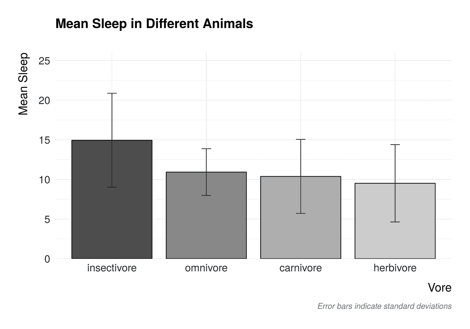
Now the barchart looks much better. We used the function theme to:
- Make the
plot.titlebigger and add a margin to the bottom - Add a margin around the whole plot with
plot.margin - Add margins to the axes titles and the axis texts using
element_text - Made the caption grey and adjusted its size using
plot.caption
Adding axis ticks and an axis lines
We can still improve the visualization. For example, axis lines usually make a plot easier to read. In addition, small axis ticks make the visualzation also easier to read. In addition, the vertical grid lines are not helpful. It is quite easy to see which bar belongs to which vore. Let's apply these changes:
sleep_mean_values %>%
  ggplot(aes(vore, mean_sleep)) +
  # Add previous code here
  theme(
    plot.title = element_text(size = 20,
                              face = "bold",
                              margin = margin(b = 35)),
    plot.margin = unit(rep(1, 4), "cm"),
    axis.text = element_text(size = 16, color = "#22292F"),
    axis.title = element_text(size = 18, hjust = 1),
    axis.title.x = element_text(margin = margin(t = 15)),
    axis.title.y = element_text(margin = margin(r = 15)),
    axis.text.y = element_text(margin = margin(r = 5)),
    axis.text.x = element_text(margin = margin(t = 5)),
    plot.caption = element_text(size = 12,
                                face = "italic",
                                color = "#606F7B",
                                margin = margin(t = 15)),
axis.line = element_line(color = "#3D4852"), axis.ticks = element_line(color = "#3D4852"), panel.grid.major.y = element_line(color = "#DAE1E7"), panel.grid.major.x = element_blank(), panel.grid.minor.y = element_blank() ) 
To add these axis lines we used axis.line. The axis ticks were added with axis.ticks. Additionally we changed the color of the horizontal grid lines with panel.grid.major.y. The other grid lines have been deleted.
Adding p values as asterisks
Imagine you calculated to specific contrasts that have tested the differences in mean sleep between insectivores and omnivores and between omnivores and herbivores. You have significant differences and need to visualize these in your barchart. There are some packages that do it for you automatically. With the packageggpubr, for example, you can automatically add the results of significance tests to your visualization. Normally, however, you want to customize your visualization, which is even more cumbersome with these packages. So we will do it directly in ggplot2.
The trick is to add two lines to the visualization. Each line needs four points. A lower value to the left, a higher value to the left, a higher value to the right, and a lower value to the right. Therefore, we need to create a data set that contains these values:
p_value_one <- tibble(
  x = c("insectivore", "insectivore", "omnivore", "omnivore"),
  y = c(22, 23, 23, 22)
)
The line starts in the middle of the insectivore bar at y == 20. Then it rises by one point to 23. Then the line travels to the omnivore bar and stops at y == 23. Then it sinks by one point to 22. Let's define our second hypothesis line:
p_value_two <- tibble(
  x = c("omnivore", "omnivore", "herbivore", "herbivore"),
  y = c(16, 17, 17, 16)
)
That's it. To add these lines to the plot we only have to add two geom_line with the respective dataset. In addition, we will add the asterisks in the middle of the plot with the function annotate:
sleep_mean_values %>%
  ggplot(aes(vore, mean_sleep)) +
  geom_col(aes(fill = vore), color = "black", width = 0.85) +
  geom_errorbar(aes(ymin = mean_sleep - sd_sleep,
                    ymax = mean_sleep + sd_sleep),
                color = "#22292F",
                width = .1) +
  geom_line(data = p_value_one,             aes(x = x, y = y, group = 1)) +  geom_line(data = p_value_two,             aes(x = x, y = y, group = 1)) +  annotate("text", x = 1.5, y = 23.5,            label = "***",           size = 8, color = "#22292F") +  annotate("text", x = 3, y = 17.5,            label = "*",           size = 8, color = "#22292F") +  scale_fill_grey(start = 0.3) +
  scale_y_continuous(limits = c(0, 26), expand = c(0, 0)) +
  guides(fill = FALSE) +
  # Rest of the code goes here
Note that we have added a new datset to each geom_line. In addition, we need to define the aesthetic group = 1 to visualize a single line. Each text annotation needs a label. The labels are completely arbitrary. You would have to adapt them to your specific results. You may need to play around with the x and y values in the annotation to make them look good in your bar chart.
That's it. Hope you enjoyed this tutorial. See you next time.
