Look at this code:
ggplot(celebs, aes(x = age,
                   y = oscars)) +
  geom_point(size = 7, aes(color = gender)) +
  geom_text(aes(label = name))
At first glance, this may seem like complete gibberish to you as a beginner in ggplot2. You may be able to guess that ggplot is a function and that the visualization generated by this code probably represents points and text. But what does aes or geom_text or size mean?
To implement a data visualization in ggplot2, you need to understand a few key concepts. Once you understand them, any visualization will be much easier for you. I hope that in this tutorial we achieve exactly that. We will not create fancy visualizations, nor will we create visualizations that make a lot of sense. But we will learn some important key concepts: Aesthetics, mappings, geoms, and scales. I will spend a large part of this tutorial and many examples to give you a sense of what they mean.
To make the tutorial as easy as possible, there will be no additional libraries or datasets. Just make sure that you have installed the tidyverse package. If you do not know how to install packages, look here. After you have installed the package, load it in R:
library(tidyverse)Throughout this tutorial we will work with a simple celebs dataset. The dataset contains data from six movie stars. The data includes their name, age, gender, and the number of oscars they have won during their careers. Or did you know that Brad Pitt never won an oscar? I didn't.
Go ahead and paste the following code into your R console. You don't need to know how the code works, just paste it in and see if it produces the same output as below.
celebs <- tibble(
    name = c("Brad Pitt", "Daniel Day-Lewis",
             "Tom Hanks", "Natalie Portman",
             "Kate Winslet", "Cate Blanchett"),
    age  = c(56, 62, 63, 38, 44, 50),
    oscars = c(0, 3, 2, 1, 1, 2),
    gender = c("male", "male", "male",
               "female", "female", "female")
  ) %>%
  mutate(oscars = as.factor(oscars))
celebs
# A tibble: 6 x 4
name age oscars gender
<chr> <dbl> <fct> <chr>
1 Brad Pitt 56 0 male
2 Daniel Day-Lewis 62 3 male
3 Tom Hanks 63 2 male
4 Natalie Portman 38 1 female
5 Kate Winslet 44 1 female
6 Cate Blanchett 50 2 femaleAt the time of writing Tom Hanks is 63 years old and has won two oscars. Daniel Day-Lewis has won three. Our main question is, how we can turn this data into a visualization?
What is data visualization anyway?
Before we focus on the key concepts, we should take a moment to think about the overall problem we need to solve. In data visualization we want to visualize data (e.g. numbers, text). Visualize on what? Well, painters usually paint on a canvas, and so do we. Every new canvas is empty. It is our job as painters and data visualization engineers to fill the canvas. However, our canvas is not a real thing, it is a function. And we call this function ggplot:
ggplot()
Every data visualization in ggplot2 starts with this function. The function creates a grey canvas that we have to fill. Ultimately, almost everything we add to the plot must be mapped to the actual data, hence the data visualization. You wouldn't call it data visualization if we just added random dots on a canvas like a toddler would.
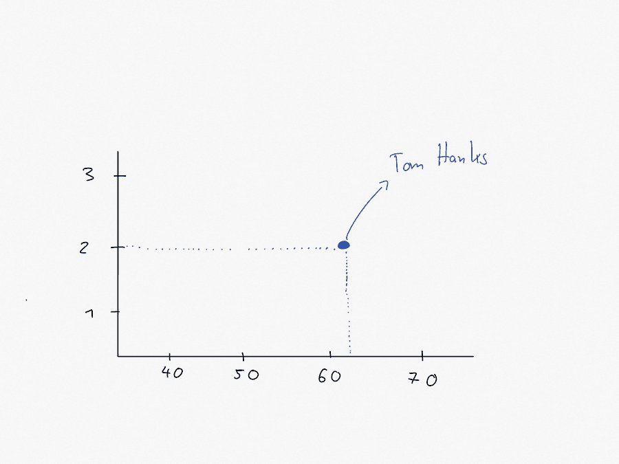
Let me give you an example of how we could do that. Tom Hanks has won three oscars, and he's 63 years old. We could add a circle or a point on the canvas. That point has to be mapped to the data somehow. And that's how it could work:
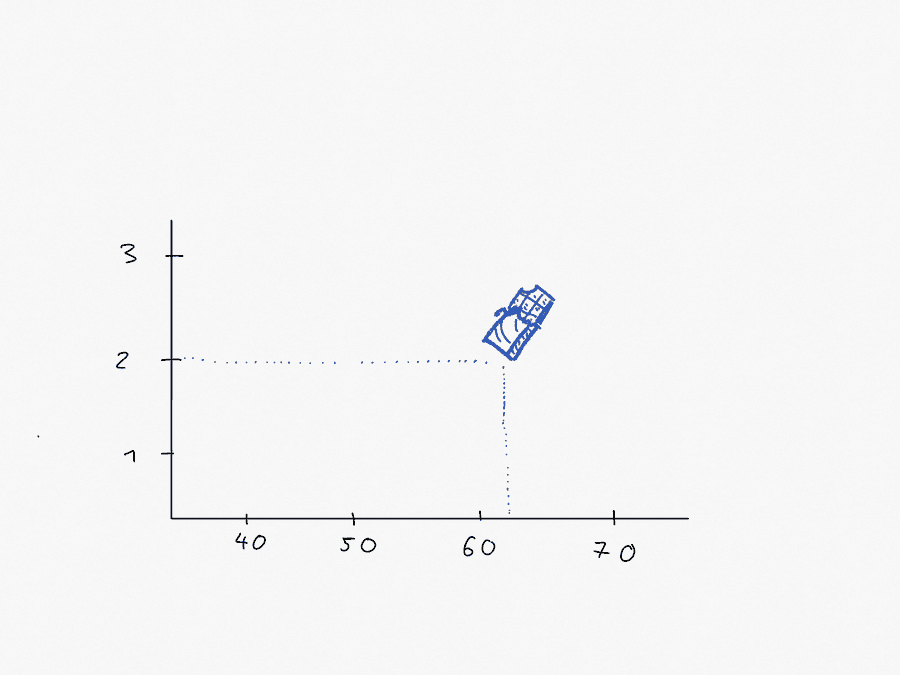
Age is displayed on the x-axis and the number of oscars on the y-axis. In this sense Tom Hanks is nothing more than a point in a two-dimensional space. Let us forget the point for a moment. Tom Hanks could also just be an image of a chocolate bar in a two-dimensional space:
The point is, it doesn't matter. The visual representation of Tom Hanks could be anything. Even just a piece of text that says Tom Hanks. So here's the first rule:
In data visualization we visualize data as geometrical objects.
We have already seen two geometric objects, a point and a chocolate bar. Here is a more comprehensive list:
- a point
- a rectangle
- a line
- a path (or a connected line)
- an area
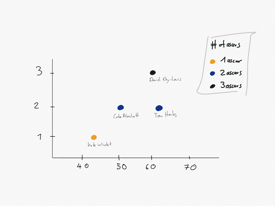
In two-dimensional space, each of these geometric objects requires an x- and a y-coordinate. Our Tom Hanks chocolate bar must be placed somewhere on the canvas. The actual location makes a difference in how we interpret the data visualization. If the chocolate bar were further to the left, Tom Hanks would be younger than he actually is. So there is a mapping between the position of the chocolate bar in space and the data. We call this mapping aesthetic mappings. Every visual aesthetic tells us something about how a geometric object is visualized. Take the next visualization, for example:
Here we use a point as our geometric object. Each point has three aesthetic mappings. First, each point is positioned in two-dimensional space by an x and a y value. Second, each point is colored differently, depending on the number of oscars each movie star has won. Daniel Day-Lewis, for example, has won three oscars. The number three is mapped to the color green. Similarly, the number 2 (2 oscars) is mapped to the color blue. We could represent this mapping as follows:
- age -> x
- number of oscars -> y
- number of oscars -> color
In ggplot we have a function to define such mappings, aes. To replicate our example in R, we would write the following code:
aes(x = age,
    y = oscars,
    color = oscars)
Aesthetic mapping:
* `x` -> `age`
* `y` -> `oscars`
* `colour` -> `oscars`With such a mapping, each geometric object would be positioned relative to each other on the canvas according to the age and the number of oscars for each movie star. In addition, the color of each geometric object would be mapped to the number of oscars won by each movie star. So here is our second rule:
The data is mapped to aesthetic mappings that are applied to geometric objects.
The interaction of geoms, aesthetics and mappings
We now know that in data visualization with ggplot2 we map aesthetics to geometric objects. Let's see this idea in action with the help of our movie star dataset. The following data visualization represents a scatterplot, i.e. points as geometric objects projected onto a two-dimensional space:
ggplot(data = celebs, mapping = aes(x = age, y = oscars)) +
  geom_point()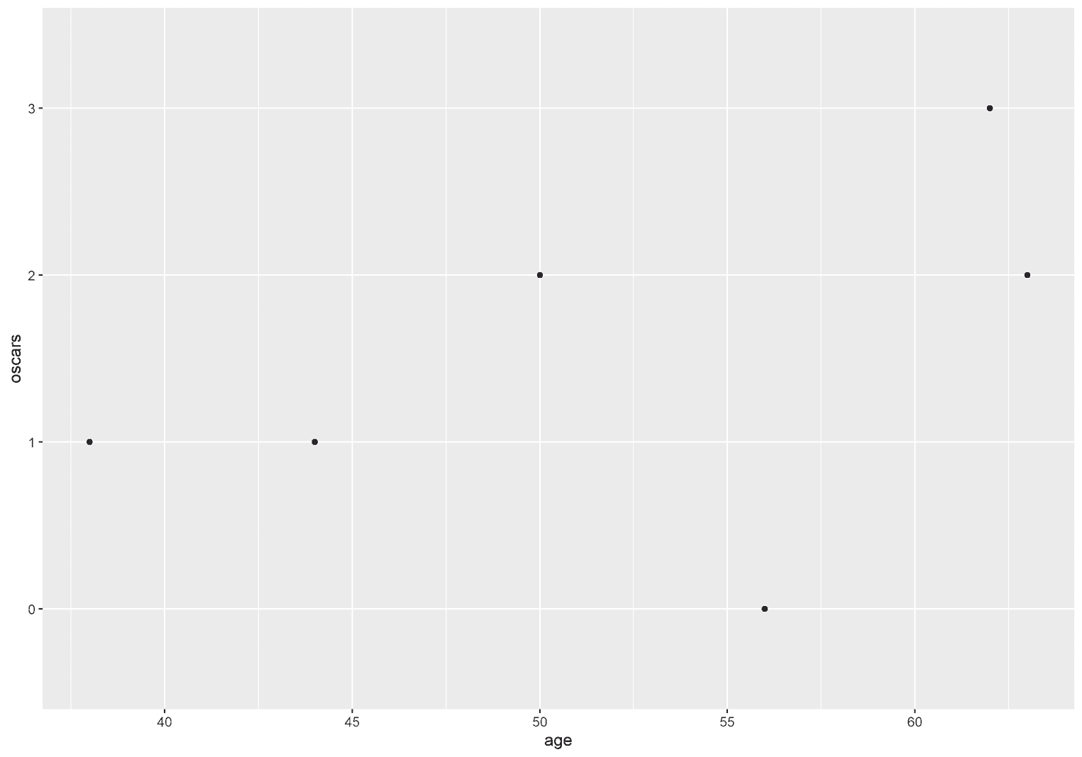
ggplot is a function and takes two arguments. The first argument is the data itself. This argument is conveniently called data. The second argument is our aesthetics mapping and is called mapping. We add geometric objects with a plus sign. In this visualization, for example, we add points as geometric objects. These geometric objects always start with a geom_. Then we have to tell ggplot what kind of geometric objects to display: geom_point.
ggplot(data = <DATA>, mapping = aes(<MAPPING>)) +
  geom_<NAME_OF_GEOMETRIC_OBJECT>() +
  ...
We do not have to name the arguments. We could therefore omit data = and mapping =, provided we keep the order of the arguments the same.
ggplot(celebs, aes(x = age, y = oscars)) +
  geom_point()
Same aesthetics, different geometric objects
To appreciate the fact that aesthetic mappings are applied to any geometric object, we could change geom_point to geom_text, which displays the text on the screen:
ggplot(celebs, aes(x = age, y = oscars)) +
  geom_text(label = "Some text")
As you can see, the same x and y coordinates are applied to a different geometric object. We might as well display rectangles as geometric objects on the screen instead of points or text:
ggplot(celebs, aes(x = age, y = oscars)) +
  geom_rect(aes(xmin = age,                 xmax = age + 0.5,                ymin = oscars,                 ymax = as.integer(oscars) + 0.5))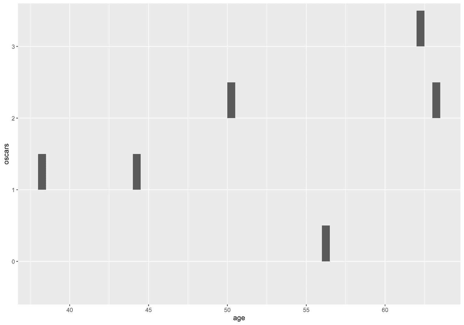
And another example. geom_spoke is a geometric object that displays short lines with a certain angle:
ggplot(celebs, aes(x = age, y = oscars)) +
  geom_spoke(angle = .45, radius = 0.5)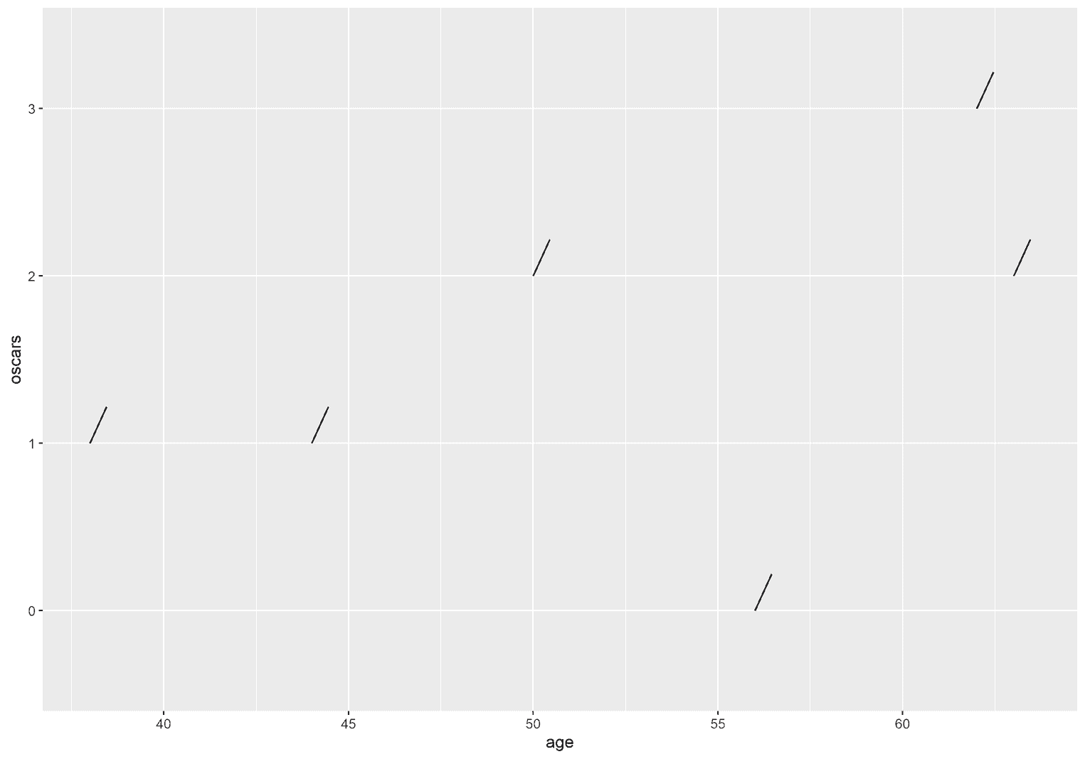
The aesthetic mappings we use within the ggplot function will be applied to all following geometric objects. In this case we had only two aesthetics mappings (x and y). Let's turn this idea around and see if we can apply different aesthetic mappings to the same geometric object.
Same geometric object, different aesthetics
Before we start, to make the changes more visible, we create a scatterplot with large points:
ggplot(celebs, aes(x = age, y = oscars)) +
  geom_point(size = 9)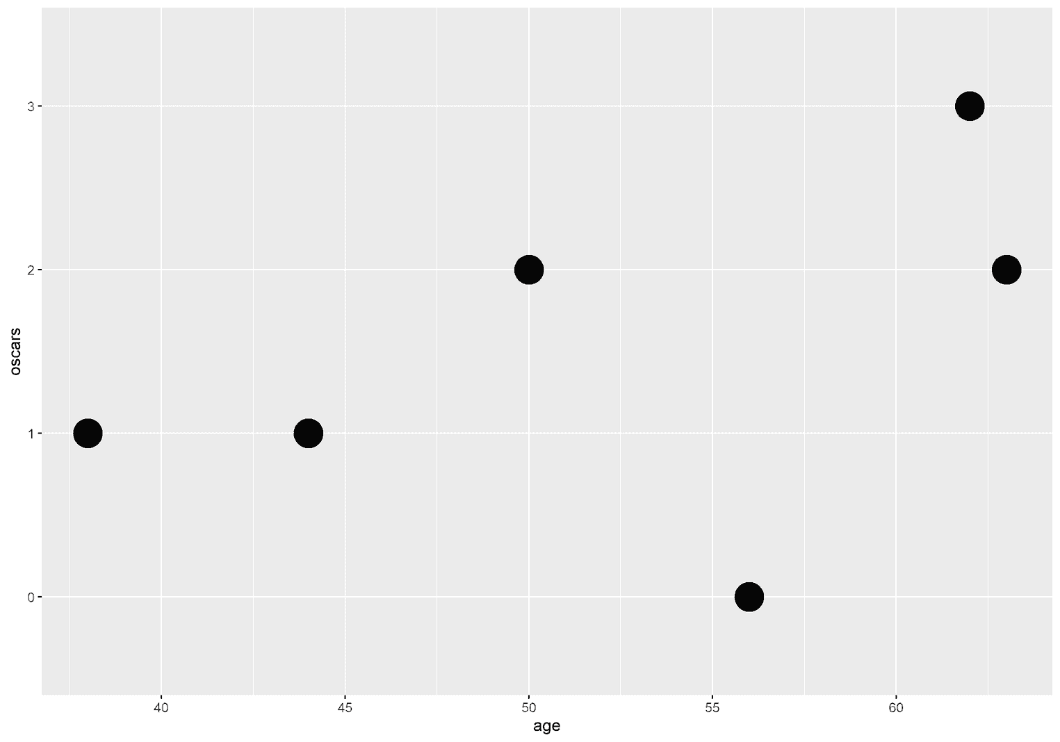
Next, we want to add another aesthetic mapping to our visualization. The color of the points should be mapped to the gender of the movie stars: color -> gender:
ggplot(celebs, aes(x = age, y = oscars,
                   color = gender)) +  geom_point(size = 9)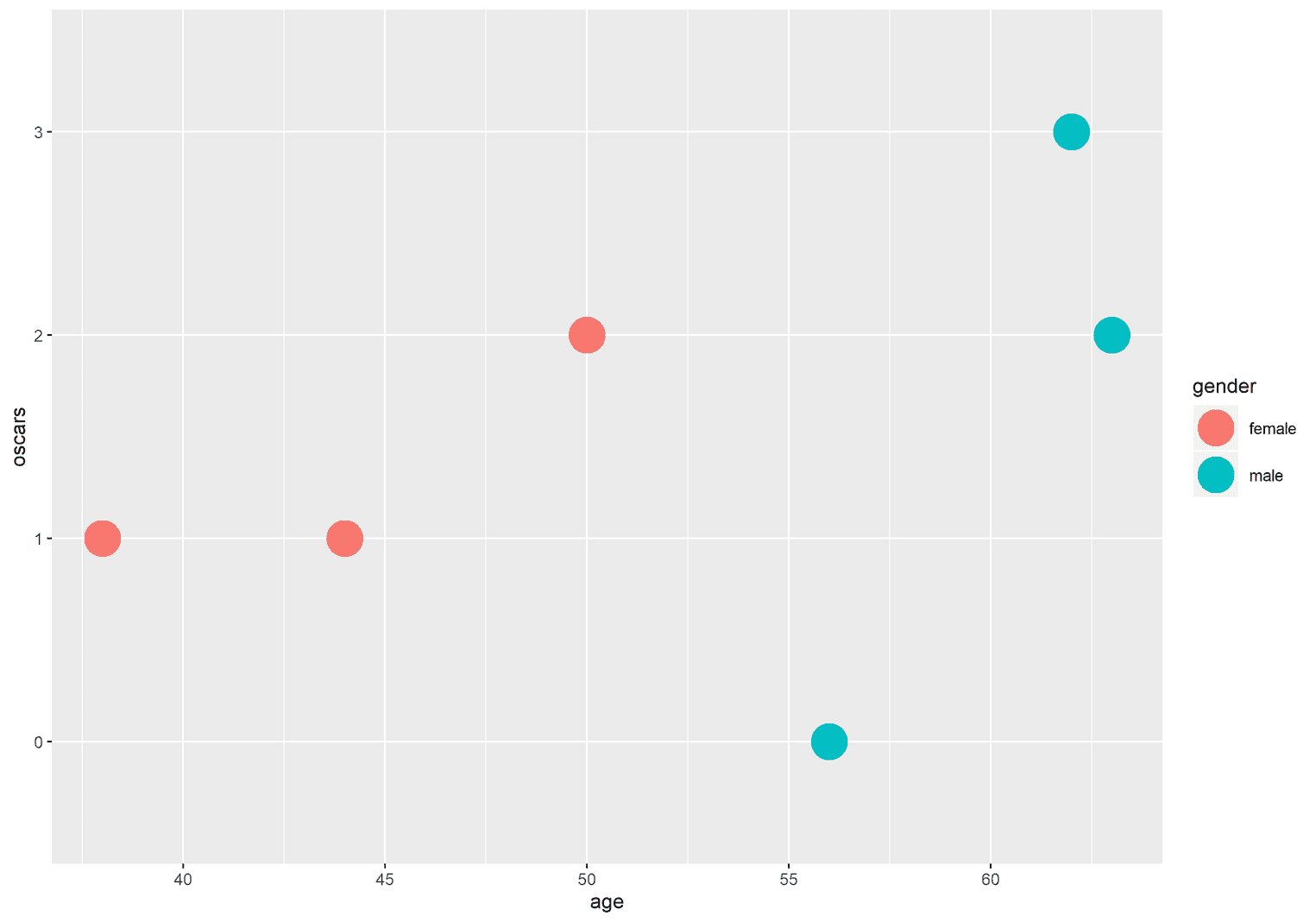
What happened here is that every geometric object that follows the ggplot function has a color that is assigned to the gender of the movie stars. By default ggplot2 decided to use the colors blue and red. Later we will learn how to change them manually. For now, let's acknowledge the fact that we have added a third aesthetic mapping to our visualization. However, the x-y coordinates and the color are not the only mappings, you could also make the points transparent according to the gender of the movie stars:
ggplot(celebs, aes(x = age, y = oscars,
                   alpha = gender)) +  geom_point(size = 9)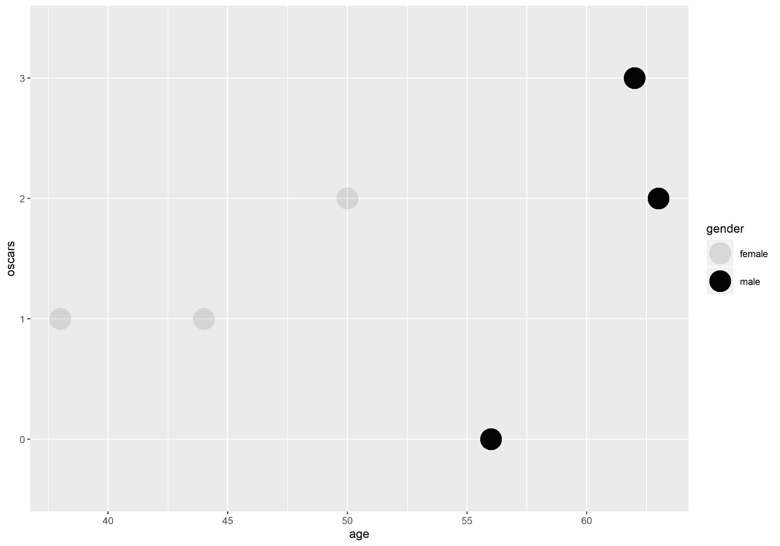
As you can see, points associated with female movie stars have a high transparency and points associated with male movie stars have no transparency at all. We could also add the aesthetic size, which displays the points in different sizes, depending on how many oscars each movie star has won:
ggplot(celebs, aes(x = age, y = oscars,
                   size = oscars)) +  geom_point()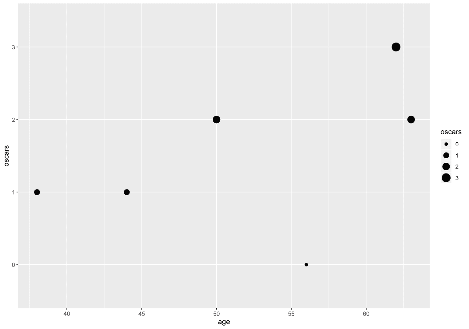
Points associated with movie stars that have won two or three oscars are larger than points associated with movie stars that have won no oscars or one.
The beauty of ggplot2 is that we can apply several aesthetic mappings to a single geometric object:
ggplot(celebs, aes(x = age, y = oscars,
                color = gender,                size = oscars)) +  geom_point()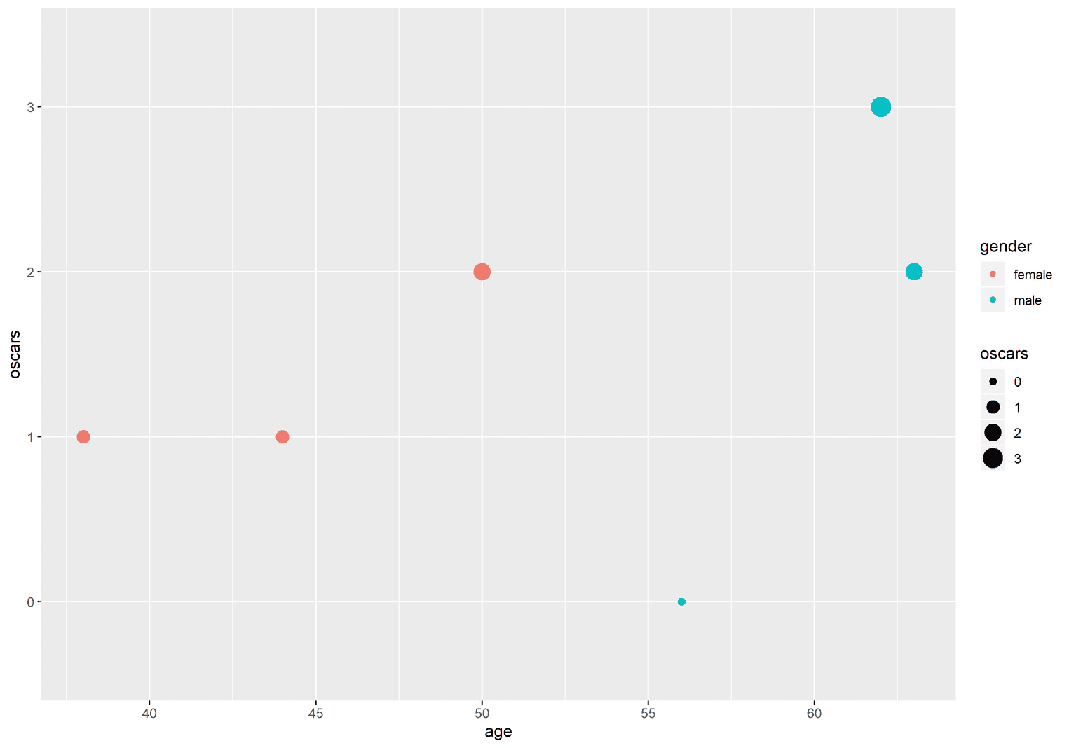
Aesthetics can be added to specific geoms
Whenever you add an aesthetic mapping to the ggplot function, it is applied to each subsequent geometric object. For example, in the following example, we apply the aesthetic mapping color -> gender to geom_point and geom_text:
ggplot(celebs, aes(x = age, y = oscars,
                   color = gender)) +
  geom_point(size = 9) +
  geom_text(label = "Some text", nudge_y = 0.3)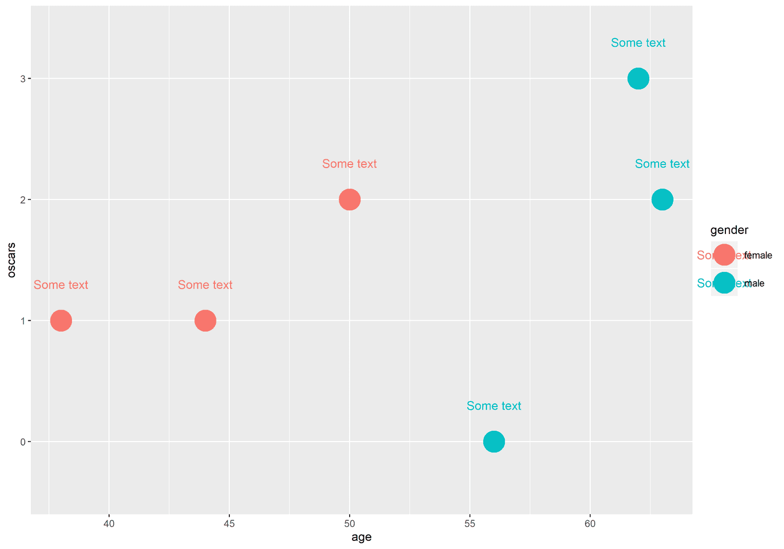
Both the color of the text and the color of the points are mapped to the gender of the movie stars. But maybe we only want to apply the color -> gender the aesthetic mapping to the points and not the text. We can do this by adding another aes function to geom_point:
ggplot(celebs, aes(x = age, y = oscars)) + geom_point(size = 9, aes(color = gender)) + geom_text(label = "Some text", nudge_y = 0.3)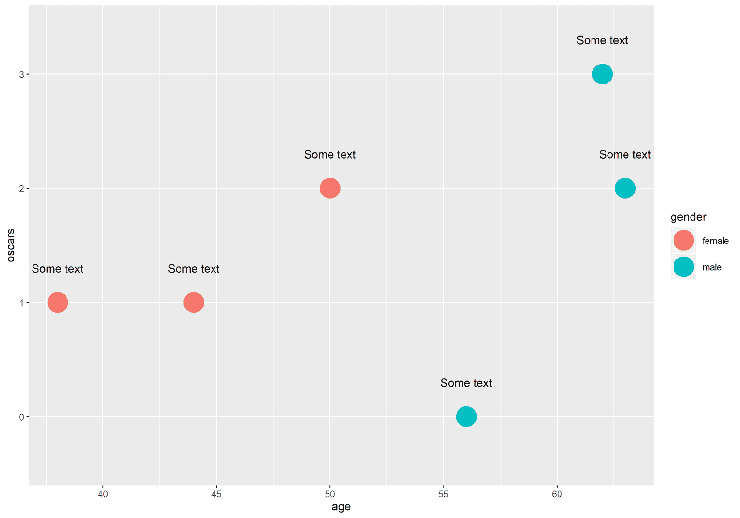
The text is now black because the aesthetic mapping color -> gender is only applied to the geom_point. Here is our general rule:
Aesthetic mappings within the ggplot function are applied to any geometric object, while aesthetic mappings within a geometric object are only applied to this specific geometric object.
Do not map one aesthetic to several variables
However, you should be careful not to get too creative at this point. For example, you might think that you could easily map colors to different variables. For example, you could map color to both the gender and the names of the movie stars:
ggplot(celebs, aes(x = age, y = oscars)) + geom_point(size = 7, aes(color = gender)) + geom_text(aes(label = name, color = name), nudge_y = -0.2)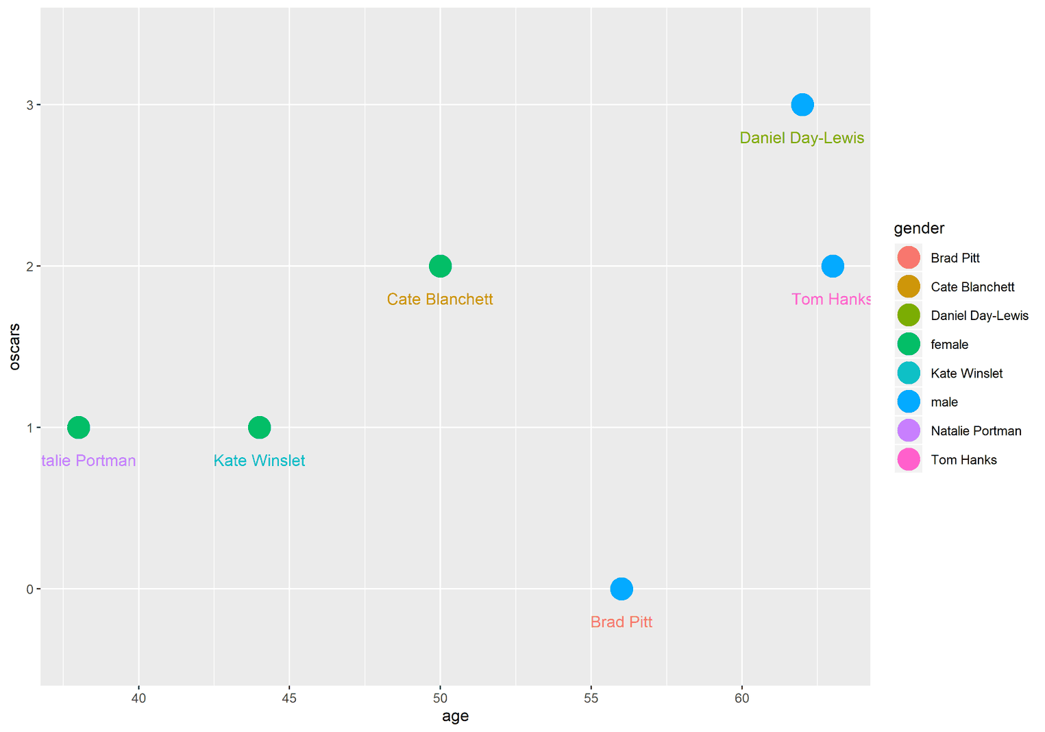
To identify the problem, look at the legend on the right. Have you ever heard about the gender Brad Pitt? I haven't, because it doesn't exist. ggplot got confused because you applied several variables to a single aesthetic. This is not recommended. What happens is that the name of the first aesthetic mapping is kept as the title of the legend and the values of the variables are used as legend labels.
You should not map one aesthetic to several variables.
In the following visualization I have mapped the aesthetic x to the variables age and name. As you can see, the first mapping takes over the name of the x-axis, while the logic of the x-axis is taken from the second mapping:
ggplot(celebs, aes(x = age, y = oscars)) + geom_point(size = 7, aes(x = name))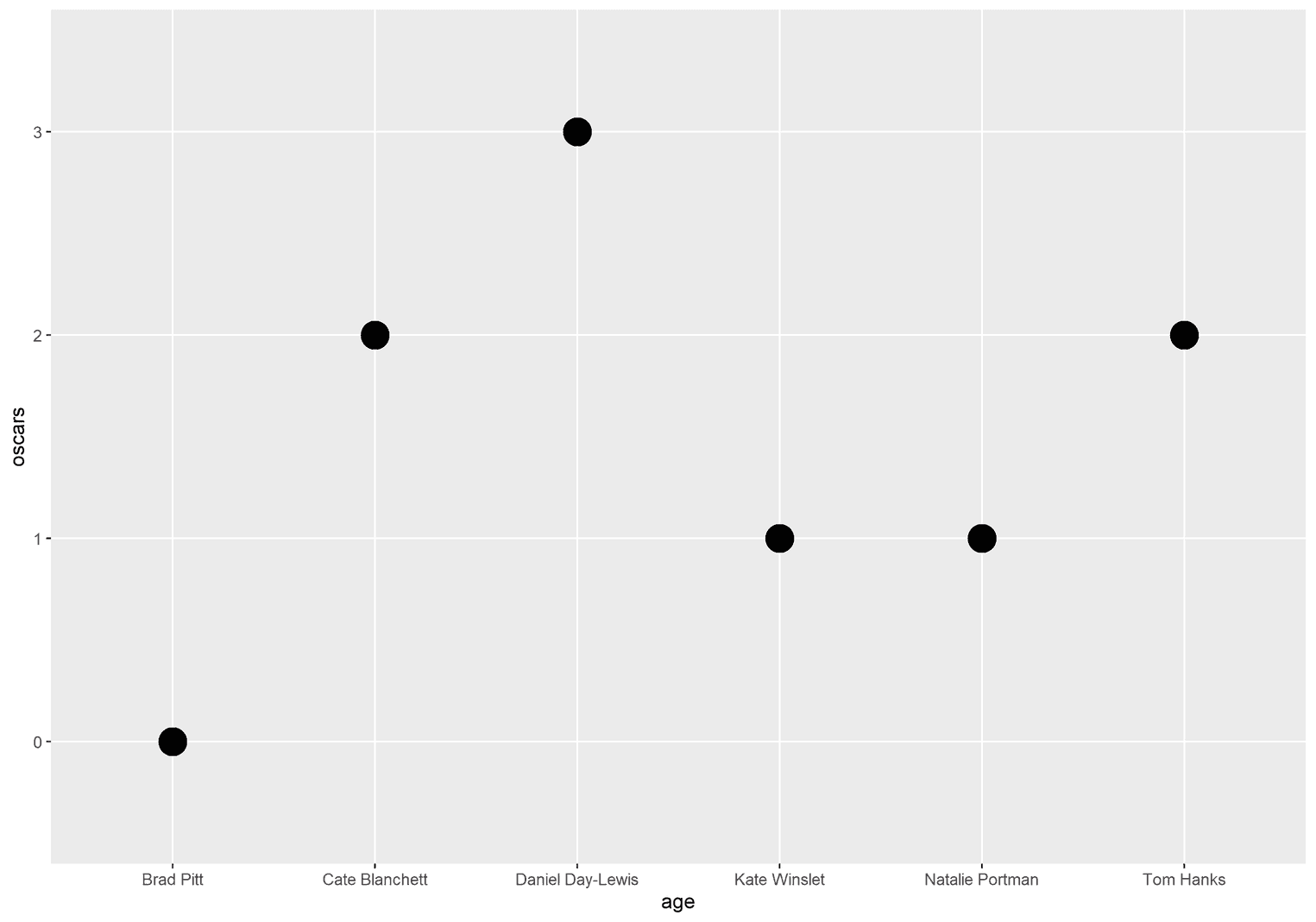
Not all aesthetics must be mapped
Sometimes we want to apply the same color to each point or rectangle. Since these aesthetics are not mapped to data, we must remove them from the aes function. Instead, we simply add the aesthetics as arguments to our geom. Let's do it wrong for now. In the next example, we apply a single color as an aesthetic mapping:
ggplot(celebs, aes(x = age, y = oscars)) + geom_point(size = 7, aes(color = "purple")) # Wrong!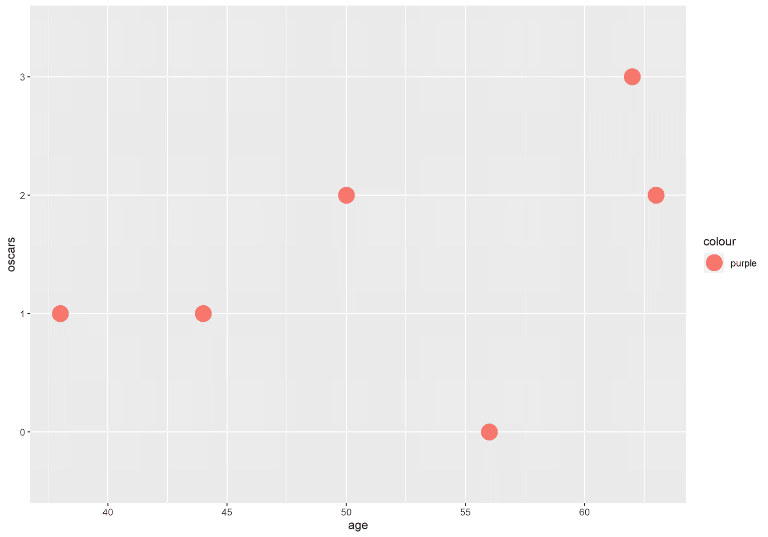
In the corrected version, the color aesthetic is removed from the aes function and added as an argument to geom_point:
ggplot(celebs, aes(x = age, y = oscars)) + geom_point(size = 7, color = "purple")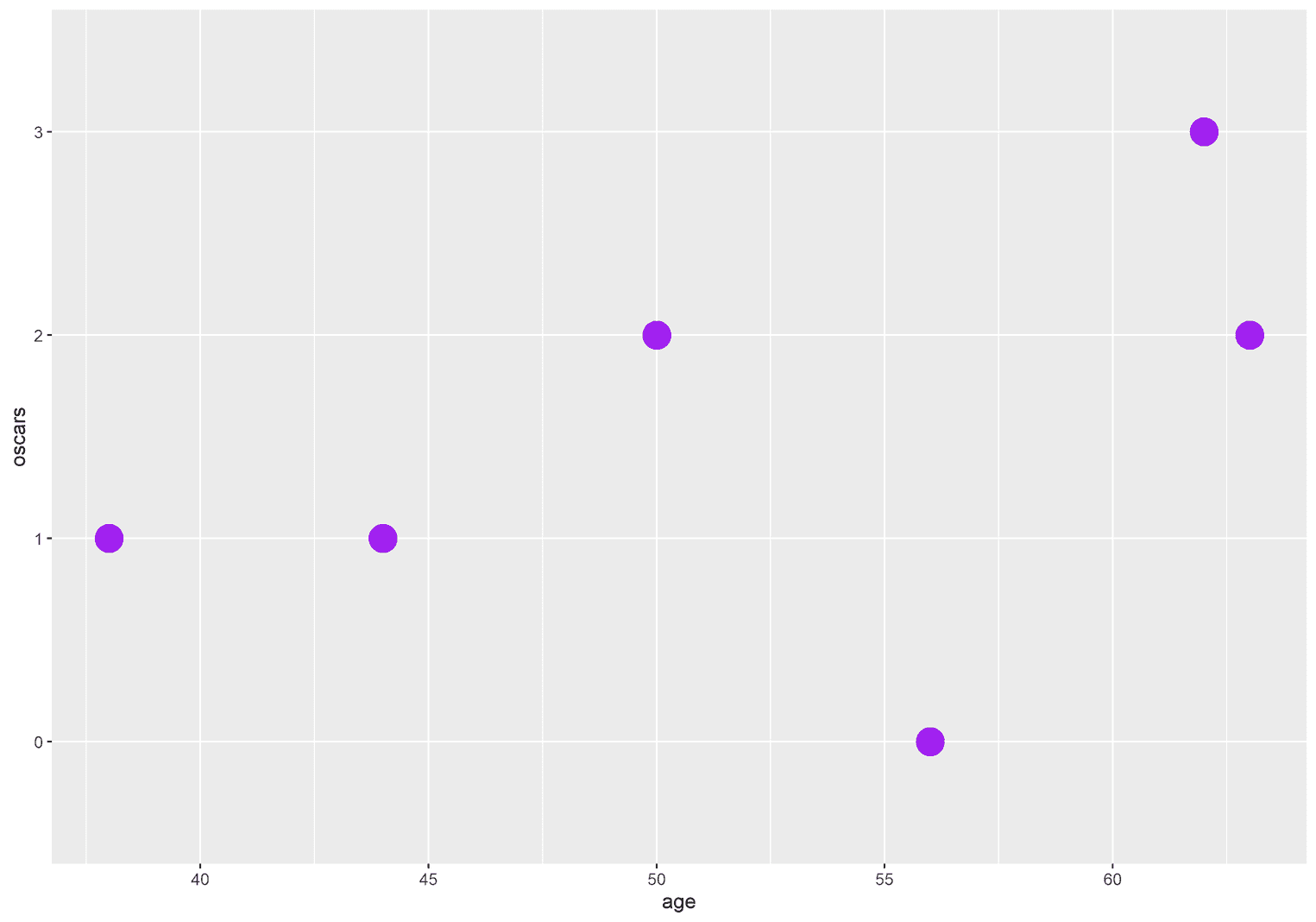
Similarly, you can change the size of each point by adding the argument size, as we did earlier:
ggplot(celebs, aes(x = age, y = oscars)) +
  geom_point(size = 15)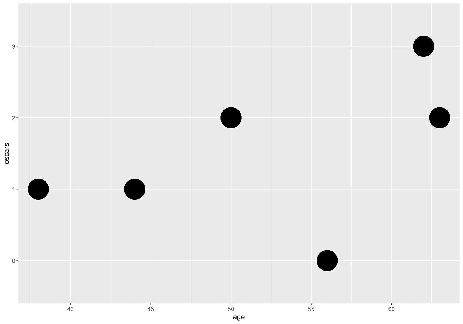
You can change the appearance of the aesthetics using scales
Every aesthetic was defined in advance by ggplot2. For example, ggplot2 uses a standard color palette and tries to make an intelligent decision about which size is large and which is small. However, you may want to change these default values yourself. To do so, we need scales. Scales always have the following structure:
scale_AESTHETIC_...There are many scales functions. Each function starts with scale_. Then you add the name of the aesthetics: scale_color_. Finally, there are different terms to complete the functions. For example, you can change the aesthetics manually by writing scales_color_manual.
Changing the appeareance of colors
For example, imagine you want to change the default colors of ggplot2 manually. There is a function called scale_color_manual that has a value argument which takes a vector of colors:
ggplot(celebs, aes(x = age, y = oscars)) +
  geom_point(size = 7, aes(color = oscars)) +  scale_color_manual(values = c("green", "blue", "red", "purple"))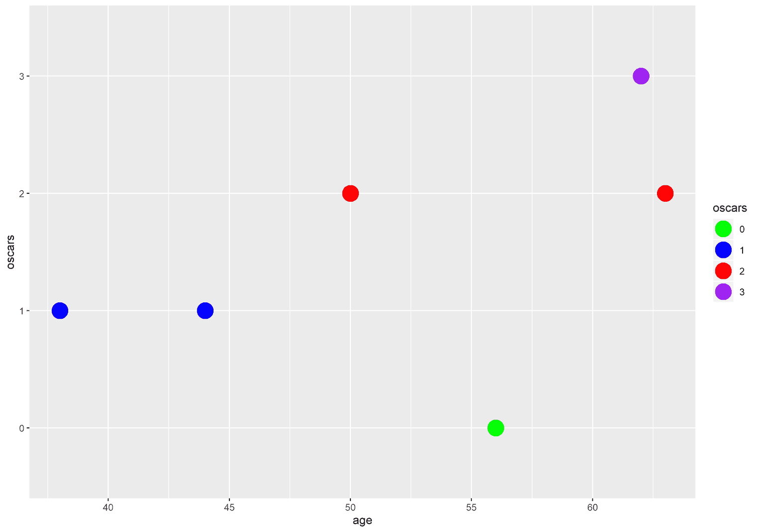
But the choice of your own colours is a delicate matter. You must ensure that the colors are color-blind safe and sufficiently different from another. One solution to this problem is to use professional color palettes, such as the viridis color palette, which comes with ggplot2:
ggplot(celebs, aes(x = age, y = oscars)) +
  geom_point(aes(color = oscars), size = 7) +
  scale_color_viridis_d()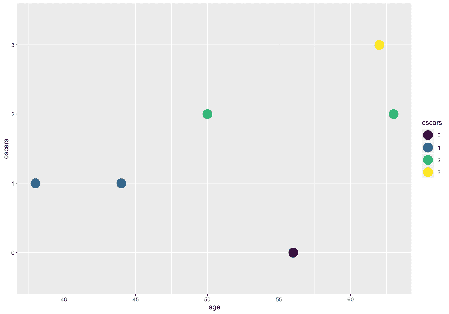
Sometimes you may not even want to display colors. Imagine that you want to give your visualization a more serious look by using different shades of gray. For this purpose ggplot2 has the function scales_color_grey:
ggplot(celebs, aes(x = age, y = oscars)) +
  geom_point(aes(color = oscars), size = 7) +
  scale_color_grey(start = 0.1, end = 0.9)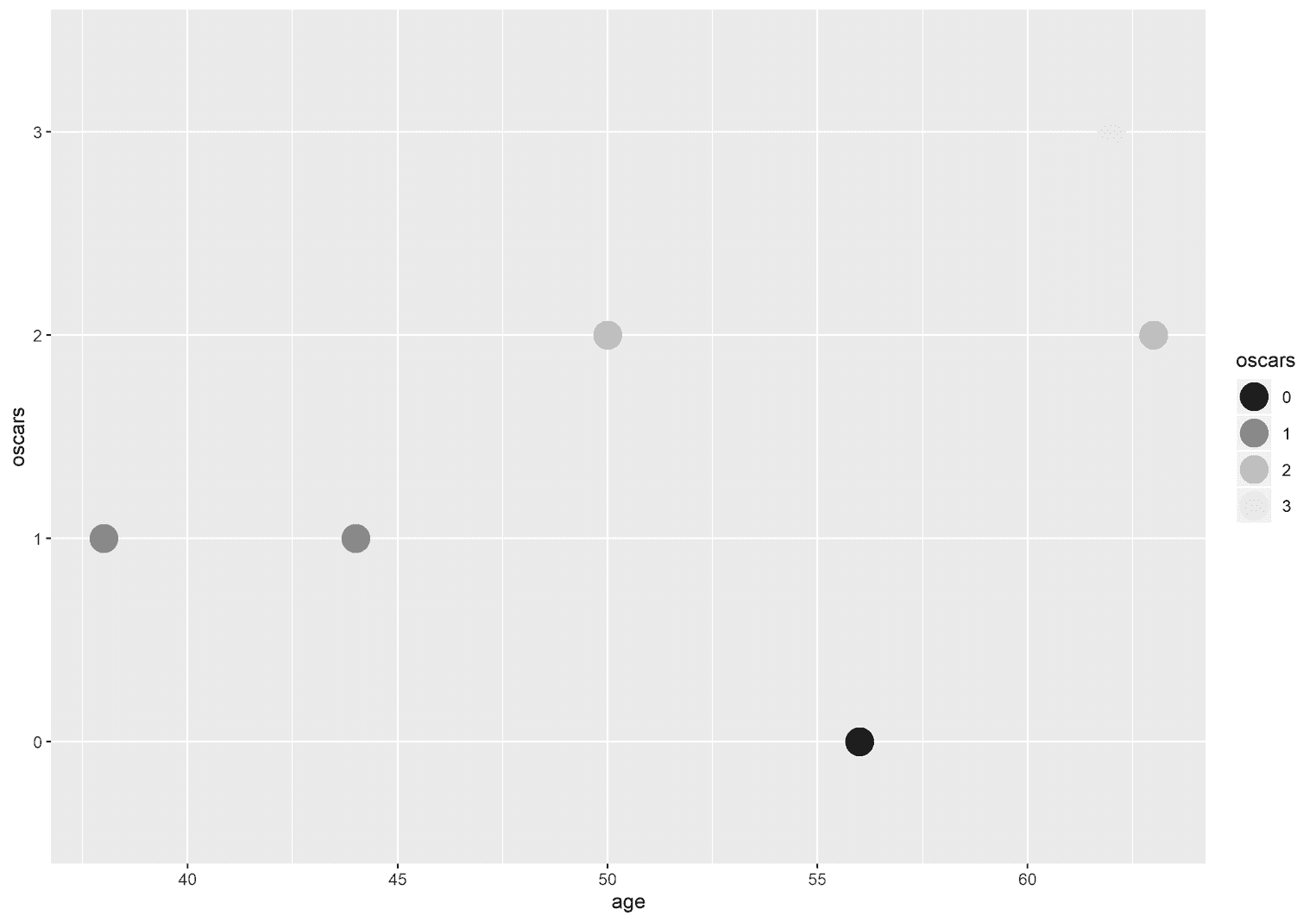
Changing the appeareance of axes
Remember that x and y values are also aesthetics. Therefore, we have scale functions that allow us to change the visual appearance of the axes. Before I show you some examples, we need to talk about different types of data.
To make wise decisions about how to change the appearance of axes, you need to understand the difference between discrete and continuous data. Discrete data is characterized by the fact that it has no intermediate values. In R, we refer to such data as factors or strings. For example, the names of people are discrete. There are no intermediate values between Tom Hanks and Daniel Day-Lewis. Likewise, you can only win a certain number of oscars. No person will ever win 1.5 oscars. Continuous data behaves quite differently. This data has intermediate values. The age of a person, for example, is discrete. A person can be 61 years old, but also 61 years and one day old. The same applies to the height of a person. Between a person who is 170 cm and 180 cm tall, there are infinitely many intermediate values.
To understand this distinction, we need to look at the dataset again:
glimpse(celebs)# A tibble: 6 x 4
name age oscars gender
<chr> <dbl> <fct> <chr>
1 Brad Pitt 56 0 male
2 Daniel Day-Lewis 62 3 male
3 Tom Hanks 63 2 male
4 Natalie Portman 38 1 female
5 Kate Winslet 44 1 female
6 Cate Blanchett 50 2 femalechr and fct stand for discrete values. chr means character and fct means factor. dbl stands for continuous data and means double. So if we want to change the x-axis with the scale functions in the next step, we need to know beforehand what kind of data has been mapped to the x or y values. In our case, the x-values were mapped to the continuous variable age.
Let us start with the function scale_x_continuous. With this function we can make various changes to the x-axis. For example, we can change the title of the x-axis:
ggplot(celebs, aes(x = age, y = oscars)) +
  geom_point(size = 7) +
  scale_x_continuous(name = "Celebs Age")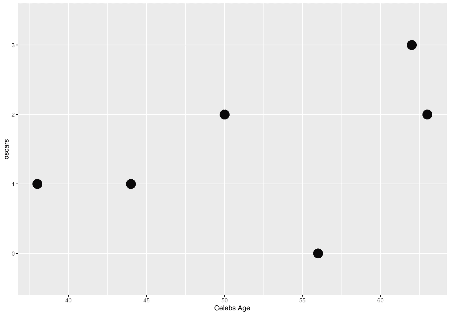
We can also use the function to determine where the breaks of the x-axis are inserted.
ggplot(celebs, aes(x = age, y = oscars)) +
  geom_point(size = 7) +
  scale_x_continuous(name = "Celebs Age",
                     breaks = c(40, 50, 60))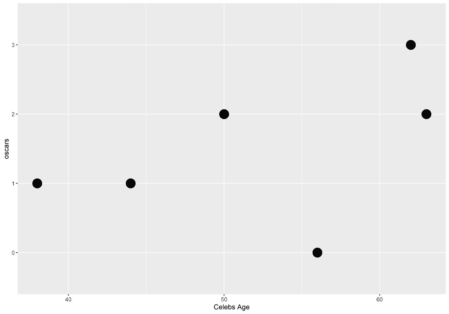
Sometimes you may also want to specify which text is displayed at each break. To do this, we can add labels to the breaks:
ggplot(celebs, aes(x = age, y = oscars)) +
  geom_point(size = 7) +
  scale_x_continuous(name = "Celebs Age",
                     breaks = c(40, 50, 60),
                     labels = c("Forty", "Fifty", "Sixty"))
Who actually decided that the x-axis is at the bottom? ggplot2. But you can also move the x-axis upwards with the argument position:
ggplot(celebs, aes(x = age, y = oscars)) +
  geom_point(size = 7) +
  scale_x_continuous(name = "Celebs Age",
                     position = "top")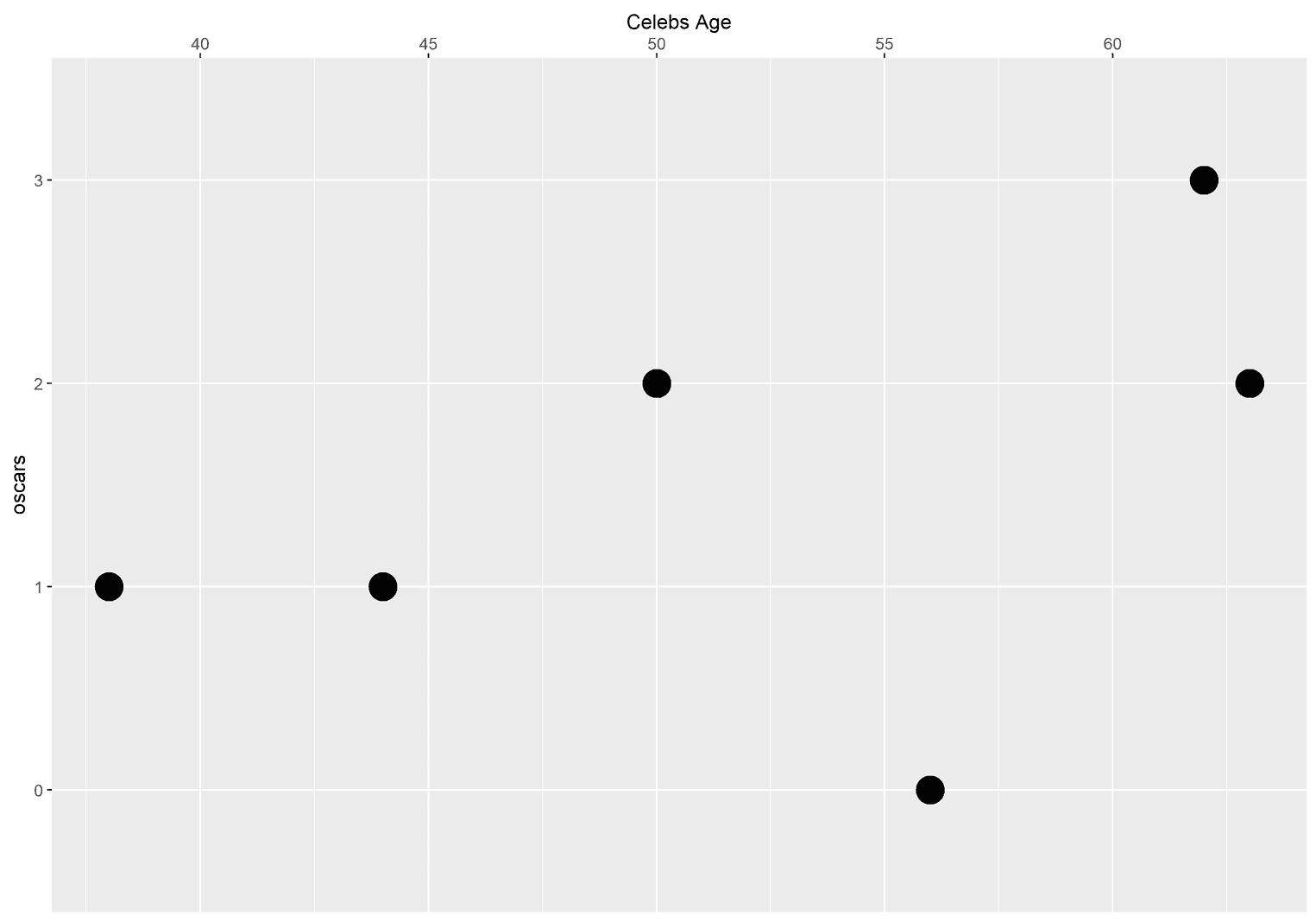
Working with scales
To appreciate the variety of scale functions in ggplot2, take a look at the official documentation. This tutorial would never end if we went through them all. I suggest you spend half an hour trying out different scale functions to understand how they work. Remember, there are two things you need to know: You should know which variables the aesthetics have been mapped to, and you need to know the name of the aesthetics.
Conclusion
That was our tour for beginners. The main focus of the tutorial was to better understand the terms aesthetics, mappings, geoms, and scales. In my experience, these terms cause a lot of confusion, especially in the beginning. I hope that you feel a little more confident after the tutorial and use these three concepts more consciously in your data visualizations.

