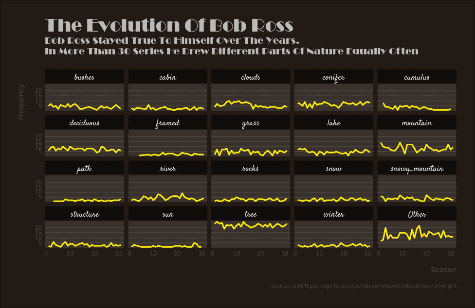
Bob Ross was an iconic American painter, instructor and television host. I remember the days when I came home from a party and watched Bob Ross draw beautiful paintings with his soft and calming voice that brought joy to so many people.
In this article, I'd like to make a data visualization that will give you an idea of what kind of objects Bob Ross has painted over the years. The data comes from the 538 R package. I did the visualization as part of the tidytuesday project.
First we load all necessary libraries and the data for the visualization:
library(tidyverse)
library(janitor)

bob_ross <- readr::read_csv("https://raw.githubusercontent.com/rfordatascience/tidytuesday/master/data/2019/2019-08-06/bob-ross.csv")
bob_ross
# A tibble: 403 x 69
EPISODE TITLE APPLE_FRAME AURORA_BOREALIS BARN BEACH BOAT BRIDGE BUILDING BUSHES CABIN CACTUS CIRCLE_FRAME CIRRUS CLIFF CLOUDS CONIFER
<chr> <chr> <int> <int> <int> <int> <int> <int> <int> <int> <int> <int> <int> <int> <int> <int> <int>
1 S01E01 "\"A… 0 0 0 0 0 0 0 1 0 0 0 0 0 0 0
2 S01E02 "\"M… 0 0 0 0 0 0 0 0 1 0 0 0 0 1 1
3 S01E03 "\"E… 0 0 0 0 0 0 0 0 1 0 0 0 0 0 1
4 S01E04 "\"W… 0 0 0 0 0 0 0 1 0 0 0 0 0 1 1
5 S01E05 "\"Q… 0 0 0 0 0 0 0 0 0 0 0 0 0 0 0
6 S01E06 "\"W… 0 0 0 0 0 0 0 0 1 0 0 0 0 0 1
7 S01E07 "\"A… 0 0 0 0 0 0 0 0 0 0 0 0 0 0 0
8 S01E08 "\"P… 0 0 0 0 0 0 0 1 0 0 0 0 0 0 1
9 S01E09 "\"S… 0 0 0 1 0 0 0 0 0 0 0 0 0 1 0
10 S01E10 "\"M… 0 0 0 0 0 0 0 1 0 0 0 0 0 0 1
# ... with 393 more rows, and 52 more variables: CUMULUS <int>, DECIDUOUS <int>, DIANE_ANDRE <int>, DOCK <int>, DOUBLE_OVAL_FRAME <int>,
# FARM <int>, FENCE <int>, FIRE <int>, FLORIDA_FRAME <int>, FLOWERS <int>, FOG <int>, FRAMED <int>, GRASS <int>, GUEST <int>,
# HALF_CIRCLE_FRAME <int>, HALF_OVAL_FRAME <int>, HILLS <int>, LAKE <int>, LAKES <int>, LIGHTHOUSE <int>, MILL <int>, MOON <int>,
# MOUNTAIN <int>, MOUNTAINS <int>, NIGHT <int>, OCEAN <int>, OVAL_FRAME <int>, PALM_TREES <int>, PATH <int>, PERSON <int>,
# PORTRAIT <int>, RECTANGLE_3D_FRAME <int>, RECTANGULAR_FRAME <int>, RIVER <int>, ROCKS <int>, SEASHELL_FRAME <int>, SNOW <int>,
# SNOWY_MOUNTAIN <int>, SPLIT_FRAME <int>, STEVE_ROSS <int>, STRUCTURE <int>, SUN <int>, TOMB_FRAME <int>, TREE <int>, TREES <int>,
# TRIPLE_FRAME <int>, WATERFALL <int>, WAVES <int>, WINDMILL <int>, WINDOW_FRAME <int>, WINTER <int>, WOOD_FRAMED <int>The dataset contains more than 69 variables. Each variable is obviously coded with 0 or 1, that is, if a specific object was present in the painting of a particular episode. For example, in the first episode of season one Bob painted bushes (see variable BUSHES). Since this data is not tidy we need to refactor the dataset so that we have two variables: One factor variable that specifies the kind of object and another variable that specifies if the kind of object was present in a given episode:
(bob_cleaned <- bob_ross %>%
  janitor::clean_names() %>%
  separate(episode, into = c("season", "episode"), sep = "E") %>%
  mutate(season = str_extract(season, "[:digit:]+")) %>%
  mutate_at(vars(season, episode), as.integer) %>%
  gather(type, present, -season, -episode, -title))
# A tibble: 27,001 x 5
season episode title type present
<int> <int> <chr> <chr> <int>
1 1 1 "\"A WALK IN THE WOODS\"" apple_frame 0
2 1 2 "\"MT. MCKINLEY\"" apple_frame 0
3 1 3 "\"EBONY SUNSET\"" apple_frame 0
4 1 4 "\"WINTER MIST\"" apple_frame 0
5 1 5 "\"QUIET STREAM\"" apple_frame 0
6 1 6 "\"WINTER MOON\"" apple_frame 0
7 1 7 "\"AUTUMN MOUNTAINS\"" apple_frame 0
8 1 8 "\"PEACEFUL VALLEY\"" apple_frame 0
9 1 9 "\"SEASCAPE\"" apple_frame 0
10 1 10 "\"MOUNTAIN LAKE\"" apple_frame 0
# ... with 26,991 more rowsNow we have a type variable that specifies the kind of object. In addition, we have made some other changes to the dataset. First, we cleaned all variable names with the janitor package using the clean_names function. Second, we have separated the variable EPISODE into two variables, season and episode, since we need to count how often an object occured per season and episode we have to separate them. Third, we removed all character strings from the variable episode using str_extract. Finally, we turned the season and episode variables into atomic integers. Our next challenge is to count how often each and every object occured per season and episode:
(count_objects_data <- bob_cleaned %>%
  filter(present == 1) %>%
  mutate(
    type = case_when(
      type == "trees" ~ "tree",
      type == "mountains" ~ "mountain",
      TRUE ~ as.character(type)
    )
  ) %>%
  mutate(
    type = type %>% fct_lump(19)
  ) %>%
  count(season, type))
# A tibble: 595 x 3
season type n
<int> <fct> <int>
1 1 bushes 5
2 1 cabin 3
3 1 clouds 4
4 1 conifer 8
5 1 deciduous 6
6 1 grass 2
7 1 lake 7
8 1 mountain 14
9 1 river 2
10 1 rocks 1
# ... with 585 more rowsA few things are happening here: Since we are only interested in the objects that were painted and not in the missing objects, we can filter them. It turns out that some object names are redundant. For example the dataset consists of a tree and trees object. That is just a linguistic difference that doesn't change the meaning of the word. Therefore, we combine them to tree with the function case_when. Since we want to end up with a data visualization, it would be a bad idea to visualize all objects. The visualization would be inflated and almost unreadable. Therefore, I used the function fct_lump to include only the 19 most common objects. Finally, we can count each object per season and episode with the function count.
First visualization - Setting the stage
First, we create multiple line charts, which are separated by the function facet_wrap. Our x-axis represents the seasons and the y-axis indicates the number of times a specific object was painted per season:
count_objects_data %>%
  ggplot(aes(x = season, y = n)) +
  geom_line() +
  facet_wrap(~ type, ncol = 5))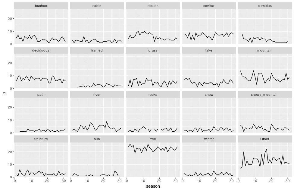
Looking at the visualization you realize that Bob was not particulary interested of specifc objects, except for trees, which he loved to paint. At the beginning of his television career he liked to paint clouds. In addition, he sometimes had seasons in which he liked to draw mountains.
Add all the necessary labels
The first visualization is a good start, but it misses some important information. For each visualization we need a title and axis titles:
count_objects_data %>%
  ggplot(aes(x = season, y = n)) +
  geom_line() +
  facet_wrap(~ type, ncol = 5)) +
  labs(    title = str_to_title("The evolution of bob ross"),    subtitle = str_to_title("Bob Ross stayed true to himself over the years.\nHe enjoyed all aspects of nature."),    caption = "source: 538 R package https://github.com/rudeboybert/fivethirtyeight",    x = "Season",    y = "Frequency"  )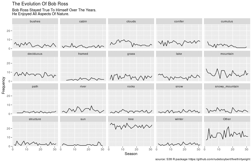
Now we have all the necessary information in place. We added a title, a subtitle, the axis titles and a caption to indicate where the data comes from. Mind, that I was a little bit lazy and used the function str_to_title to convert each string to a title string.
Setting the fonts
However, the plot still looks like a typical ggplot. It has a grey panel background and the font sizes vary randomly. We also need to give the visualization a Bob Ross touch. I googled a little and it turned out that the television series used a Broadway and a handwriting font. I found a Broadway font here and took a handwriting font from google fonts. In addition, I decided to make the axis titles eligible by using the Roboto font:
count_objects_data %>%
  ggplot(aes(x = season, y = n)) +
  geom_line() +
  facet_wrap(~ type, ncol = 5)) +
  labs(
    title = str_to_title("The evolution of bob ross"),
    subtitle = str_to_title("Bob Ross stayed true to himself over the years.\nHe enjoyed all aspects of nature."),
    caption = "source: 538 R package https://github.com/rudeboybert/fivethirtyeight",
    x = "Season",
    y = "Frequency"
  ) +
  theme(    plot.title = element_text(family = "Broadway"),    plot.subtitle = element_text(family = "Broadway"),    strip.text = element_text(family = "Satisfy"),    axis.title = element_text(family = "Roboto"),    plot.caption = element_text(family = "Roboto"),    axis.text = element_text(family = "Roboto")  )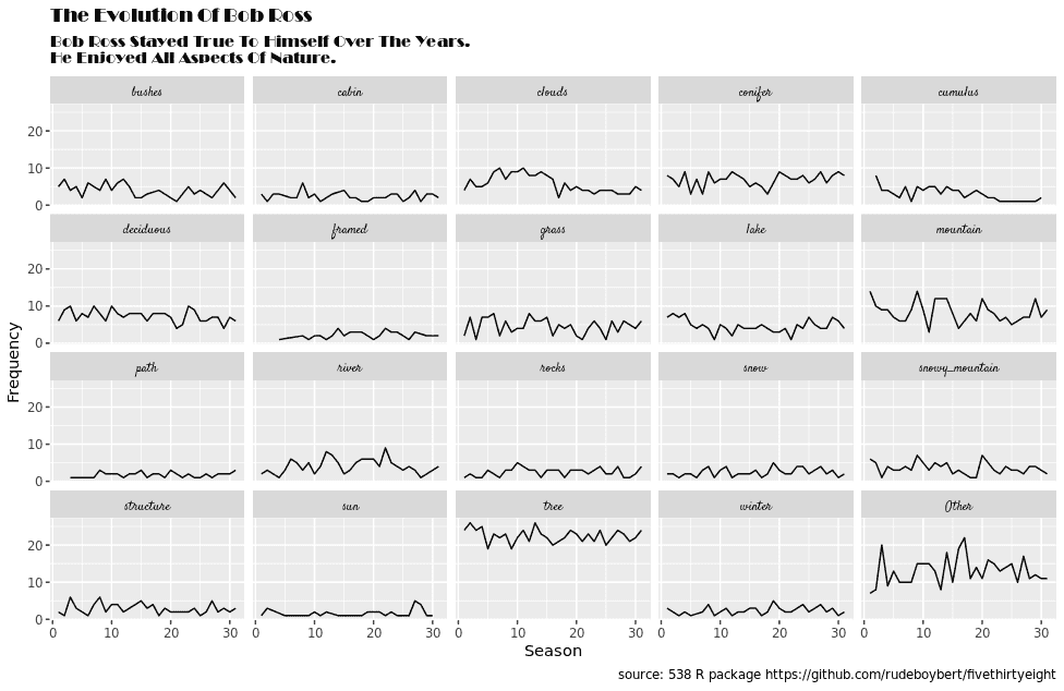
To change the overall appearance of a visualization in ggplot2, you need to use the theme function. For example, I changed the font family of the title by adding an element_text object to the plot.title argument. If you are not familiar with the ggplot theme yet, it will take a while until you know the most important terms but you'll get the hang of it sooner or later.
Perhaps the fonts are a little bit too much and the Satisfy font is unreadable, but I chose to make the data visualizatoin more Bob Ross like instead of making a fully readable plot.
Make it right in black and white
Now that we have all the fonts in place, we can adjust the visualization visually. Again, we will use the theme function to do all the heavy lifting:
count_objects_data %>%
  ggplot(aes(x = season, y = n)) +
  geom_line() +
  # Fill in labs function from previous visualization here
  theme_minimal() +  scale_y_continuous(minor_breaks = NULL,                      breaks = c(5, 10, 15, 20)) +  theme(
    plot.margin = unit(c(1, 1, 1, 1), "cm"),    plot.title = element_text(family = "Broadway",
                              size = 28),    plot.subtitle = element_text(family = "Broadway",
                                 margin = margin(b = 20),                                 size = 15),    strip.text = element_text(family = "Satisfy",
                              size = 13),    axis.title = element_text(family = "Roboto"),
    plot.caption = element_text(family = "Roboto",
                                size = 8,                                margin = margin(t = 15),                                face = "italic"),    axis.text = element_text(family = "Roboto"),
    axis.title.x = element_text(margin = margin(t = 15), hjust = 1),    axis.title.y = element_text(margin = margin(r = 15), hjust = 1)  )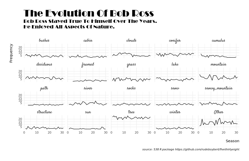
Some interesting things are happening here. First, I used theme_minimal to remove all unecessary styling from the visualization. In addition, I added a margin of 1cm around the visualization, since it is always important to have enough white space. I also made the title large and put the axis titles to the very left and top. Sometimes axis titles in the middle look out of place and do not align with any other elements. I also adjusted the grid lines to make the plot more readable.
Adding color
Finally, we need to add some color to the visualization. I borrowed one or two colors from this Bob Ross color palette and used the brown color as the background color of the visualization.
bob_color_one <- "#32a2e8"
bob_color_two <- "#051017"
grid_color <- "#6abbee"
count_objects_data %>%
  ggplot(aes(x = season, y = n)) +
  geom_line(color = "#FFEC00", size = 1.1) +  facet_wrap(~ type, ncol = 5) +
  # Add labels from previous visulization here
  theme_minimal() +
  # Add scale_y_continuous from previous visualization here
  theme(
    plot.background = element_rect(fill = bob_color_one),    plot.margin = unit(c(1, 1, 1, 1), "cm"),
    plot.title = element_text(family = "Broadway", size = 28,
                              color = bob_color_two),    plot.subtitle = element_text(family = "Broadway", margin = margin(b = 20), size = 15,
                                 color = bob_color_two),    plot.caption = element_text(family = "Roboto", size = 8, margin = margin(t = 15),
                                color = "#4e4843"),
    panel.background = element_rect(fill = "#38312c", color = "#1e1812"),    strip.text = element_text(family = "Satisfy", size = 13,
                              color = "#e8e8e7"),    strip.background = element_rect(fill = "#110d0a", color = "#1e1812"),    axis.text = element_text(family = "Roboto",
                             color = "#4e4843"),    axis.title = element_text(family = "Roboto",
                              color = "#4e4843"),    axis.title.x = element_text(margin = margin(t = 15), hjust = 1),
    axis.title.y = element_text(margin = margin(r = 15), hjust = 1),
    panel.grid.major.x = element_blank(),    panel.grid.minor.x = element_blank(),    panel.grid.major.y = element_line(color = grid_color),    panel.grid.minor.y = element_line(color = grid_color)  )
Some interesting things are happening here: I used panel.grid.minor.x and panel.grid.major.x with element_blank() to get rid of the vertical grid lines. In addition, I dediced to make the axis titles and axis text less salient and applied a bright brown color to them (axis.title.x, axis.title.y, and axis.text).
So much for now. I hope you enjoyed the data visualization. You can find the full code here.
