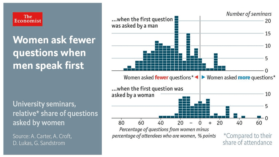
Recently I stumbled across a tweet reporting from a study that investigated to what extent it makes a difference whether women or men ask the first question in a seminar. Apparently women are much more encouraged to ask questions in a seminar if the first question in the seminar was asked by a woman.
The visualization is elegant in several ways. At first the visualization does not look like a typical visualization in ggplot2. The two histograms on the right side are separated by white horizontal line to increase the readability of the histogram. As far as I know, ggplot2 does not have this feature integrated. In addition, several annotations are added to the visualization to make the visualiation more comprehensive. For example, the vertical line in the middle is explained by two annotations to the left and right of the line.
When looking at the visualization, I noticed that it would be much easier to implement these details with Adobe Illustrator. Adobe Illustrator is used to create vector graphics, and visualization in R can also be exported as vector graphics. Therefore, in this tutorial we try to build a fictional visualization in the style of the visualization of this tweet to show that the combination of ggplot and Adobe Illustrator gives us much more creative scope to create data visualizations.
However, we need data first. Since I couldn't find the data for the study and we want to rebuild the visualizations, we create fictitious data:
library(tidyverse)
library(cowplot)

set.seed(356)
data <- tibble(
  men = rnorm(100, mean = -40, sd = 15)
)
First, we load the packages tidyverse and cowplot. With cowplot we will be able to combine both histograms later. It is much easier to adjust two visualisations in height and width in R directly than in Illustrator. In addition, we use rnorm to draw 100 data points from a normal distribution. If men ask the question first in the seminar, we assume that women ask 40% fewer questions than men. If women ask the first question in the seminar, we assume that women ask 5% fewer questions than men in the seminar. In addition, we vary the standard deviation of both distributions with the argument sd.
After we have created the data, we can create the histograms. We start with the upper histogram of the tweet, which shows how many questions women ask in a seminar when men ask the first question. As always, we start with the simplest histogram.
ggplot(data, aes(x = men)) +
  geom_histogram(binwidth = 8, fill = "#115D7F",
                 color = "white")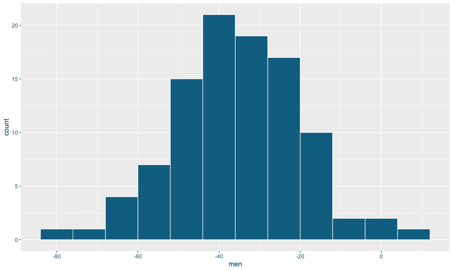
The histogram doesn't look like the one in the tweet yet. First, the y-axis is on the wrong side. In addition, we shoud get rid of axis titles and the axis labels on the x-axis. Let's correct these two errors next:
ggplot(data, aes(x = men)) +
  geom_histogram(binwidth = 8, fill = "#115D7F",
                 color = "white") +
  scale_y_continuous(breaks = seq(0, 20, by = 5),                     expand = c(0, 0),                     labels = seq(0, 20, by = 5),                     position = "right") +  scale_x_continuous(limits = c(-85, 65), expand = c(0, 0)) +  labs(    x = "",    y = ""  ) +  theme(    axis.text = element_text(size = 20),    axis.text.x = element_blank(),    axis.ticks.x = element_blank()  )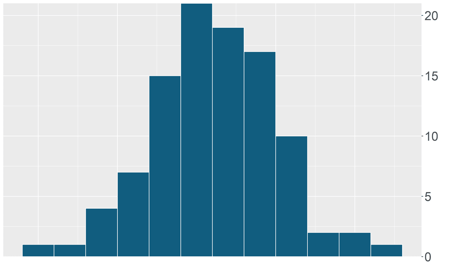
First we used the function scale_y_continuous to change the y-axis. With breaks we can define where the grids of the y-axis are. If you are not familiar with seq, have a look at the documentation or try typing the command in the console (seq(0, 20, by = 5)). labels is the equivalent of breaks only that we define the labels for the individual grid lines. Using position = "right" we tell ggplot that the y-axis is shifted to the right. By expand we can remove the distance of the horizontal 0 line to the x-axis.
Additionally, we use labs to remove the titles for the x and y axes. With the help of theme we remove the labels for the x-axis and the individual ticks for these labels. Additionally we make the text for the labels of the y-axis bigger.
However, the visualization still does not look like the one in the example. What we need is a new white background, vertical grid lines and the white horizontal lines in the bins of the histogram:
lines <- tibble(x = seq(0, 20, by = 1))
men <- ggplot(data, aes(x = men)) +   geom_histogram(binwidth = 8, fill = "#115D7F",
                 color = "white") +
  geom_segment(data = lines,               aes(x = -85, xend = 65,                   y = x, yend = x),               color = "white") +  scale_x_continuous(limits = c(-85, 65), expand = c(0, 0)) +
  scale_y_continuous(breaks = seq(0, 20, by = 5),
                     expand = c(0, 0),
                     labels = seq(0, 20, by = 5),
                     position = "right") +
  labs(
    x = "",
    y = ""
  ) +
  theme_minimal() +  theme(
    text = element_text(family = "Montserrat"),    axis.text = element_text(size = 20),
    axis.text.x = element_blank(),
    axis.ticks.x = element_blank(),
panel.grid.minor.x = element_blank(), panel.grid.major.x = element_blank(), panel.grid.major.y = element_line(color = "#cccccc", size = 1), panel.grid.minor.y = element_blank(), axis.line.x = element_line() ) 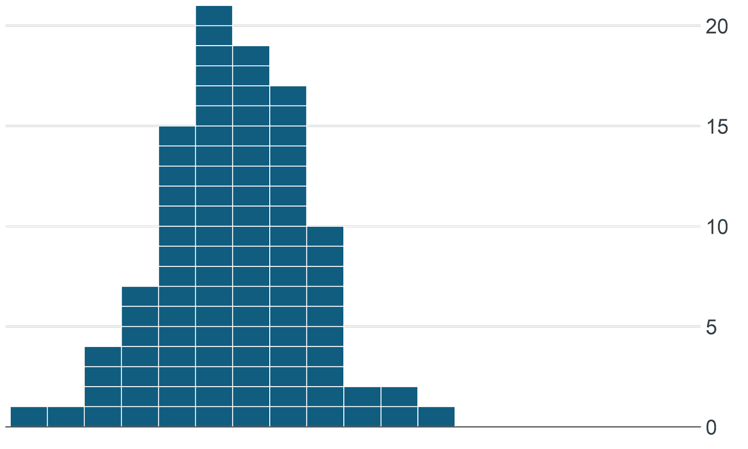
The most important trick to create the horizontal lines in the histogram is the function geom_segment. Using geom_segment we can create several white horizontal lines above the histogram. We have generated the data for this in advance ('lines <- tibble(x = seq(0, 20, by = 1))`). Each line has a starting point, which we mark with x and y, and an end point, which we mark with xend and yend.
Additionally we remove the vertical and horizontal grid lines as well as the grey background with the help of theme_minimal and the arguments panel.grid. With the argument panel.grid.major.y we color the horizontal grid lines in a darker gray than ggplot comes by default. We still have a problem, which we will solve later. The grey grid line is overlaid by the white horizontal lines. We can adjust the width of these white lines later with Illustrator. Finally we add a black line to the x-axis by axis.line.x and save the plot in the variable men.
Similarly, we now design the equivalent visualization for the women. All we have to do is change the data set and define the length and height of the axes and the white lines. Additionally we have to specify the texts for the x-axis this time.
set.seed(309)
data_women <- tibble(
  women = rnorm(40, mean = -5, sd = 15)
)

lines <- tibble(x = seq(0, 10, by = 1))

women <- ggplot(data_women, aes(x = women)) +
  geom_histogram(binwidth = 8, fill = "#115D7F",
                 color = "white") +
  geom_segment(data = lines,
               aes(x = -85, xend = 65,
                   y = x, yend = x),
               color = "white") +
  scale_x_continuous(limits = c(-85, 65),
                     breaks = seq(-80, 60, by = 20),
                     expand = c(0, 0)) +
  scale_y_continuous(breaks = seq(0, 10, by = 5),
                     expand = c(0, 0),
                     limits = c(0, 11),
                     labels = seq(0, 10, by = 5),
                     position = "right") +
  theme_minimal() +
  labs(
    y = "",
    x = ""
  ) +
  theme(
    plot.margin = margin(2, 0, 0, 0, "cm"),
    text = element_text(family = "Montserrat"),
    panel.grid.minor.x = element_blank(),
    panel.grid.major.x = element_blank(),
    panel.grid.major.y = element_line(color = "#cccccc", size = 1),
    panel.grid.minor.y = element_blank(),
    axis.text = element_text(size = 20),
    axis.text.x = element_text(margin = margin(t= 10)),
    axis.line.x = element_line(),
    axis.ticks.x = element_line()
  )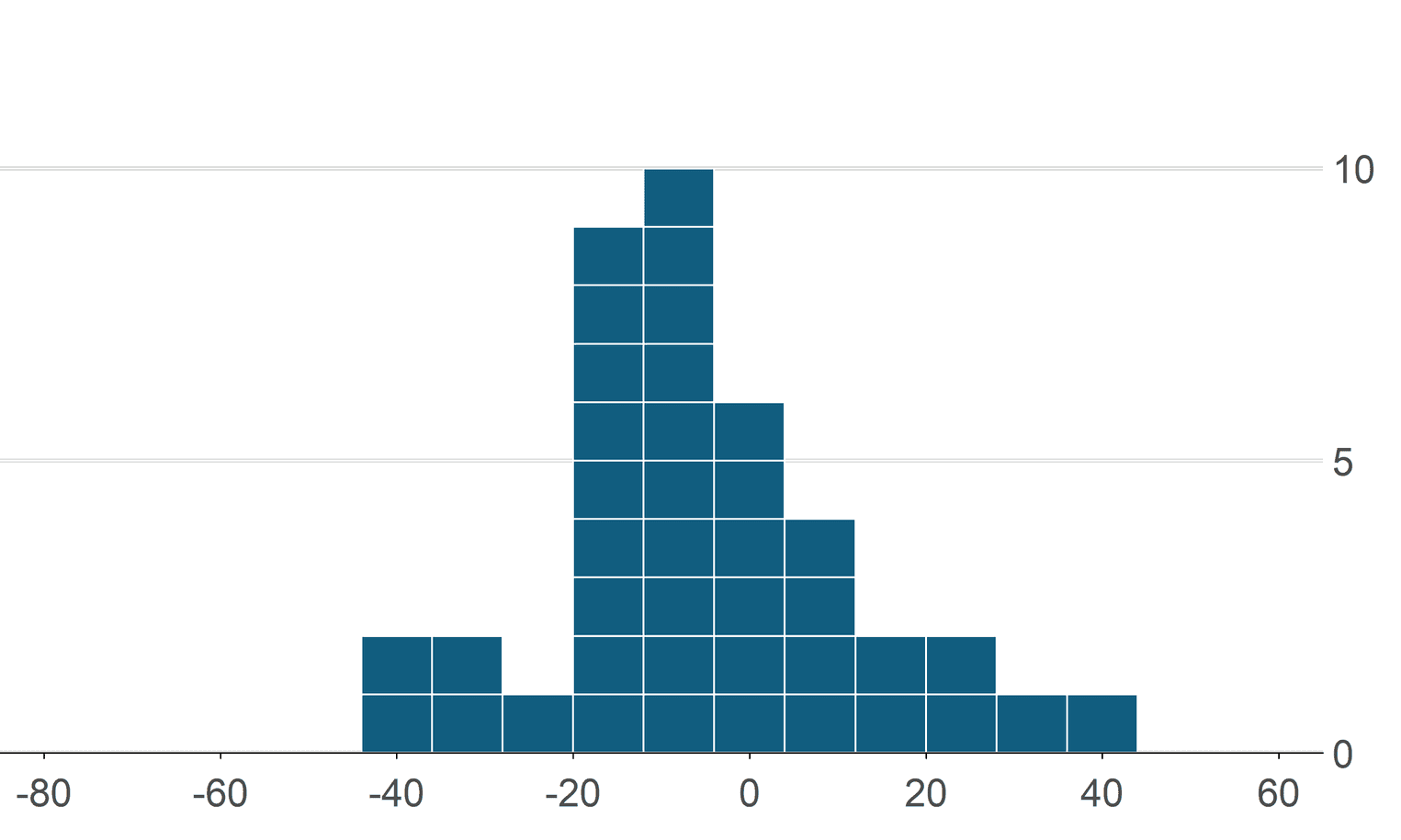
The code is almost the same as the previous histogram. Make sure that the x-axis has the same width in this histogram as in the previous histogram. We have to make sure that this is the case, because in the next step we have to merge both visualizations.
Before we export the visualization to Illustrator, we need to merge both histograms. For this we use the function plot_grid from the cowplot package. In the tweet you can see that there is a gap between the two visualizations so that the annotations can be placed between the histograms. To insert this gap, we insert a NULL between both histograms:
plot_grid(men, NULL, women, ncol = 1, align = "v",
          rel_heights = c(1, 0.1, 0.75))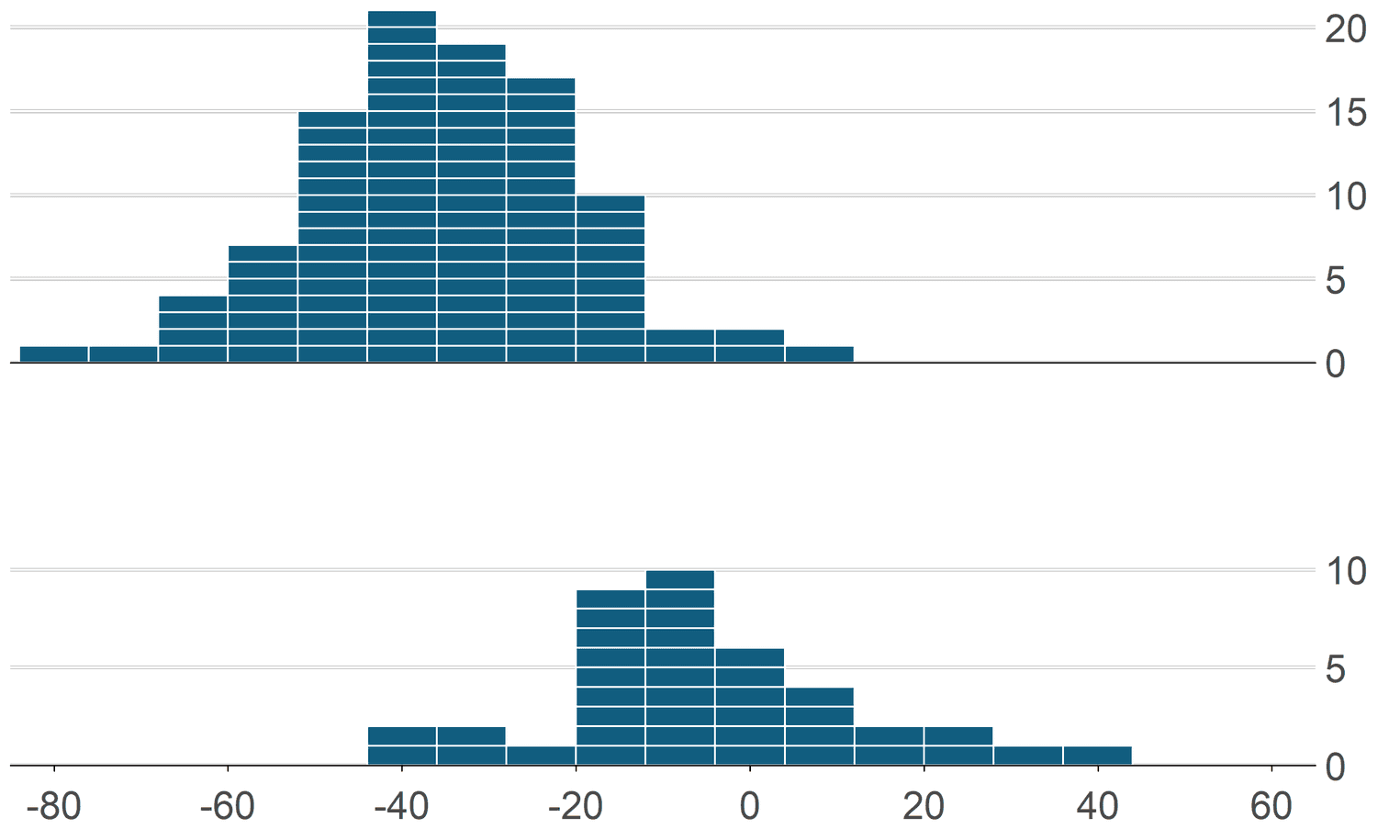
The nice thing about cowplot is that we can align both histograms on the x-axis so that no distortion of the data occurs. We will need Illustrator to resize the histograms later and make sure we keep the aspect ratio.
Finally, we need to export the graphic as a svg file:
ggsave("r_histograms.svg", height = 6, width = 10)As you can see, our result looks very similar to the visualization. Illustrator gives us a lot more flexibility that we can use to create more creative and vivid visualizations.

