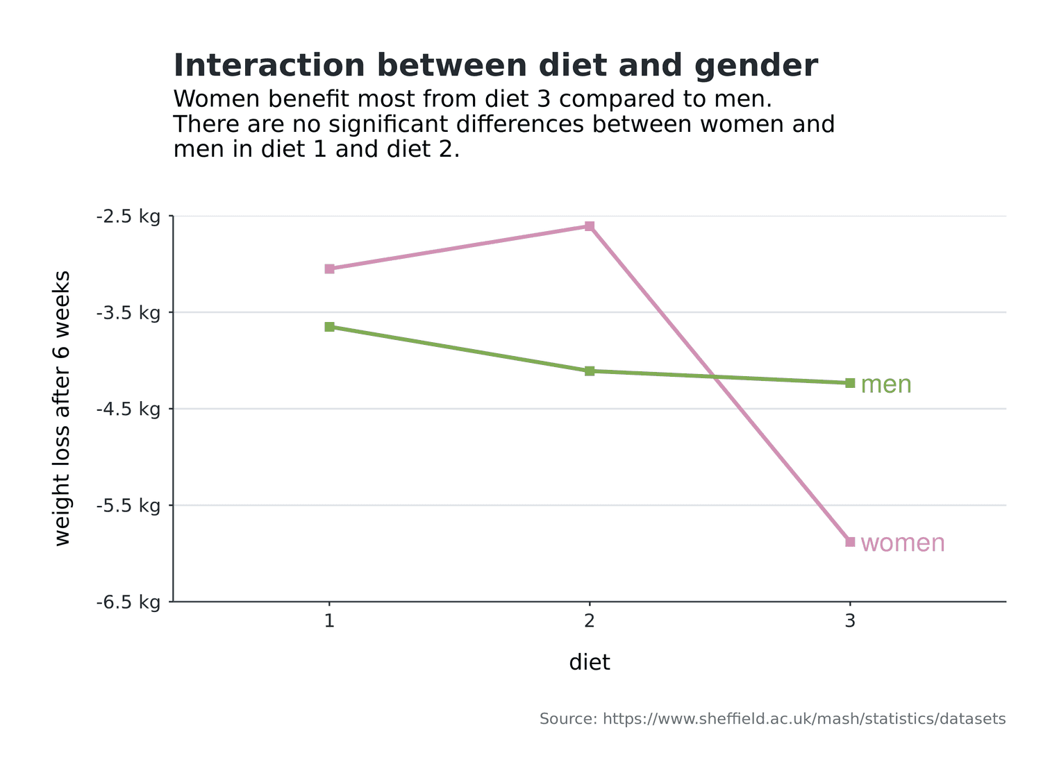
As a working scientist you have to create interaction plots from time to time. Interactions enable you to present your audience with boundary conditions for your effects in factorial designs. The graphical goal of interaction plots is to enable your audience to quickly identify the groups of factors and interpret their effects. Readability is therefore a central goal of interaction plots.
In this tutorial we will create an interaction plot for a dataset on the topic of diets. The dataset can be obtained from the University of Sheffield. Imagine that 78 subjects each received one of three diets. All subjects are weighed before the diet. After 6 weeks you test the weight of the subjects again and check which diet was the best. You are also interested in whether the diets had different effects on men and women. In this tutorial, we will not deal with the statistical verification of this question, but will concentrate on the creation of the visualization.
First, we load the dataset:
library(tidyverse)
diet <- read_csv("diet.csv")
glimpse(diet, width = 40)
Observations: 78
Variables: 7
$ Person <int> 25, 26, 1, 2, 3,…
$ gender <int> NA, NA, 0, 0, 0,…
$ Age <int> 41, 32, 22, 46, …
$ Height <int> 171, 174, 159, 1…
$ pre.weight <int> 60, 103, 58, 60,…
$ Diet <int> 2, 2, 1, 1, 1, 1…
$ weight6weeks <dbl> 60.0, 103.0, 54.…The data set comprises seven variables and 78 rows (e.g. subjects). Of interest to us are the variables gender, pre.weight, and weight6weeks. pre.weight indicates the weight of the subjects before the diet, weight6weeks the weight of the subjects six weeks after the diet.
Before we start with the visualization, we have to adjust the data a bit. First, we want to calculate mean values from the individual values. Since we have two sexes and three diets, i.e. two factors, we need six mean values later. We also need to calculate a dependent variable from the difference between the weight of the subjects before the diet and after the diet. These values are likely to be negative because we assume that the subjects weigh less after taking the diets. Finally, we should convert our factors gender and Diet into factors in R. The reason for this transformation is that we later want to color the individual lines of the interaction plot. If R interprets the variables as continuous variables (e.g. integers), the colors are also displayed continuously. However, we would like to present divergent colors later so that the lines look different in color. Let's apply these changes:
(cleaned_data <- diet %>%
  mutate(
    diff = weight6weeks - pre.weight,
    gender = gender %>% as.factor,
    Diet = Diet %>% as.factor
  ) %>%
  group_by(Diet, gender) %>%
  summarise(
    mean_diff = mean(diff, na.rm = TRUE)
  ) %>%
  drop_na())
# A tibble: 6 x 3
# Groups: Diet [3]
Diet gender mean_diff
<fct> <fct> <dbl>
1 1 0 -3.05
2 1 1 -3.65
3 2 0 -2.61
4 2 1 -4.11
5 3 0 -5.88
6 3 1 -4.23You can see that I have enclosed the code with brackets (CODE). This will output the output of the cleaned_data variable directly. I also removed NA values from the record. You can also see that we have now created a variable diff, which indicates the weight change of the subjects. The mean values were determined by group_by and summarise. If you want to read more about these two functions, see the [Documentation] (https://dplyr.tidyverse.org/reference/index.html).
Creating the first interaction plot
Now we can write the first interaction plot with this dataset:
cleaned_data %>%
  ggplot(aes(Diet, mean_diff)) +
  geom_line(size = 1.2, aes(group = gender, color = gender)) +
  geom_point(size = 2.6, aes(color = gender), shape = 15)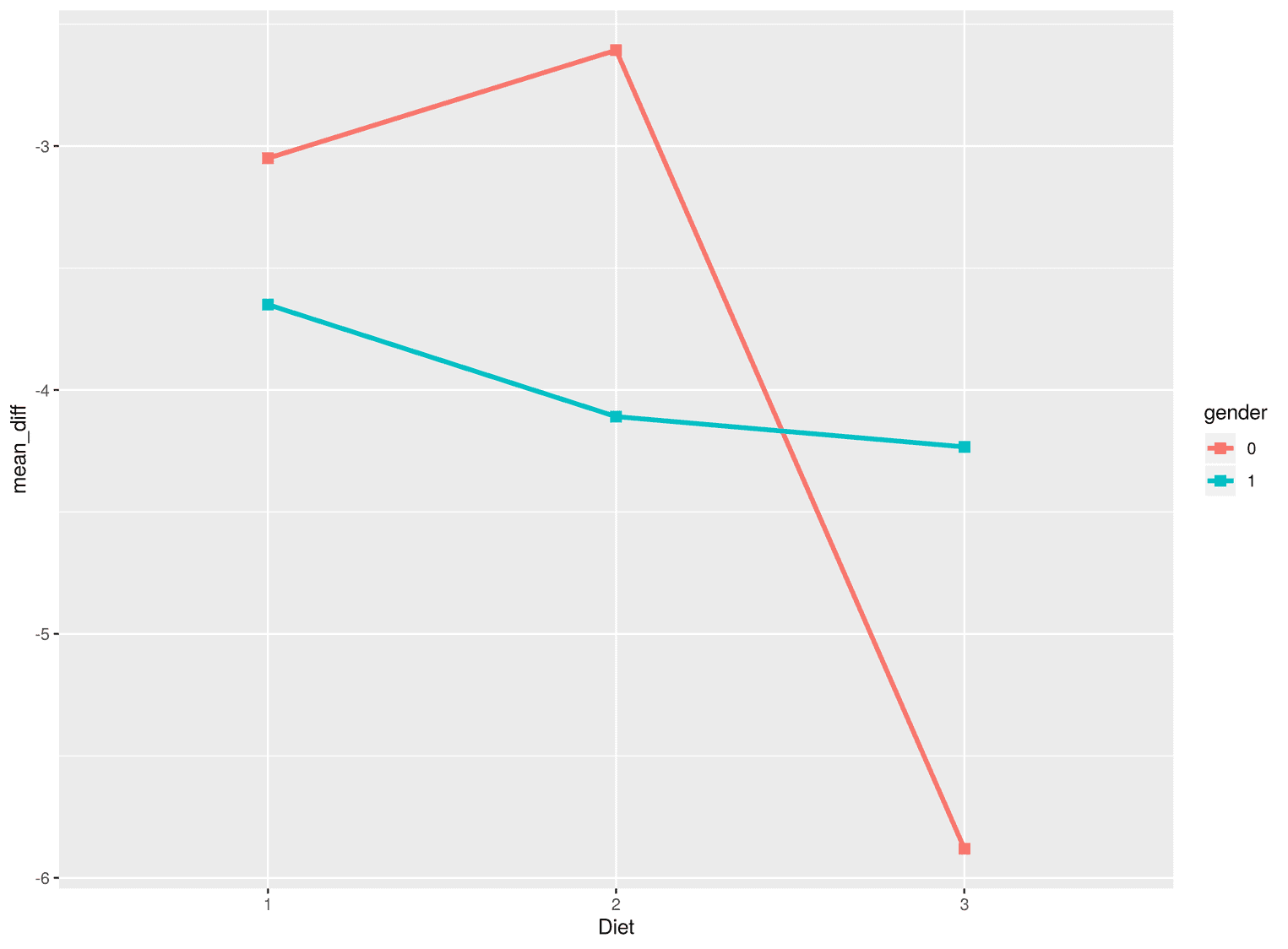
Several things are important here. If we want to create multiple lines in ggplot, we must use the group argument to tell ggplot from which factor the lines are created. In our case this is the gender factor. In addition, we have not visualized the points as circles as usual, but as squares. I find squares more useful in this visualization compared to circles, because the whole visualization is characterized by corners and edges and not by curved lines. ggplot has different point types, which you can look up here.
Adding text
Next, we need to add all the texts to the visualization. The axes have to be labeled correctly and the visualization needs a title, a subtitle and a caption:
cleaned_data %>%
  ggplot(aes(Diet, mean_diff)) +
  geom_line(size = 1.2, aes(group = gender, color = gender)) +
  geom_point(size = 2.6, aes(color = gender), shape = 15) +
labs( title = "Interaction between diet and gender", subtitle = paste0("Women benefit most from diet 3 compared to men.\n", "There are no significant differences between women and\n", "men in diet 1 and diet 2."), caption = "Source: https://www.sheffield.ac.uk/mash/statistics/datasets", x = "diet", y = "weight loss after 6 weeks" ) 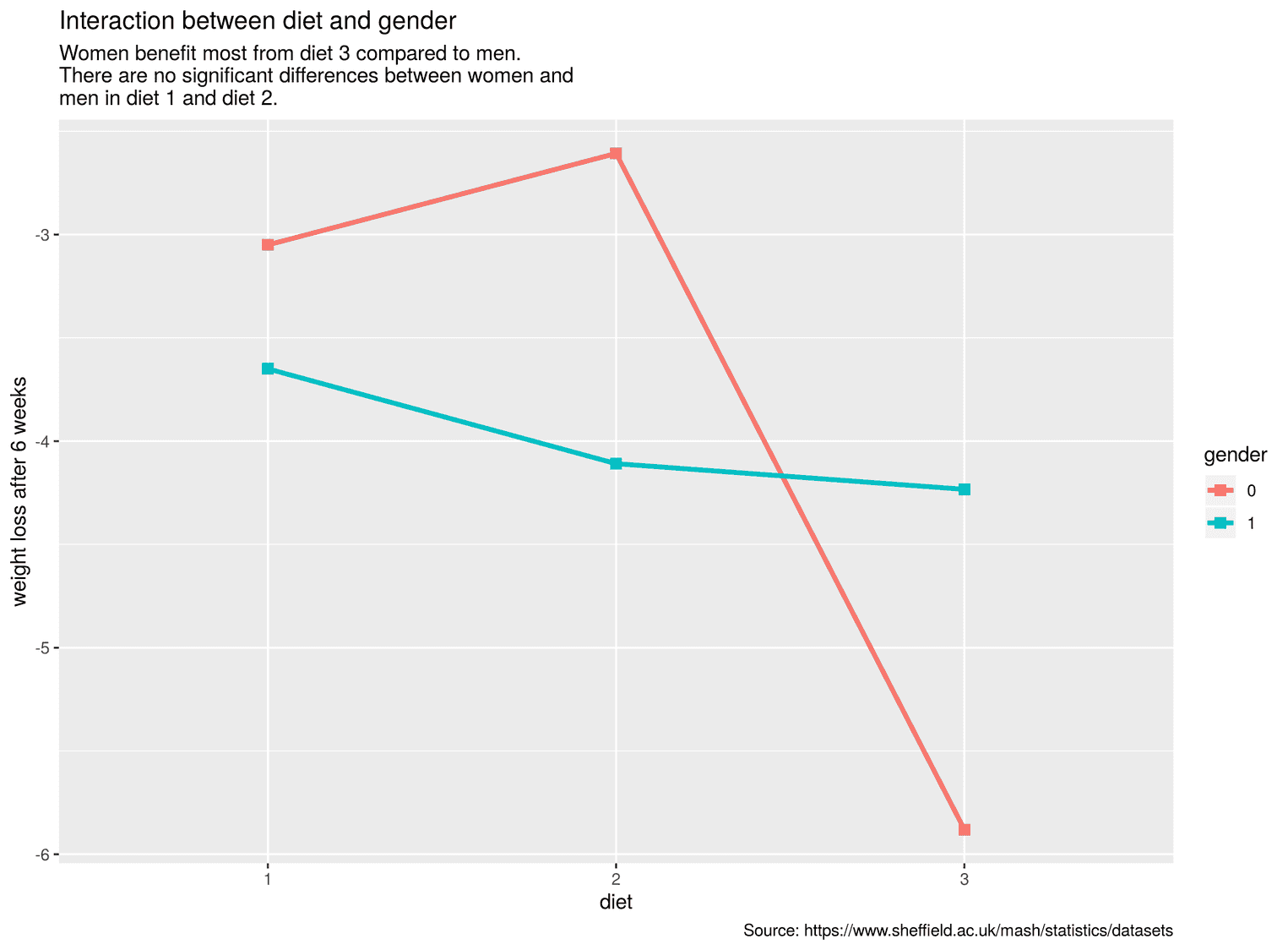
To change the text, we used the function labs. To avoid writing the lines too long, I used the function paste0. With paste0 we can separate several strings with commas and distribute them over several lines.
Improving the readability of the lines
The interaction plot still has a central problem: The legend, which explains what the lines mean, is too far away from the lines. This requires readers to use cognitive resources to bring both information, the legend and the lines, together. From educational sciences research we know that this spatial discontiguity effect is detrimental to learning from graphical representations. We therefore need to find a way to bring the legend closer to the lines. We can solve this problem relatively easy by writing the labels of the lines directly behind the lines. For this we use a trick.
First, we create a new data set that includes the y-values of the points where both lines end. We also need the labels that will be at the end of the lines. For this we use the function case_when:
(labels <- cleaned_data %>%
  filter(Diet == 3) %>%
  mutate(
    label = case_when(
      gender == 0 ~ "women",
      gender == 1 ~ "men"
    )
  ))
# A tibble: 2 x 4
# Groups: Diet [1]
Diet gender mean_diff label
<fct> <fct> <dbl> <chr>
1 3 0 -5.88 women
2 3 1 -4.23 men Now we can add the geom_text to the visualization and pass the new dataset labels to the geom. Among the aesthetics, geom_text includes the asthetic label, which stands for the text we will add to the visualization. Let's apply these changes:
cleaned_data %>%
  ggplot(aes(Diet, mean_diff)) +
  geom_line(size = 1.2, aes(group = gender, color = gender)) +
  geom_point(size = 2.6, aes(color = gender), shape = 15) +
  geom_text(size = 6, aes(label = label,                           color = gender),            nudge_x = 0.04, hjust = 0,            data = labels) +  guides(color = FALSE) +  labs(
    title = "Interaction between diet and gender",
    subtitle = paste0("Women benefit most from diet 3 compared to men.\n",
                      "There are no significant differences between women and\n",
                      "men in diet 1 and diet 2."),
    caption = "Source: https://www.sheffield.ac.uk/mash/statistics/datasets",
    x = "diet",
    y = "weight loss after 6 weeks"
) 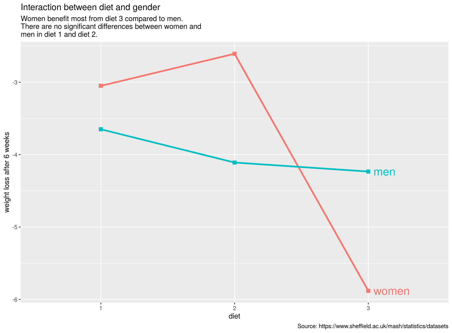
As you can see now, the labels appear directly after the lines. We have moved the text with the argument nudge_x a little to the right, otherwise the lines and the text would overlap.
Making the lines color-blind safe
If you want to publish visualizations, it is extremely important that people with color blindness are not disadvantaged in understanding the visualization. Color blindness is more common than most people think. Among men, about 8% have a color blindness, worldwide it is 4.5% of people. A good resource for obtaining colors that are readable for people with color blindness is ColorBrewer. I used ColorBrewer in this visualization to get two divergent colors. Divergent colors are designed to be perceived as different. In the next step, let's change the colors of the lines accordingly:
cleaned_data %>%
  ggplot(aes(Diet, mean_diff)) +
  geom_line(size = 1.2, aes(group = gender, color = gender)) +
  geom_point(size = 2.6, aes(color = gender), shape = 15) +
  geom_text(size = 6, aes(label = label,
                          color = gender),
             nudge_x = 0.04, hjust = 0,
             data = labels) +
  guides(color = FALSE) +
  labs(
    title = "Interaction between diet and gender",
    subtitle = paste0("Women benefit most from diet 3 compared to men.\n",
                      "There are no significant differences between women and\n",
                      "men in diet 1 and diet 2."),
    caption = "Source: https://www.sheffield.ac.uk/mash/statistics/datasets",
    x = "diet",
    y = "weight loss after 6 weeks"
  ) +
  scale_color_manual(values = c("#d192b4", "#80ac54"))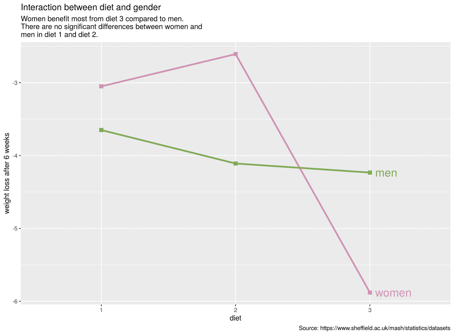
To change the colors we used the function scale_color_manual. Under values we added the two colors as a vector.
Adjusting the y-axis
We can further improve the interaction plot by making the y-axis more understandable. For this we can add the suffix "kg" to the text of the y-axis. This allows readers to see directly what kind of variable the y-axis represents. To perform this transformation, we use the scales package. Let's first have a look at a small example to understand how scales work:
# If you haven't installed scales yet, do:
# install.packages("scales"), then
library(scales)

unit_format(unit = "my_suffix", accuracy = 0.5)(c(2.4, 3.7))
[1] "2.5 my_suffix" "3.5 my_suffix"You see that the function unit_format has an argument unit with which we can add the suffix. We can also use accuracy to determine how many decimal places there should be and how exact these decimal places should be. Let's add our suffix kg to our visualization:
cleaned_data %>%
  ggplot(aes(Diet, mean_diff)) +
  geom_line(size = 1.2, aes(group = gender, color = gender)) +
  geom_point(size = 2.6, aes(color = gender), shape = 15) +
  geom_text(size = 6, aes(label = label,
                          color = gender),
            nudge_x = 0.04, hjust = 0,
            data = labels) +
  guides(color = FALSE) +
  labs(
    title = "Interaction between diet and gender",
    subtitle = paste0("Women benefit most from diet 3 compared to men.\n",
                      "There are no significant differences between women and\n",
                      "men in diet 1 and diet 2."),
    caption = "Source: https://www.sheffield.ac.uk/mash/statistics/datasets",
    x = "diet",
    y = "weight loss after 6 weeks"
  ) +
  scale_y_continuous(breaks = seq(-6.5, -2.5, by = 1),                     limits = c(-6.5, -2.5),                     expand = c(0, 0),                     labels = scales::unit_format(unit = "kg",                                                  accuracy = 0.5)) +  scale_color_manual(values = c("#d192b4", "#80ac54"))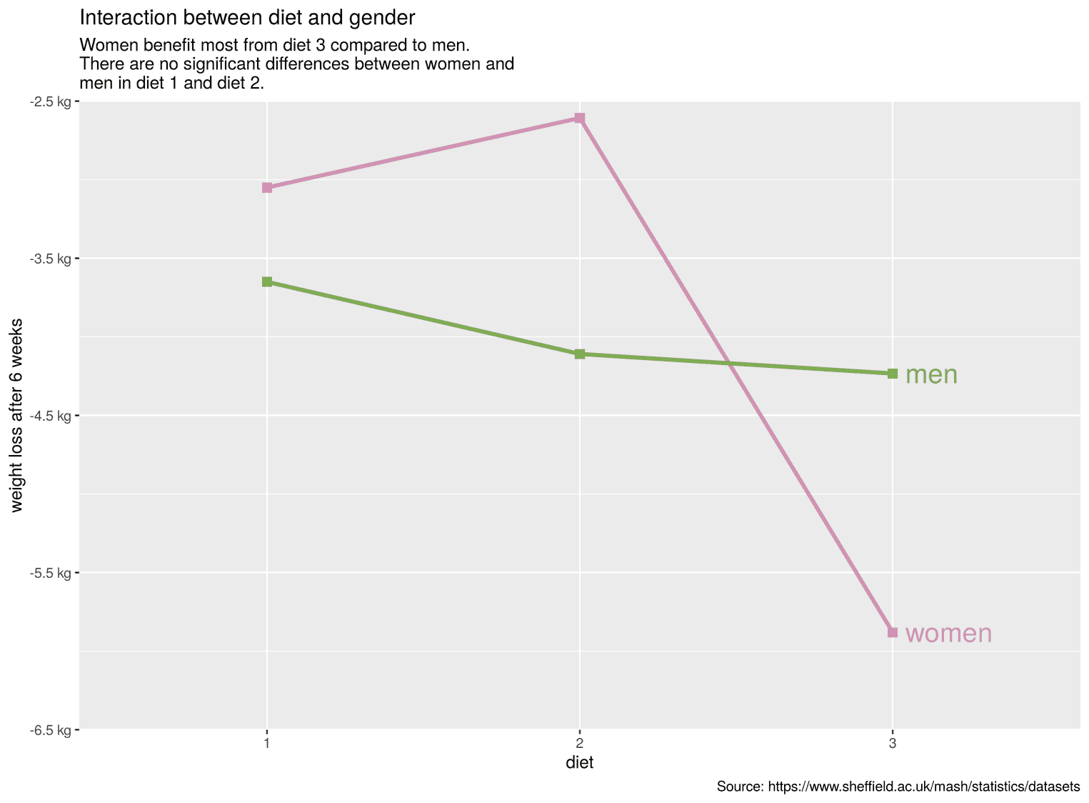
With the help of the function scale_y_continuous we have now determined the breaks, the limits of the visualization and determined with expand that the y-axis stops and starts exactly at these limits. We added the function unit_format to the argument labels and chose the suffix kg.
Improving the design of the interaction plot
Finally, we can use the theme function to adapt the entire design to the visualization. With theme we can change any element of the visualization. It is best to look at each change individually so that you understand what it does.
cleaned_data %>%
  ggplot(aes(Diet, mean_diff)) +
  # Previous code goes here
  theme(    text = element_text(family = "Roboto"),    plot.margin = unit(rep(1.2, 4), "cm"),    plot.title = element_text(size = 20,                               color = "#22292F",                              face = "bold",                              margin = margin(b = 5)),    plot.subtitle = element_text(size = 15,                                  margin = margin(b = 35)),    plot.caption = element_text(size = 10,                                margin = margin(t = 25),                                color = "#606F7B"),    panel.background = element_blank(),    axis.text = element_text(size = 12, color = "#22292F"),    axis.text.x = element_text(margin = margin(t = 5)),    axis.text.y = element_text(margin = margin(r = 5)),    axis.line = element_line(color = "#3D4852"),    axis.title = element_text(size = 14),    axis.title.y = element_text(margin = margin(r = 15),                                hjust = 0.5),    axis.title.x = element_text(margin = margin(t = 15),                                hjust = 0.5),    panel.grid.major = element_line(color = "#DAE1E7"),    panel.grid.major.x = element_blank()  )
For example, we have removed the grey background of the visualization by using the argument panel.background. In addition, we have added a little margin (plot.margin) around the whole visualization in order not to let the visualization appear too dense.
I hope you learned a few new things from the tutorial. Thanks for reading.
