ggplot2 visualizations can be recognized very quickly due to the distinct grey panel background. While each system requires its default design, you may want to create visualizations based on your own design sooner or later. Maybe you work for a newspaper and need to follow the company's style guide. You may also work at an institute and present your research results at conferences. In the latter case you would like the visualizations to be based on the design of your institute. In this tutorial, I will show you how to write your own themes that you can use for any plot without writing repetitive code.
The default theme
In order to understand how global themes work, let's first look at a visualization that uses the default theme of ggplot2. The content of the visualization is irrelevant for this tutorial, but what we show is the distribution of city miles per gallon for different car types. To create the visualization, we first load the tidyverse package and create the visualization:
library(tidyverse)

ggplot(mpg, aes(x = class, y = cty)) +
  geom_boxplot(fill = "#6CB2EB", color = "#22292F",
               alpha = .8) +
  labs(
    title = "Stet clita kasd gubergren",
    subtitle = str_wrap(paste("Lorem ipsum dolor sit amet,",
                              "consetetur sadipscing elitr, sed diam",
                              "nonumy eirmod tempor invidunt ut labore",
                              "et dolore magna aliquyam erat, sed diam voluptua."),
                        width = 80),
    caption = "Data: ggplot2; Visualization by Christian Burkhart"
) 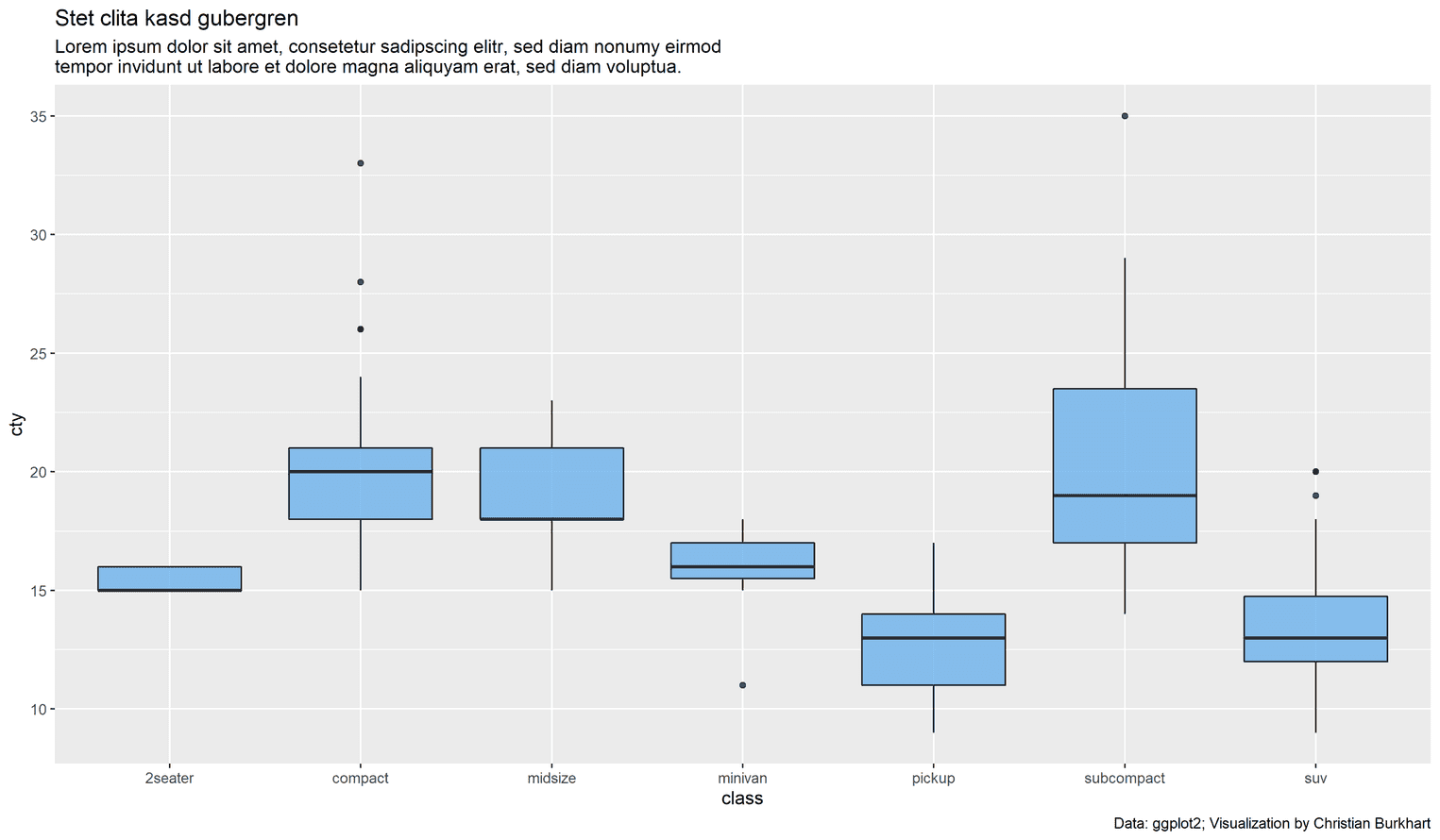
You can immediately see that it is a ggplot2 visualization due to the grey panel background. A common problem that occurs with default themes is that the axis text is too small. There is also hardly any space between the elements. As a result, the visualization appears very dense. To change the visualization, we first need to understand how theming works in ggplot2. Our goal is to write a global theme for all visualizations, so that we don't have to adjust the theme for each visualization.
All design decisions of the default theme can be viewed with the function theme_get. The function returns a very long string, so let's only look at some of the design elements. For a complete list, you can look at the official documentation. Let's start with the axis text:
theme_get()$axis.textList of 11
$ family : NULL
$ face : NULL
$ colour : chr "grey30"
$ size : 'rel' num 0.8
$ hjust : NULL
$ vjust : NULL
$ angle : NULL
$ lineheight : NULL
$ margin : NULL
$ debug : NULL
$ inherit.blank: logi TRUE
- attr(*, "class")= chr [1:2] "element_text" "element"The axis text has a total of 11 elements. You can see that the text color is set to gray. Also the font size is set to 'rel num 0.8'. Rel means that the size of the text is defined relative to the respective parent element. The parent is the hierarchically higher element. For example, if you define the text size globally in the text element, you would specify that the text should be only 80% as large as this parent element (more information can be found here).
Let's look at another element, the panel background: theme_get()$panel.background:
List of 5
 $ fill         : chr "grey92"
 $ colour       : logi NA
 $ size         : NULL
 $ linetype     : NULL
 $ inherit.blank: logi TRUE
 - attr(*, "class")= chr [1:2] "element_rect" "element"
The panel background is the element on which the visualization is set. You can see that the panel background is set to the color grey92 (for a complete list of colors see here). You can also see that there is no color for the panel background element because the value of this variable is set to NULL. With the color we define the border of the rectangle of this element.
Set a global theme
We could now adapt the default theme for each individual visualization by changing individual elements. For example, we could add a colored border to our panel and change the font size of the axis text:
ggplot(mpg, aes(x = class, y = cty)) +
  geom_boxplot(fill = "#6CB2EB", color = "#22292F",
               alpha = .8) +
  labs(
    title = "Stet clita kasd gubergren",
    subtitle = str_wrap(paste("Lorem ipsum dolor sit amet,",
                              "consetetur sadipscing elitr, sed diam",
                              "nonumy eirmod tempor invidunt ut labore",
                              "et dolore magna aliquyam erat, sed diam voluptua."),
                        width = 80),
    caption = "Data: ggplot2; Visualization by Christian Burkhart"
  ) +
  theme(    panel.background = element_rect(color = "steelblue"),    axis.text        = element_text(size = rel(1.2))  )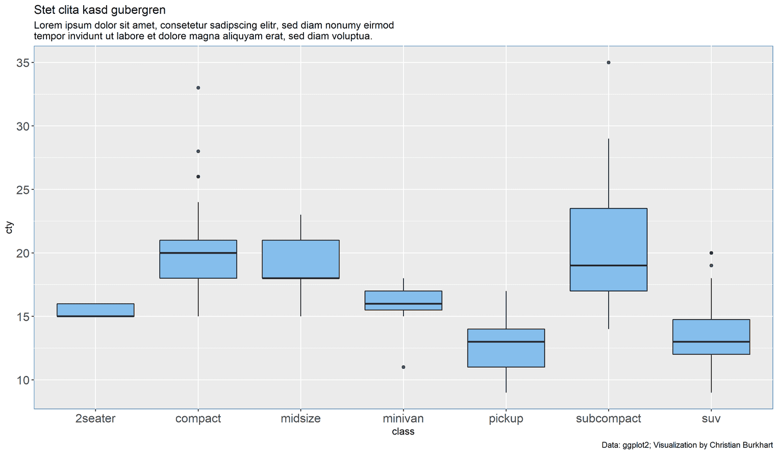
This procedure only makes sense for individual visualizations. However, there are certain design elements that we always want to change. For example, we want to add a padding around each visualizations so that the text is not too close to the edges. We also want to use a certain font of the corporate design of our institute. Hence, we have to find a way to define our styles globally.
To define the theme globally, we can first use predefined themes. One possibility is to use packages from other developers. For example, I am a fan of the package ggthemr. To use one of their themes, you only need to add one line of code:
ggthemr('fresh', text_size = 18, layout = "scientific")
# Code for the plot goes here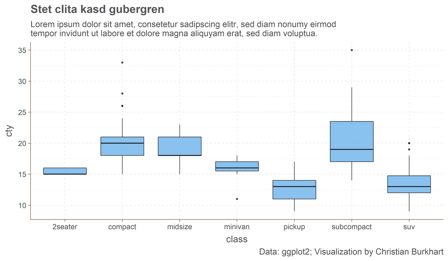
This visualization already looks much better. The texts are bigger and readable. Furthermore, the visualization has its own style, which is clearly recognizable. Nevertheless not all elements are designed the way you may want them to be. For example, I would like to have the caption in the lower right corner in a smaller font and would make the color of the title darker.
The solution for our problem is the function theme_set. With theme_set we can define our own theme and apply it globally to all visualizations. The easiest way to change a theme globally is to use one of the predefined themes (see themes) of ggplot2:
theme_set(theme_minimal(base_size = 18))# Code for the plot goes here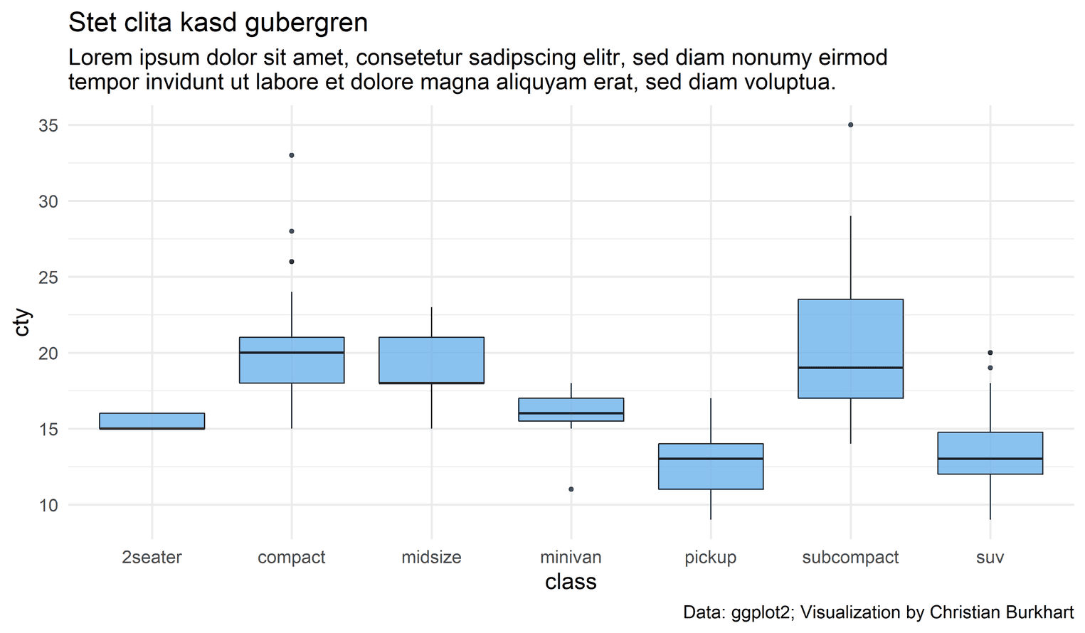
The first trick we used was to change the text size. Every predefined theme in ggplot2 has the base_size argument, which we can use to change the text size. Every other style is set by the theme_minimal function. With this function we can now design each element by adding the function theme. In the next example we add a padding around the whole visualization with the plot.margin argument:
theme_set(theme_minimal(base_size = 18) +
            theme(
              plot.margin = unit(rep(1, 4), "cm")
            ))
# Code for the plot goes here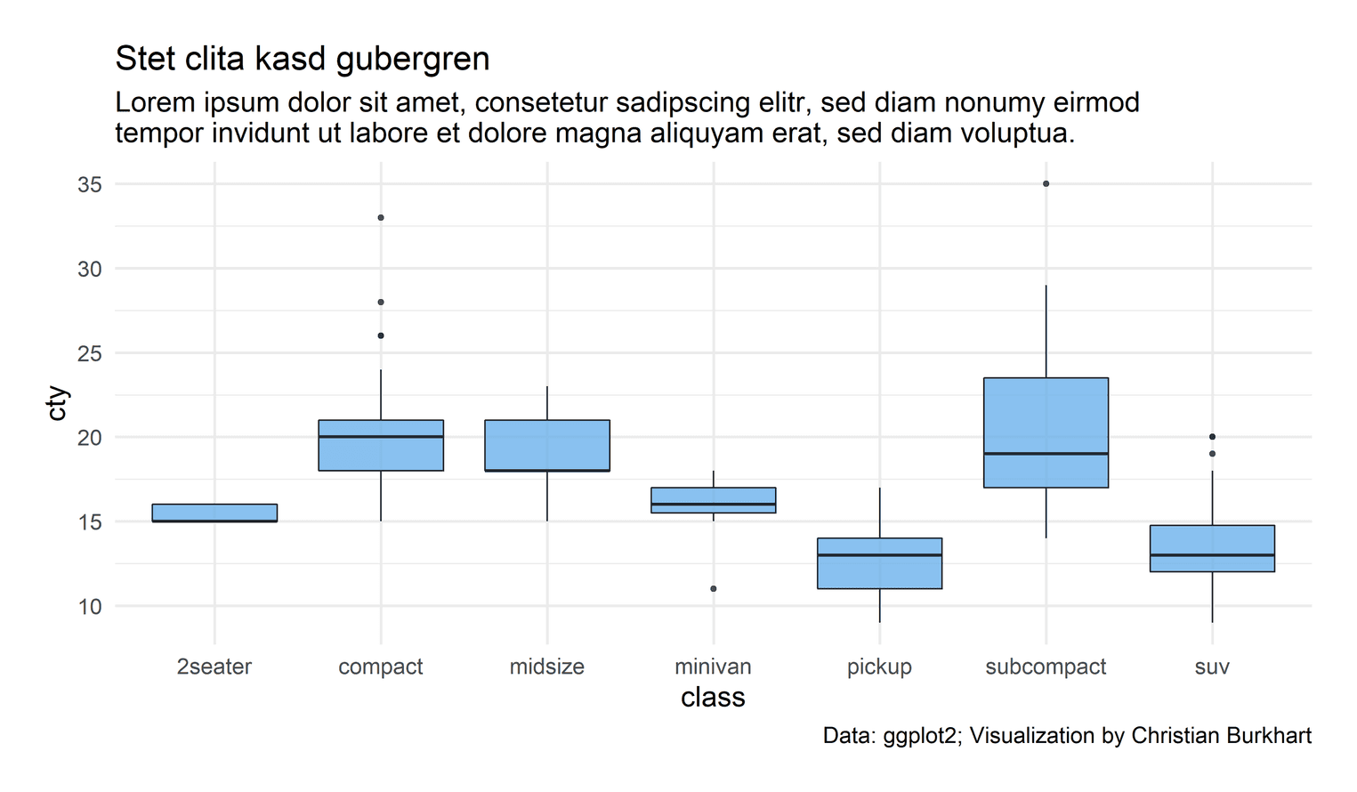
We can also change the font of the visualization with the package extrafont. First we have to execute the function font_import() to find all fonts on your laptop. You only have to execute this function once. Then load the fonts with the function loadfonts(). You can get a list of all fonts with fonts(). Now you can select any font from this list and use any of those fonts in your theme:
# library(extrafont)font_import() # Run only onceloadfonts() # Run only oncefonts() # Show a list of all fontstheme_set(theme_minimal(base_size = 18,
                        base_family = "Segoe UI") +            theme(
              plot.margin = unit(rep(1, 4), "cm")
            ))
# Code for the plot goes here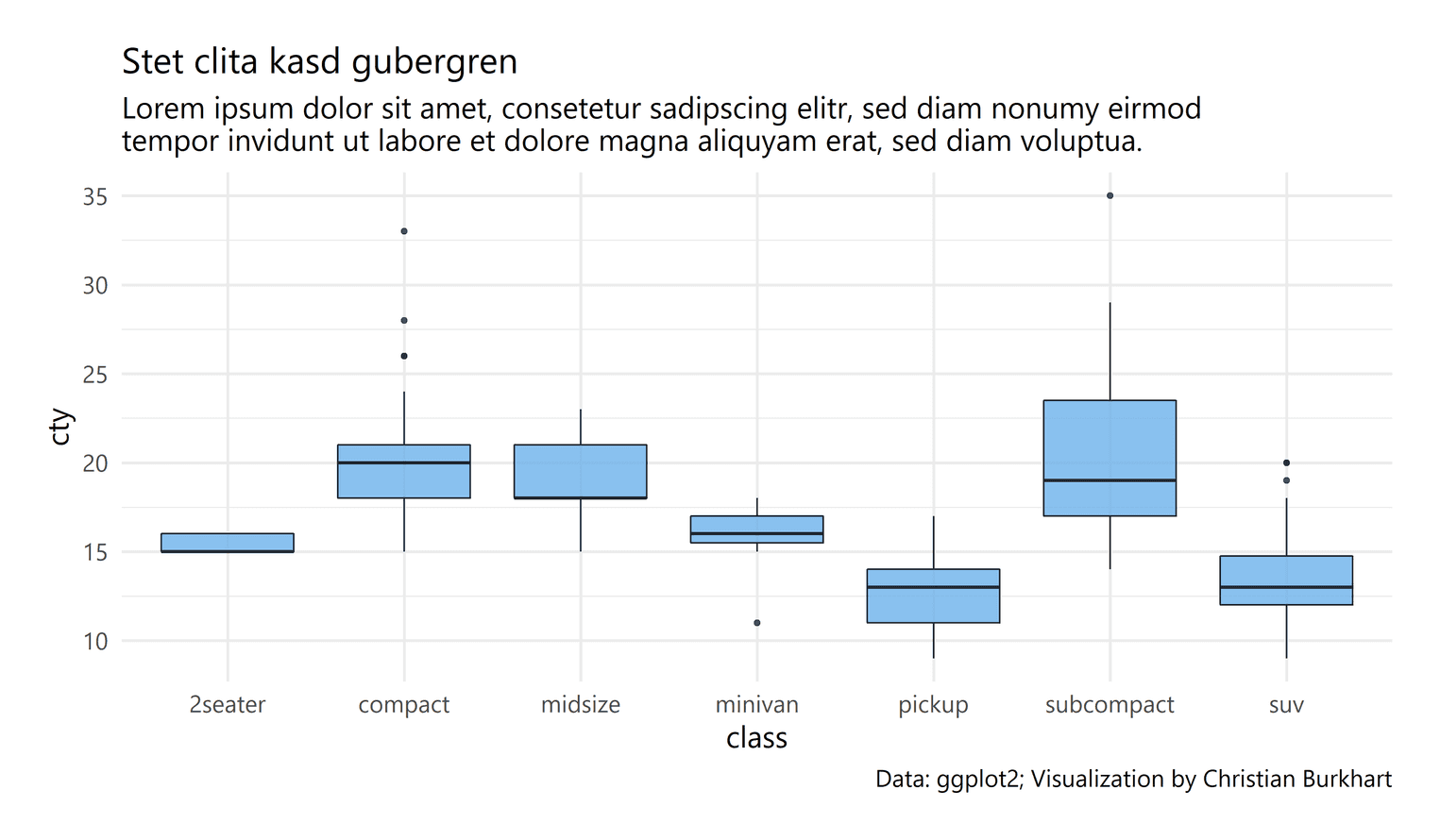
Create your own global themes
Now that we know how to change an element globally, we can create our own themes. In the next example you find a theme that I have designed. I made sure that there is enough whitespace between the elements and that the font is large enough to be readable by all readers. I also put the theme in a function so that you can easily switch between different themes later.
base_theme <- theme(
  plot.margin = unit(rep(1, 4), "cm"),
  plot.title = element_text(size = 24,
                            face = "bold",
                            color = "#22292F",
                            margin = margin(b = 8)),
  plot.subtitle = element_text(size = 16,
                               lineheight = 1.1,
                               color = "#22292F",
                               margin = margin(b = 25)),
  plot.caption = element_text(size = 12,
                              margin = margin(t = 25),
                              color = "#3D4852"),
  axis.title.x = element_text(margin = margin(t = 15)),
  axis.title.y = element_text(margin = margin(r = 15)),
  axis.text = element_text(color = "#22292F")
)

set_base_theme <- function() {
  theme_set(theme_minimal(base_size = 18) +
              base_theme)
}
set_base_theme()
# Code for the plot goes here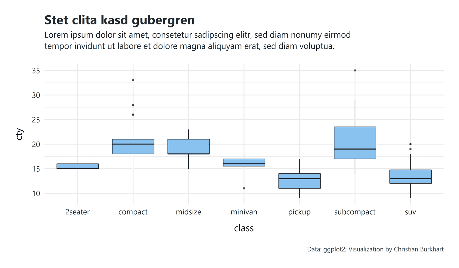
For the visualizations I use the font Segoe UI from Windows. Now that you understand the principle, you can customize your theme as you like. I find it very convenient to write a basic theme that applies to all visualizations. Every other theme builds on the base theme. For example, in the next visualization I tried to recreate one of the themes from the ggthemr package:
flat_theme <- theme(
  panel.background = element_rect(fill = "#f3f6f6", color = NA),
  panel.grid = element_line(color = "#cacfd2", linetype = "dashed"),
  axis.line = element_line(color = "#606F7B")
)

set_flat_theme <- function() {
  theme_set(theme_minimal(base_size = 18) +
              base_theme +
              flat_theme)
}

set_flat_theme()
# Code for the plot goes here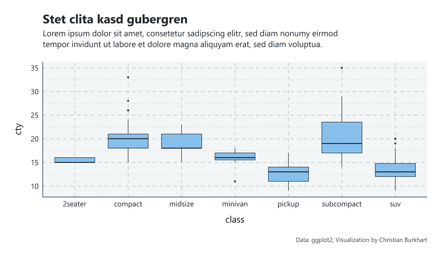
From the code you can see that I have added the flat_theme to the base_theme. Both variables contain the theme function. In principle I could also add a third theme. In the last example, I created a global dark theme:
dark_theme <- theme(
  plot.margin = unit(rep(1, 4), "cm"),
  plot.title = element_text(size = 24,
                            face = "bold",
                            color = "#22292F",
                            margin = margin(b = 8)),
  plot.subtitle = element_text(size = 16,
                               lineheight = 1.1,
                               color = "#22292F",
                               margin = margin(b = 25)),
  plot.caption = element_text(size = 12,
                              margin = margin(t = 25),
                              color = "#3D4852"),
  axis.title.x = element_text(margin = margin(t = 15)),
  axis.title.y = element_text(margin = margin(r = 15)),
  axis.text = element_text(color = "#22292F"),
  panel.background = element_rect("#34495e", color = NA),
  panel.grid = element_line(color = "#49637a")
)

set_dark_theme <- function() {
  theme_set(theme_minimal(base_size = 18,
                          base_family = "Segoe UI") +
              dark_theme)
}
set_dark_theme()
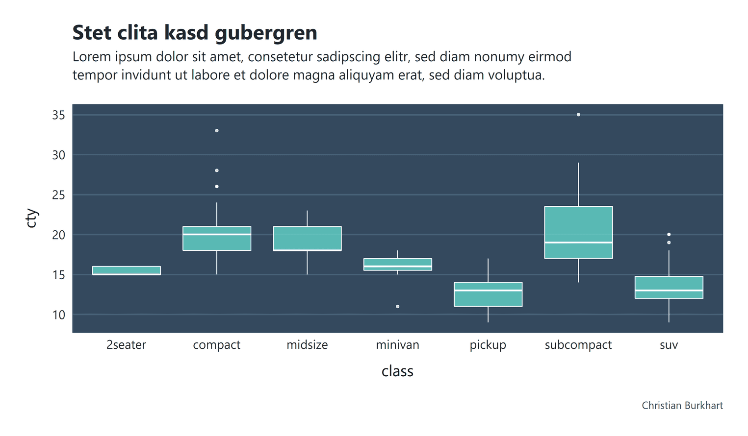
With dark themes we have to change the geoms to make the visualization readable. In this case I styled the box plots in a light green. Note that I also changed the theme inside the code of the visualization using the theme function, since not all visual changes need to be global. For example, I decided to display only grids on the x-axis for this visualization:
ggplot(mpg, aes(x = class, y = cty)) +
  geom_boxplot(fill = "#64D5CA", color = "#ffffff",
               alpha = .8) +
  labs(
    title = "Stet clita kasd gubergren",
    subtitle = str_wrap(paste("Lorem ipsum dolor sit amet,",
                              "consetetur sadipscing elitr, sed diam",
                              "nonumy eirmod tempor invidunt ut labore",
                              "et dolore magna aliquyam erat, sed diam voluptua."),
                        width = 80),
    caption = "Data: ggplot2; Visualization by Christian Burkhart"
  ) +
  theme(
    panel.grid.major.x = element_blank(),
    panel.grid.minor.x = element_blank(),
    panel.grid.minor.y = element_blank()
  )
As a next step, I suggest you try to use this template and create your own custom theme. Creating your own theme might cost you some work, but later you won't have to customize the theme for each individual visualization. You might still wonder where to store these themes without having to write a package. One solution would be to copy your themes into every R-file, but that would be repetitive. I recommend that you create a separate file in your project in which you store your theme. You can read this file into R later by using the source function:
source("set_themes.R")In my case the file is called set_themes.R. You can name the file as you like. Make sure that you know your working directory. The path of the source file is set relative to the working directory. In my example the file set_themes.R is located in the same folder as my R-script. To change the working directory, execute the shortcut Control + Shift + H.
You can find the complete script with my code here. Since you can also download code from the internet with the source function, you could just as well load the script by executing the following command (make sure to have the Segeo UI font installed and loaded first):
source("https://tinyurl.com/s35fk6y")As a hint, I uploaded the document to GitHub Gist to download the theme from the internet. To make sure the URL is not too long, I shortened it using tinyurl. In case you use GitHub Gist, make sure you put the url of the raw data into tinyurl, otherwise source will read a web page and not the R file.
Conclusion
I hope this tutorial will help you to create your own themes and make your visualizations more appealing. Feel free to share your own themes under the hashtags #myggplot2theme and #rstats on twitter. I'm curious with what you come up with.
