For many groups of friends, WhatsApp is the most important place to chat. What and when we post reveals a lot about ourselves. For example, I have a group of friends on Whatsapp who meet weekly on thursdays. We always meet at 7 p.m.. At 5 p.m. and 6 p.m. we chat about where we are going to meet. Another interesting pattern is my friends wake-up behavior. Many of my friends get up much more early than me. I know that because my friends already post two hours before I open my eyes every day.
This tutorial teaches you how to visualize the chat of your WhatsApp group using radar charts. Radar charts are great for cyclical data, such as the hours of a day or the days of the week. We will create three visualizations. In the first visualization you will create a radar chart which visualizes at what time you and your friends post. In the second visualization you analyze the posting behavior of the friends who post the most posts in your chat. Once we have understood how to create multiple radar charts, in the last visualization we will visualize the distribution of posts per weekday in the recent years.
Getting the data from WhatsApp
First, we need data. Luckily, WhatsApp makes it pretty easy for us. Here is the official documentation on how to export your WhatsApp chats. In this tutorial, we choose to exlude media. Excluding the media also makes the export file less big. I suggest you follow the documentation closely. What you get is a txt file with all the posts ever made in your chat. The txt file looks a bit like this:
29.11.19, 09:33 - PERSON1 PRIVAT TEXT
29.11.19, 09:42 - PERSON2 PRIVAT TEXT
29.11.19, 09:43 - PERSON2 PRIVAT TEXT
29.11.19, 09:55 - PERSON3 PRIVAT TEXT
29.11.19, 17:30 - PERSON1 PRIVAT TEXT
29.11.19, 22:44 - PERSON4 PRIVAT TEXT
29.11.19, 22:44 - PERSON4 PRIVAT TEXT
30.11.19, 11:45 - PERSON5 PRIVAT TEXT
Each line is a post. Unfortunately, the data is a bit messy. For example, there is no specific column for the person and the column names are missing. We will need to clean the data first.
Cleaning the WhatsApp chat
First, we need to load the data into R. Since the data is separated by a dash, we will use read_delim from the tidyverse package. Make sure you set the working directory first.
# library(tidyverse)
whatsapp_raw <- read_delim("whatsapp.txt", delim = "-")
When you look at the data, there are still some glitches:
"04.01.14, 08:52 " " PERSON1 has been added."
"17.01.14, 00:48 " " PERSON1: PRIVAT DATA,""
PRIVATE DATA CONTINUED
First, adding a person is not a post from someone but a notification that someone has been added. These posts are quite easy to get because they do not include a semicolon (:). Second, posts with line breaks also have line breaks in the data. Hence, we face lines without a specific date. However, since these lines are part of the previous line, we can exclude them because they belong to a single post. Since we do not analyze the posts itself it is ok to remove these lines. Third, the dataframe has no column names. Fourth, the date is of type chr. Since we need to get specific hours and weekdays from the date column, we need to convert it to a date object. Fifth, we do not have separate columns for the name of the person and the content of the post. We will need to separate the two. Let's go ahead and apply these changes. We will then explain them in more detail:
whatsapp <- whatsapp_raw %>%
  setNames(c("date", "post")) %>%
  filter(date %>% str_detect("^[:digit:]{2}")) %>%
  filter(post %>% str_detect(":")) %>%
  separate(post, into = c("person", "post"), sep = ":")
Since we have two columns (check ncol(whatsapp_raw)) in the dataset we can use the function setNames to give them names. We call the first column date and the second column post. Next, we want to exclude the lines without a date which represent continued posts with line breaks. We can easily catch these lines with the function str_detect. We use the regular expression "^[:digit:]{2}" to find out if a post starts with two digits. If it does not, the line is a continued post and can be removed. The whole expression filter(date %>% str_detect("^[:digit:]{2}")) basically asks: Does the column date start with two digits? If yes, keep it. If not, remove it. Again, we use str_detect to remove lines. This time, we remove lines which do not include a semicolon. These lines represent posts in which you are informed that someone has been added to the chat. Lastly, we separate the column post to the column person and post (see separate(post, into = c("person", "post"), sep = ":") ). Since the person and the post are divided by a semicolon we can use it as a separator.
We already made a big step in cleaning the data. However, we are not finished. Remember, our goal is to visualize the posting behavior per hour or weekday. At the moment we only have a chr column which represents the date as a text. However, we can convert the date column to a date using the fantastic lubridate package:
library(lubridate)whatsapp <- whatsapp_raw %>%
  setNames(c("date", "post")) %>%
  filter(date %>% str_detect("^[:digit:]{2}")) %>%
  mutate(post = str_trim(post)) %>%
  filter(post %>% str_detect(":")) %>%
  separate(post, into = c("person", "post"), sep = ":") %>%
  mutate(    date = date %>% parse_date_time("d.m.y, H:M"),    hour = hour(date),    year = year(date),    wday = wday(date, label = TRUE, abbr = TRUE)  )
Lubridate has a function called parse_date_time. The function basically turns a character vector into a date. To do that, we need to know how the date is represented. WhatsApp exports the date variable in the format "d.m.y, H:M": Look at this date: "04.01.14, 11:15". Someone posted on the fourth of january in 2014 at 11:15 o'clock. I am not sure if WhatsApp exports the date differently in other countries. I am from Germany and this representation of a date looks ok to me. If you run into the issue that your date variable looks different, I suggest you have a closer look at the documentation and find out the correct representation for your date variable. After we converted the date variable to a date object getting the hour, weekday and year is straightforward. Lubridate has many function which allow us to easily extract those variables. For example with hour we can get the hour of a post. wday is a bit more complicated in that you can specify if you want to get a label (such as Mo for monday) and an abbreviation of the label. We want to have both.
Create a radar chart with the hourly posting behavior
Now we are ready to create the first radar chart. Our goal is visualize the hourly posting behavior of you and your friends. To do that, we need to count the number of posts per hour. This step is straightforward:
hour_count <- whatsapp %>%
  count(hour) %>%
  drop_na(hour)
# A tibble: 24 x 2
hour n
<int> <int>
1 0 325
2 1 133
3 2 100
4 3 59
5 4 45
6 5 42
7 6 199
8 7 387
9 8 436
10 9 650
# ... with 14 more rowsAs you can see, we simply count the number of posts per hour. For example, between two and three at night my friends posted a hundred messages since 2014. Mind that we also dropped rows that have an NA in the variable hour (drop_na(hour)). Otherwise we might run into issues later.
You would think we are now ready to create the radar chart. Unfortunately, I stumbled across a little problem whose solution seems weird at first glance. If we create the radar chart now our clock will start at the hour 0 and stop at the hour 23. In other words, the chart will depict the time between 23 and 0 and 0 and 1 als the exact same timeslot which is obviously false. Hence, we need to add an extra line to the data. The line will represent the 24th hour of the day which is the same as the 0th hour of the day. Hence, we will need to set the exact same number of posts to that line. Let's do that:
# Get 24th hour
first_hours <- hour_count %>%
  filter(hour == 0) %>%
  mutate(hour = 24)

# Add extra line to hour_count dataset
hour_count_extended <- hour_count %>%
  rbind(first_hours)
The new hour_count_extended dataset has 25 rows:
# A tibble: 25 x 2
    hour     n
   <dbl> <int>

 1     0   302
 2     1   124
 3     2    96
 4     3    58
 5     4    44
 6     5    36
 7     6   193
 8     7   374
 9     8   414
10     9   605
11    11   886
12    12  1013
13    13  1088
14    14  1010
15    15  1081
16    16  1467
17    17  2233
18    18  2291
19    19  1821
20    20  1500
22    21  1408
23    22  1120
24    23   546
25    24   302
You can see that hour 0 and 24 are identically in the number of posts (n). With the extended version of the dataset hour_count we are ready to create the first radar chart:
coord_radar <- function (theta = "x", start = 0, direction = 1) {
  theta <- match.arg(theta, c("x", "y"))
  r <- if (theta == "x") "y" else "x"
  ggproto("CordRadar", CoordPolar, theta = theta, r = r, start = start,
          direction = sign(direction),
          is_linear = function(coord) TRUE)
}

ggplot(hour_count_extended, aes(x = hour, n)) +
  geom_polygon(fill = "#009688", group = 1,
               color = "#4cb5ab", alpha = .70) +
  geom_point(color = "#99d5cf", size = 1.3, alpha = .8) +
  scale_x_continuous(breaks = seq(0, 24, by = 1)) +
  coord_radar() +
  theme_minimal()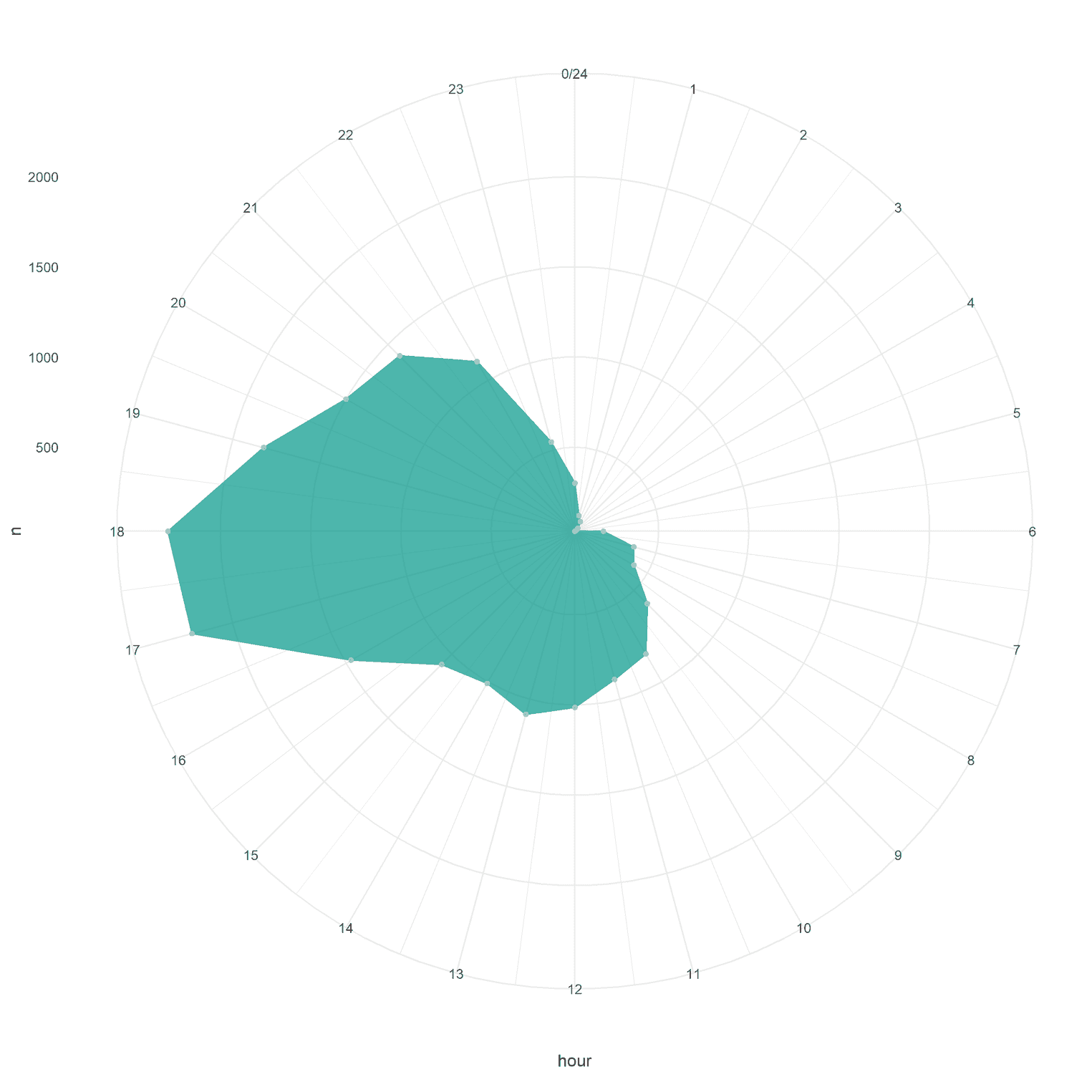
What you can instantly see is that my friends most often post between 5 p.m. and 6 p.m. That's when we usually meet on thursday. There is a small peak at 1 p.m. probably because many of my friends' lunch break is over at that time.
In terms of the R code we need to explain one or two things. First, you can find this weird coord_radar function. If you use coord_polar instead of coord_radar, the connecting lines in the radar chart will not be straight. I got the tip from this stackoverflow answer. I believe straight lines are much more readable as curved lines in a radar chart. To create the radar chart itself we used geom_polygon. You could have used geom_area, however then the last and first point would not have been connected. In addition, I used scale_x_continuous to visualize every hour in the day. If you exclude that line from the visualization you would have to figure out which line stands for which hour. That would be a nuisance.
Still, the visualization does not look very nice. As always, we make use the theme function to style the visualization:
ggplot(hour_count_extended, aes(x = hour, n)) +
  geom_polygon(fill = "#009688", group = 1,
               color = "#4cb5ab", alpha = .70) +
  geom_point(color = "#99d5cf", size = 1.3, alpha = .8) +
  scale_x_continuous(breaks = seq(0, 24, by = 1)) +
  coord_radar() +
  theme_minimal() +
theme( plot.background = element_rect(fill = "#22292F"), plot.margin = unit(rep(2, 4), "cm"), axis.text.x = element_text(size = 15, color = "#c6ced6"), axis.title = element_blank(), axis.text.y = element_blank(), axis.ticks = element_blank(), panel.grid = element_line(color = "#364049", linetype = "dashed"), panel.grid.minor = element_blank(), panel.background = element_rect(fill = "#1e242a", color = "#22292F"), panel.spacing = unit(3, "lines"), ) 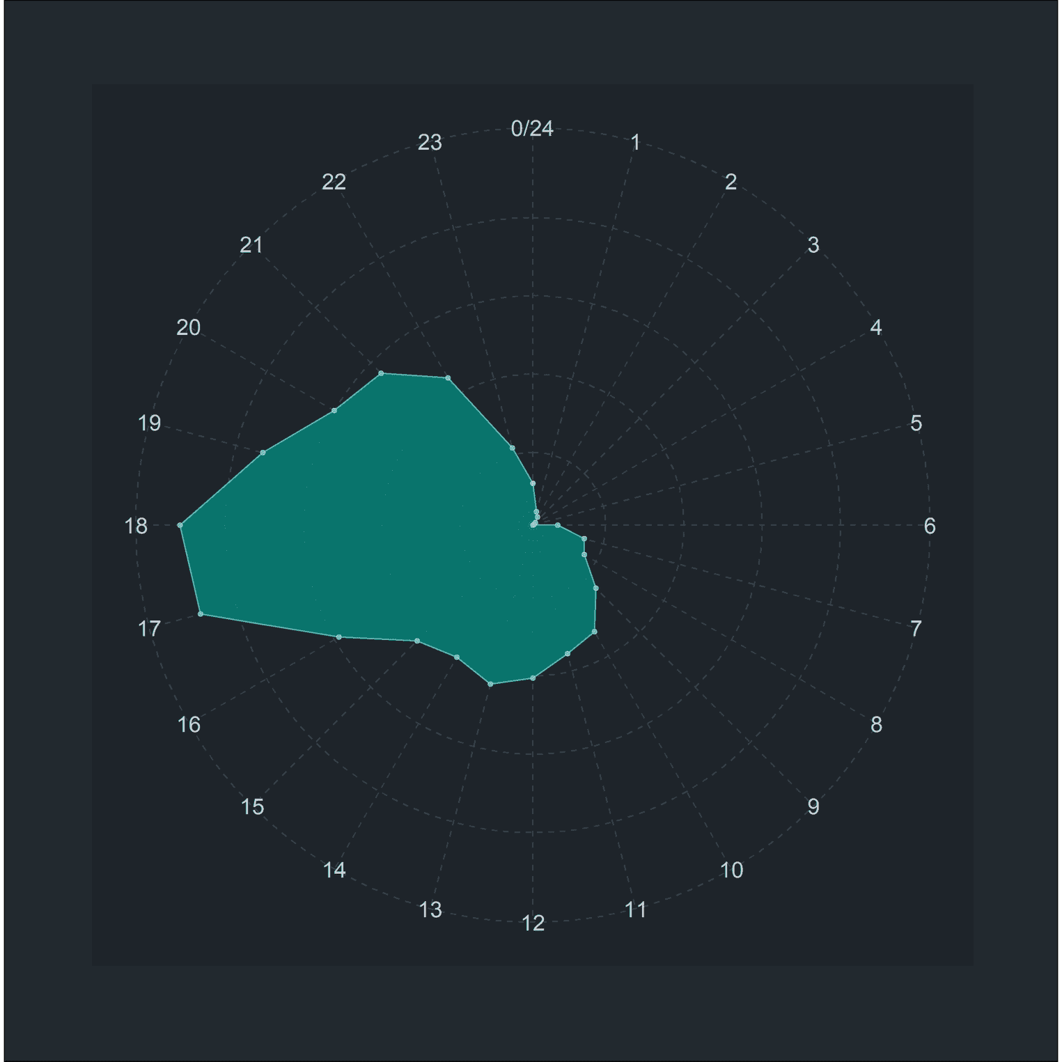
There is a lot of stuff happening here. I will not go into every little detail here. I suggest you add every one of these rows one by one and have a look what aspect of the visualization changes. For example, when you only add plot.margin = unit(rep(2, 4), "cm") you will see that there is a wider margin around the visualization. As a final step, we can add a title and subtitle to the plot:
library(ggtext)

ggplot(hour_count_extended, aes(x = hour, n)) +
  geom_polygon(fill = "#009688", group = 1,
               color = "#4cb5ab", alpha = .70) +
  geom_point(color = "#99d5cf", size = 1.3, alpha = .8) +
  scale_x_continuous(breaks = seq(0, 24, by = 1)) +
  coord_radar() +
  theme_minimal() +
  labs(    title = "Hey Friends,<br />when are you posting on **<span style='color: #4cb5ab'>WhatsApp</span>**? ",    subtitle = str_wrap(paste0("The visualization shows at what time ",                               "we have posted on WhatsApp. ",                               "The closer a datapoint ",                               "is to the edge of the circle, the more ",                               "posts were made."), width = 50)  ) +  theme(
    plot.background = element_rect(fill = "#22292F"),
    plot.margin = unit(rep(2, 4), "cm"),
    plot.title = element_markdown(color = "#F1F5F8",                                  size = 25,                                  lineheight = 1.2,                                  margin = margin(b = 15)),    plot.subtitle = element_text(color = "#c6ced6",                                 size = 17,                                 margin = margin(b = 50),                                 lineheight = 1.1),    axis.text.x = element_text(size = 15, color = "#c6ced6"),
    axis.title = element_blank(),
    axis.text.y = element_blank(),
    axis.ticks = element_blank(),
    panel.grid = element_line(color = "#364049", linetype = "dashed"),
    panel.grid.minor = element_blank(),
    panel.background = element_rect(fill = "#1e242a", color = "#22292F"),
    panel.spacing = unit(3, "lines"),
  )
This is what we will get:
We used the wonderful ggtext package to highlight the word WhatsApp in the title. With ggtext we can add html and markdown tags to strings. The element_markdown function then applies these changes to the text. We used another trick for the subtitle. Subtitles are usually longer than the title and need line breaks. However, it is cumbersome to create the line breaks by hand. Imagine you want to add a little piece of text to the subtitle. You then need to change every line break again. One way to solve this issue is to wrap the subtitle in the str_wrap function. With the argument width you can specify how many characters each line should have. Mind that I also wrapped the text into the paste0 function. Otherwise our line would have been way to long.
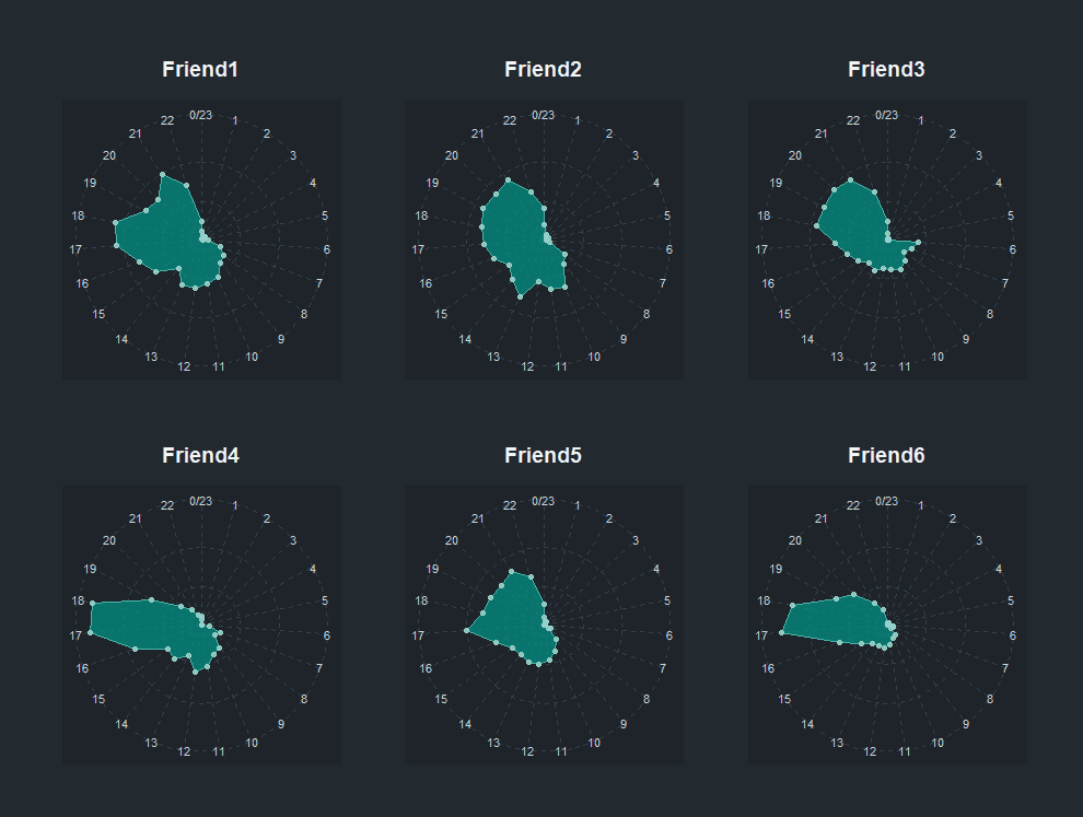
Create a radar chart for the most dedicated friends
The previous visualization already is pretty nice. However, it does not provide us with a lot of information. It would be much more interesting to visualize your friends posting behavior. In my group there are about six friends who post a lot. Some of them still live back home, others have moved to other cities. Some of them wake up early, others later in the day. If you wanna give your friends a present, this would be the most interesing visualization. To create such a visualization, we need to change some things to our code, but not too much. Let's start by counting the posts by hour and people:
whatsapp_per_person <- whatsapp %>%
  mutate(
    person = person %>% fct_lump(n = 6) %>% fct_infreq
  ) %>%
  filter(person != "Other")

hour_count_person <- whatsapp_per_person %>%
  count(hour, person) %>%
  drop_na(person)
We did the following: First, we lumped the friends so that we only assign a name to the most dedicated friends. Every other friend will be categorized as other. To do that we used the fct_lump function. factor_lump takes a variable and then lumps together the factors which appear most often. With n = 6 we specified that we only want to keep the six most dedicated friends. Every other friends will be named "Other". We then sorted these factors in the frequency they appear with the fct_infreq function. We then exclude each friend who was named as "Other" with filter. As previously, we then counted the number of posts per hour and person.
ggplot(hour_count_person, aes(x = hour, n)) +   geom_polygon(fill = "#009688", group = 1,
               color = "#4cb5ab", alpha = .70) +
  geom_point(color = "#99d5cf", size = 1.3, alpha = .8) +
  scale_x_continuous(breaks = seq(0, 24, by = 1)) +
  coord_radar() +
  theme_minimal() +
  theme(
    plot.background = element_rect(fill = "#22292F"),
    plot.margin = unit(rep(2, 4), "cm"),
    axis.text.x = element_text(size = 8, color = "#c6ced6"),    axis.title = element_blank(),
    axis.text.y = element_blank(),
    axis.ticks = element_blank(),
    panel.grid = element_line(color = "#364049", linetype = "dashed"),
    panel.grid.minor = element_blank(),
    panel.background = element_rect(fill = "#1e242a", color = "#22292F"),
    panel.spacing = unit(3, "lines"),
strip.text = element_text(size = 14, color = "#F1F5F8", face = "bold", margin = margin(b = 15)) ) + facet_wrap(~ person, ncol = 3) 
To visualize every friend separately, we used facet_wrap. The ncol argument allowed us to specify the number of columns. Since we have six friends, it is a good idea to use three columns. I also used the argument strip.text to style the names of my friends. I made them bold and added some margin below the names. If you look closely you see that I also made the size of the points (geom_points) smaller. If you want to add a title and a subtitle you can paste in the same code we used in the previous visualization.
Create a radar chart that visualized the distribution of posts on weekdays
Our last visualization should visualize the distribution of posts on weekdays. Again, we did all the heavy lifting already and need to tweak the code a little bit. First, we need to count each post per year and weekday:
wday_count <- whatsapp %>%
  count(wday, year) %>%
  drop_na(year) %>%
  mutate(
    wday = wday %>% as_factor %>%
      fct_relevel("Mo", "Di", "Mi", "Do", "Fr", "Sa", "So")
  )
I used fct_relevel in order to change the order of the weekday. My weekdays are in German. I guess lubridate extracts each weekday according to your system language. That's why you should first check the levels of our wday variable with whatsapp %>% count(wday). I decided to start my week on monday and end it on sunday. When you are from an english speaking country you probably want to have another order.
That is all we need to create the visualization:
ggplot(wday_count, aes(x = wday, n)) +   geom_polygon(fill = "#009688", group = 1,
               color = "#4cb5ab", alpha = .70) +
  geom_point(color = "#99d5cf", size = 1.3, alpha = .8) +
  scale_x_discrete(breaks = c("Mo", "Di", "Mi", "Do", "Fr", "Sa", "So")) +  coord_radar() +
  theme_minimal() +
  theme(
    plot.background = element_rect(fill = "#22292F"),
    plot.margin = unit(rep(2, 4), "cm"),
    axis.text.x = element_text(size = 8, color = "#c6ced6"),
    axis.title = element_blank(),
    axis.text.y = element_blank(),
    axis.ticks = element_blank(),
    panel.grid = element_line(color = "#364049", linetype = "dashed"),
    panel.grid.minor = element_blank(),
    panel.background = element_rect(fill = "#1e242a", color = "#22292F"),
    panel.spacing = unit(3, "lines"),
    strip.text = element_text(size = 14, color = "#F1F5F8",
                              face = "bold", margin = margin(b = 15))
  ) +
facet_wrap(~ year, ncol = 3) 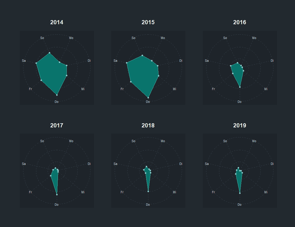
Clearly, my friends love to post on thursdays. That makes total sense since that's the day we usually meet. You can also see that years ago we tended to post more on saturdays and fridays. Now that many of us have a family, there is less going on on the weekends. As a last comment: I used scale_x_discrete to specify each break on the x axis. If I do not we would have missing axis texts which would confuse our readers.
I hope the tutorial gave you a thorough introduction on how to create radar charts from your WhatsApp chat. The tutorial was not extensive but should provide you with the toolkit to create your own radar charts. Feel free to post your results on Twitter. I am curious to see what you come up with.
