I have been using Runtastic to track my runs for years. The app is great and it provides me with a lot of insights into my training. Not all the information I need, though. I would, for example, like to know how many kilometres I have run each year? I am also curious what my previous records in the 5km, 10km or half marathon distance are? Fortunately Runtastic allows to export the running data and analyze it in R.
In the next three tutorials I will show you how to export your running data from Runtastic and show you in four visualizations what information you can extract from the data. We will visualize your accumulated running kilometres over the years. We will compare how much you have run compared to the world class runner Eliud Kipchoge. We will visualize all your runs using a violin plot and we will visualize your records on the 5km, 10km and half marathon distance.
In this tutorial we will write two visualizations. In the first visualization we will look at how many kilometres you have run with the app. For this we will create an area chart with the accumulated mileage of your runs. In the second visualization we will compare your mileage with Eliud Kipchoge's estimated mileage. We will also see how many kilometres you could have run if you had constantly run a certain amount of kilometres per week.
Exporting the data from Runtastic
Runtastic makes it relatively easy to export the data. First you need to login with your username and password:
Then click on Settings and you will be forwarded to a page where you can export your data:
Under Account & Data you will find a large green button with the name Export Data. Click on the button. Runtastic will take one or a couple of days to export your data. Mind, that you can only export the data every seven days. Once the data is exported, you will receive an email and can download the data from the same page.
After you extracted the data, you will see several folders, each containing different data. In the next three tutorials we will focus on the data in the Sport-sessions folder. All your activities are stored as json files in this folder. Each json file represents one recorded sport activity. A sport activity includes the duration, the average pace, or your average heart rate of the sport activity. In principle, you could use the tutorial to visualize your bike data as well.
For example, each json file contains the date and time of each run ("start_time":1534436960000). However, we need to clean the data first because it is not interpretable in this form. For example, the distance of your runs is given in meters (or probably yards if you are from the US). We would prefer to store the distance in kilometres or miles.
{"start_time":1534436960000,"end_time":1534440163000,
"created_at":1534440163000,"updated_at":1534440167000,
"start_time_timezone_offset":7200000,"end_time_timezone_offset":7200000,
"distance":6569,"duration":2698185,"elevation_gain":244,
"elevation_loss":226,"average_speed":8.764558,"calories":604,
"longitude":7.8477354,"latitude":47.9889,"max_speed":13.774089,
"pause_duration":503072,"duration_per_km":410745,
"temperature":31.0,"pulse_avg":0,"pulse_max":0,
"avg_cadence":0,"max_cadence":0,"manual":false,
"edited":false,"completed":true,"live_tracking_active":false,
"live_tracking_enabled":false,"cheering_enabled":false,
"indoor":false,"id":"ea198500-3e53-40ff-bc90-f9cb476c985f",
"weather_condition_id":"2","subjective_feeling_id":"5",
"sport_type_id":"1","user_equipment_ids":["57f9eb862103bea869dea65f"]}
Cleaning the data
Before we start, make sure that you have installed and loaded the tidyverse and the lubridate package. Next, we have to load all json files of your runs into R. For this we need the path of each json file. With the library fs we can store all json files as a vector in a variable. Before you do this, make sure that you working directory is set to the directory export-DATEOFEXPORT (setwd()).
library(tidyverse)
library(fs) # install.packages("fs") if you haven't done yet
activity_paths <- dir_ls("Sport-sessions",
                         type = "file", glob = "*.json")
Your output should then look something like this:
> activity_paths
Sport-sessions/005ea639-4b26-4168-b9f9-7fd113838976.json
Sport-sessions/025e9497-fad5-4c70-9858-ab2d35efbd03.json
Sport-sessions/039180a8-91eb-4643-bb53-411481dd3d38.json
Sport-sessions/04b9a150-0284-4163-bbc3-dc97b1dc832d.json
Sport-sessions/058b0ddf-f838-4d0d-8508-0b7aa3669567.json
...
Now that we have stored the path for each json file in a variable, we can load the actual data. For this we use the library purrr and jsonlite. More specifically, we read each json file, keep only the sports activities that contain runs and create a dataframe where each row represents a running activity.
# install.packages("jsonlite") if you haven't done yet
library(jsonlite)
json_files <- activity_paths %>%
  map(~ read_json(.)) %>%
  keep(~ .$sport_type_id == 1) %>% # Only running
  map_df(~ as_tibble(.))
Your data should then look like the this:
Rows: 448
Columns: 39
$ start_time                 <dbl> 1.547903e+12, 1.528136e+12, 1....
$ end_time                   <dbl> 1.547905e+12, 1.528138e+12, 1....
$ created_at                 <dbl> 1.547905e+12, 1.528138e+12, 1....
$ updated_at                 <dbl> 1.547905e+12, 1.528138e+12, 1....
$ start_time_timezone_offset <int> 3600000, 7200000, 7200000, 360...
$ end_time_timezone_offset   <int> 3600000, 7200000, 7200000, 360...
$ distance                   <int> 7548, 7102, 13512, 6966, 10034...
$ duration                   <int> 2184691, 2102588, 4002684, 201...
$ elevation_gain             <int> 58, 59, 142, 49, 44, 96, 97, 7...
$ elevation_loss             <int> 52, 46, 135, 35, 57, 84, 95, 6...
$ average_speed              <dbl> 12.42135, 12.15987, 12.15500, ...
$ calories                   <int> 623, 607, 1099, 582, 689, 939,...
$ longitude                  <dbl> 7.866308, 7.865628, 7.868318, ...
$ latitude                   <dbl> 47.98994, 47.98988, 47.99009, ...
$ max_speed                  <dbl> 15.96011, 13.44784, 12.93258, ...
$ pause_duration             <int> 0, 0, 0, 7361, 437000, 0, 0, 0...
...
Clean the variables
Now comes the hard part. We have to clean the variables. For example, we need to change the variables that contain time data and modify the variables that store the duration and distance of a running activity. In this tutorial I assume that you use the metric system. If you are from the US, you will need to convert the data into miles. In a second I will try to explain how you do this.
The complete code can be found below. If you use the metric system and are familiar with tidyverse, you can copy the code and jump right to the visualization. If you are not yet familiar with tidyverse, I recommend that you follow the next steps in which I explain how we clean the data.
running_data <- json_files %>%
  mutate(
    start_time      = substr(start_time, 1, 10) %>% as.double %>%
      as_datetime(., tz = "Europe/Berlin"), # Sys.timezone() for tz,
    end_time        = substr(end_time, 1, 10) %>% as.double %>%
      as_datetime(., tz = "Europe/Berlin"),
    year            = year(start_time) %>% as_factor,
    distance        = distance / 1000, # meters to kilometers
    duration        = duration / 60000, # milliseconds to minutes
  ) %>%
  select(-(created_at:end_time_timezone_offset),
         -(avg_cadence:surface_id)) %>%
  filter(distance != 0) # Only keep runs with a distance of over 0km
So you have decided to understand the individual steps of the data cleaning process. We use four functions for data cleaning: mutate to create new variables or change existing variables, select to select specific variables, filter to delete rows, and arrange to order the data.
running_data <- json_files %>%
  mutate(
    <CLEAN VARIABLES>
  ) %>%
  select(
    <ONLY KEEP VARIABLES THAT ARE OF INTEREST>
  ) %>%
  filter(
    <FILTER ROWS: KEEP RUNS WITH A DISTANCE OVER 0KM>
  ) %>%
  arrange(
    <ORDER ROWS BY TIME>
  )
First, we have to convert the time data into another format. Currently, the dates are given in milliseconds that have passed since January 1, 1970. This format is called Unix format. For example, the number 1589714878000 represents May 17, 2020. (try this page to convert dates from the Unix format to a readable format). We will cut off the last three digits of this number using the substr function to get the seconds since January 1, 1970. Then, we will then convert this string to a number using the as.double function. Then we will use the as_datetime function to convert this number to a date format.
running_data <- json_files %>%
  mutate(
    start_time      = substr(start_time, 1, 10) %>% as.double %>%
      as_datetime(., tz = "Europe/Berlin"), # Sys.timezone() for tz,
    end_time        = substr(end_time, 1, 10) %>% as.double %>%
      as_datetime(., tz = "Europe/Berlin"))
as_datetime needs to know which timezone you are in. The easiest way to find your timezone is to run the Sys.timezone() function in the console and add the output to the tz argument. The data should then look like this:
# A tibble: 448 x 2
   start_time          end_time
   <dttm>              <dttm>
 1 2019-01-19 14:02:37 2019-01-19 14:39:02
 2 2018-06-04 20:06:59 2018-06-04 20:42:03
 3 2019-04-16 18:35:54 2019-04-16 19:42:38
 4 2019-01-12 14:52:56 2019-01-12 15:26:42
 5 2020-01-06 18:42:44 2020-01-06 19:44:18
 6 2019-10-10 18:16:11 2019-10-10 19:09:45
 7 2018-05-05 16:21:10 2018-05-05 17:33:23
 8 2017-12-31 12:25:10 2017-12-31 13:15:53
 9 2019-06-01 12:35:17 2019-06-01 13:08:29
10 2019-09-25 18:22:01 2019-09-25 19:41:28
# ... with 438 more rows
Next, we need to convert the distance and duration of each run into a more comprehensible format. To get the distance in kilometers, you have to divide the meters given by the variable distance by 1000. If you think in miles, your data is probably stored in yards (not totally sure about it). If this is the case, you will need to multiply the distance variable by 0.0005681 to get miles. The duration of each run is given in seconds. If you divide the seconds by 60000, you get the duration in minutes. We could use the same steps for the variables pause_duration and duration_per_km. However, we will not use these variables in this tutorial. Finally, we need the year for each run. We get this easily with the year function from the lubridate library.
running_data <- json_files %>%
  mutate(
    start_time = substr(start_time, 1, 10) %>% as.double %>%
      as_datetime(., tz = "Europe/Berlin"),
    end_time = substr(end_time, 1, 10) %>% as.double %>%
      as_datetime(., tz = "Europe/Berlin"),
    distance = distance / 1000, # meters to kilometers    duration = duration / 60000, # milliseconds to minutes    year = year(start_time)  )
Finally, we remove uneccessary variables and ensure that we do not include runs with a distance of 0 kilometers or miles.
running_data <- json_files %>%
  mutate(
    start_time = substr(start_time, 1, 10) %>% as.double %>%
      as_datetime(., tz = "Europe/Berlin"),
    end_time = substr(end_time, 1, 10) %>% as.double %>%
      as_datetime(., tz = "Europe/Berlin"),
    distance = distance / 1000, # meters to kilometers
    duration = duration / 60000, # seconds to minutes
    year = year(start_time)
  ) %>%
  select(-(created_at:end_time_timezone_offset),         -(avg_cadence:surface_id)) %>%  filter(distance != 0)
Preparing the data for the first visualization
Since my last tutorial I find it very convenient to create a theme that gives me a consistent design for all visualizations. A detailed explanation can be found in the last tutorial. But before you do that, I recommend you create the following visualization first:
running_data %>%
  ggplot(aes(x = distance)) +
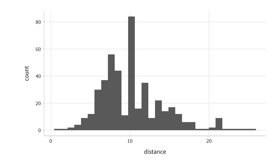
  geom_histogram()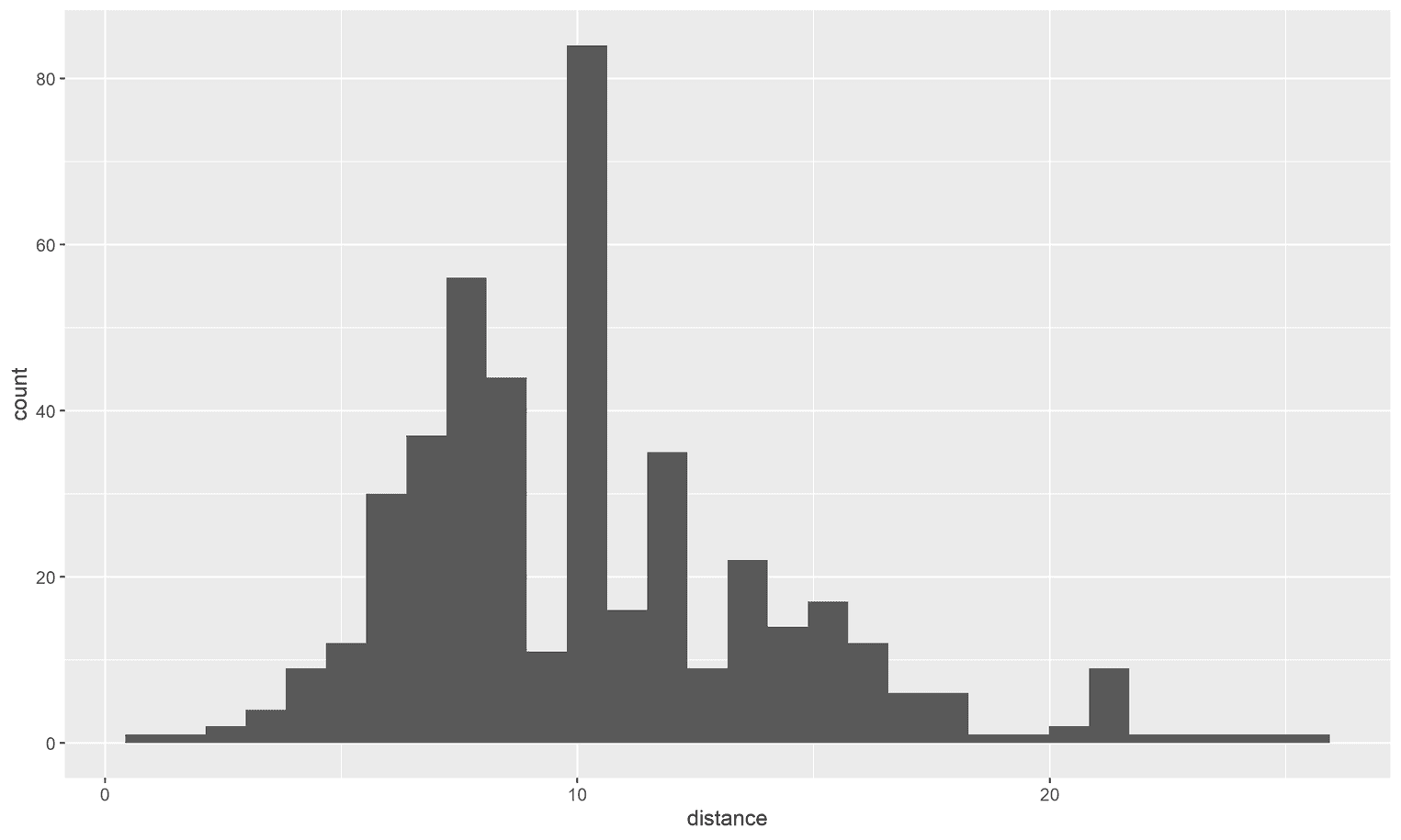
What you get is the default theme in ggplot2. However, the default themes are rarely the most readable themes. Now let's see how the visualization changes if we apply the upcoming theme:
The theme, for example, makes the axis labels larger, removes the gray background and changes the font family. Basically it makes the visualization more readable.
Setting up the theme
To create the theme, simply copy the following code and run it in your console:
base_theme <- theme(
  plot.margin = unit(rep(1, 4), "cm"),
  plot.title = element_text(size = 18,
                            face = "bold",
                            color = "#22292F",
                            lineheight = 1.1,
                            margin = margin(b = 8)),
  plot.subtitle = element_text(size = 15,
                               lineheight = 1.1,
                               color = "#22292F",
                               margin = margin(b = 25)),
  plot.caption = element_text(size = 12,
                              margin = margin(t = 25),
                              color = "#3D4852"),
  panel.grid.minor = element_blank(),
  legend.text = element_text(size = 12),
  legend.title = element_text(size = 14),
  axis.title.x = element_text(margin = margin(t = 15),
                              size = 16),
  axis.title.y = element_text(margin = margin(r = 15, l = 35),
                              size = 16),
  axis.text = element_text(color = "#22292F", size = 14),
  axis.ticks = element_line(size = .07),
  axis.line = element_line(color = "black", size = .07)
)

set_base_theme <- function() {
  theme_set(theme_minimal(base_size = 18,
                          base_family = "Source Sans Pro") +
            base_theme)
}

set_base_theme()
You may notice that we set the font to Source Sans Pro in the set_base_theme. I find that Source Sans Pro is a very readable font for axis labels and gives the visualization a more professional touch. If you want to use this font, I recommend that you first download and install it from Google Fonts and then use the extrafont library to load the font. There are four steps in the process. First, you load the extrafont package, then you import all your system fonts with font_import(), and then you load the fonts with loadfonts (for Windows users). As a last step, you better restart R so that R finds the fonts on your system:
library(extrafont)
font_import()
loadfonts(device = "win") # Only for Windows users
# + Restart R
When you are finished, run the previous visualization to see if everything works. Now we are ready for our first visualization.
Visualizing your accumulated running kilometers
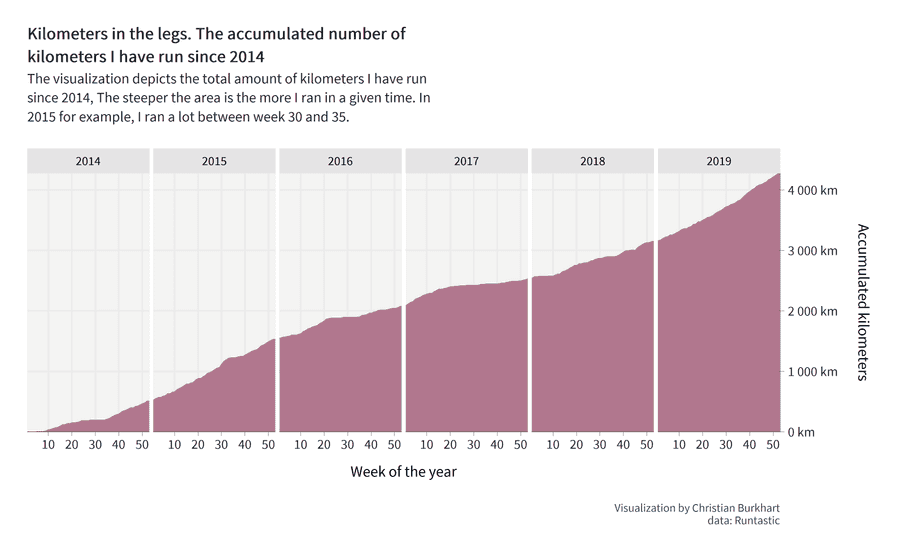
The final visualization will look as follows:
The visualization shows our readers how many miles or kilometers you have accumulated over the years. Let's assume you ran 10km the first week of 2014 and 30km on the second week of 2014. Then you would have accumulated a total of 40km in two weeks. The visualization shows this accumulation as an area chart. On the right side of the visualization you can see the total amount of kilometres you have run with the app. The steepness of the area chart shows you when you ran a lot and when you ran less. For example, I ran a lot in week 30 and 35 in 2015 (the area chart gets steeper at this point). In 2017 I was injured and could only run very little.
Preparing the data
First we have to do some analyses to visualize the data. What we need is the number of kilometers or miles you ran in each week and in each year. So we need to extract the week from the data and calculate a summary statistic of the total number of kilometres for each week and year. Furthermore, we only want to look at years that have passed completely. Otherwise the area chart would not nicely align with the y-axis on the right. We will go through each step individually.
First we keep only full years, select only the variables that we need for the visualization, and get the week for each run as a number:
accumulated_mileage <- running_data %>%
  filter(year != 2020 & year > 2013) %>%
  transmute(
    year,
    distance,
    week = week(start_time))
Still, the data shows the distance for each run. But we need the accumulated mileage for each week. To calculate the accumulated mileage, we use the group_by function in combination with the summary function. The group_by function groups the data in sub-dataframes and the summary function allows us to calculate the weekly mileage for each week of each year.
accumulated_mileage <- running_data %>%
  filter(year != 2020 & year > 2013) %>%
  transmute(
    year,
    distance,
    week = week(start_time)) %>%
  group_by(week, year) %>%   summarise(sum = sum(distance)) %>%   ungroup()
To avoid side effects I always find it convenient to ungroup the grouping once I calculated the summary statistics. The next step is strictly speaking not necessary but very important to write clean data. If you have not run every week you will probably have missing weeks in the data. Let's assume you did not run in week 3 of 2019. Then there would be no row of that week in the dataset. Later we will compare your mileage with the mileage of Eliud Kipchoge. Missing weeks will then lead to calculation errors. So we have to find a way to add these missing weeks to the dataframe.
First we will sort the data by year and week. Once the data is sorted, we can calculate the cumulative mileage. However, we still miss the weeks in which you did not run. With the complete function we can create these rows and add the missing values for these runs. In a final step, we then replace these missing values with the mileage you had a week before this missed week. For example, if you had accumulated 1400 km in week 5 in 2017 and did not run in week 6, you would still have a total mileage of 1400 km in week 6. Let us apply these changes:
accumulated_mileage <- running_data %>%
  filter(year != 2020 & year > 2013) %>%
  transmute(
    year,
    distance,
    week = week(start_time)) %>%
  group_by(week, year) %>%
  summarise(sum = sum(distance)) %>%
  ungroup() %>%
  arrange(year, week) %>%   mutate(cumsum = cumsum(sum)) %>%   complete(week, nesting(year)) %>%   arrange(year, week) %>%   fill(cumsum)
A few things are important here. The complete function works as follows:
"Give me the variable for which there is no complete set. For example, if your set is 1 2 and 3 and the 2 is missing, I will add the 2. For any other variable, I will add NA values. And remember, if the set is nested within another variable (e.g., weeks within years), let me know, and I will write the complete set for each instance of that grouping variable."
You may also wonder why we arrange the dataframe twice for year and week. This is not a mistake. The complete function rearranges the order of our data without telling us, so we have to order the data again after the function has finished. Once the order is applied, we can fill the NA values with the accumulated mileage of the last week.
Your data should then look something like this:
# A tibble: 318 x 4
    week  year   sum cumsum
   <dbl> <dbl> <dbl>  <dbl>
 1     1  2014  6.39   6.39
 2     2  2014 NA      6.39
 3     3  2014 NA      6.39
 4     4  2014 NA      6.39
 5     5  2014  3.08   9.47
 6     6  2014 NA      9.47
 7     7  2014 NA      9.47
 8     8  2014  5.57  15.0
 9     9  2014 10.5   25.6
10    10  2014 16.9   42.5
# ... with 308 more rows
In week 2 of 2014 I, for example, I did not run. Nevertheless, the data contains all weeks for each year. But only for the cumsum variable.
Visualizing the accumulated running hours
Our goal is to visualize the accumulated mileage over the last years. To do this, we create several visualizations that are horizontally aligned. In ggplot2 we call this technique a grid. The advantage of such a visualization is that readers of our visualization can later clearly see the degree of increase in mileage for a given year. We create a grid with the function facet_grid. The function takes an argument cols which holds the variable that should be aligned horizontally. To visualize the data, we use an area as the geometric object (geom_area). Let's create this first visualization:
accumulated_mileage %>%
  ggplot(aes(week, cumsum)) +
  geom_area(fill = "#84254a", alpha = .6) +
  facet_grid(cols = vars(year))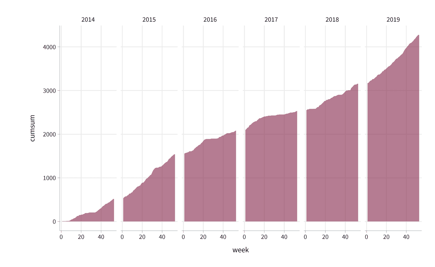
There's still a few problems. Somehow the area chart looks like it is floating in space as it is not aligned with the x-axis. It would be nicer to align it with the x-axis directly. The readers will also find it difficult to understand the scale of the y-axis. Since we have a clear metric (km or miles), we should add this metric as the labels of the y-axis. We will use the scales package to do this. Similarly, we have free space for more labels on the x-axis. To make the visualization more readable it would be nice to add the 10th, 40th and 50th week of each year. The readers will also want to know what their current maximum mileage is. The position of the y-axis on the left side makes it unnecessarily difficult to get this information. It would be much easier if we positioned the y-axis on the right. The spatial proximity of the area chart and the y-axis helps the readers to find the values much faster.
library(scales) # Put this line to the top of your scriptaccumulated_mileage %>%
  ggplot(aes(week, cumsum)) +
  geom_area(fill = "#84254a", alpha = .6) +
  facet_grid(cols = vars(year)) +
  scale_x_continuous(expand = c(0, 0),                     breaks = seq(10, 50, by = 10)) +  scale_y_continuous(expand = c(0, 0), position = "right",                     label = label_number(suffix = " km"))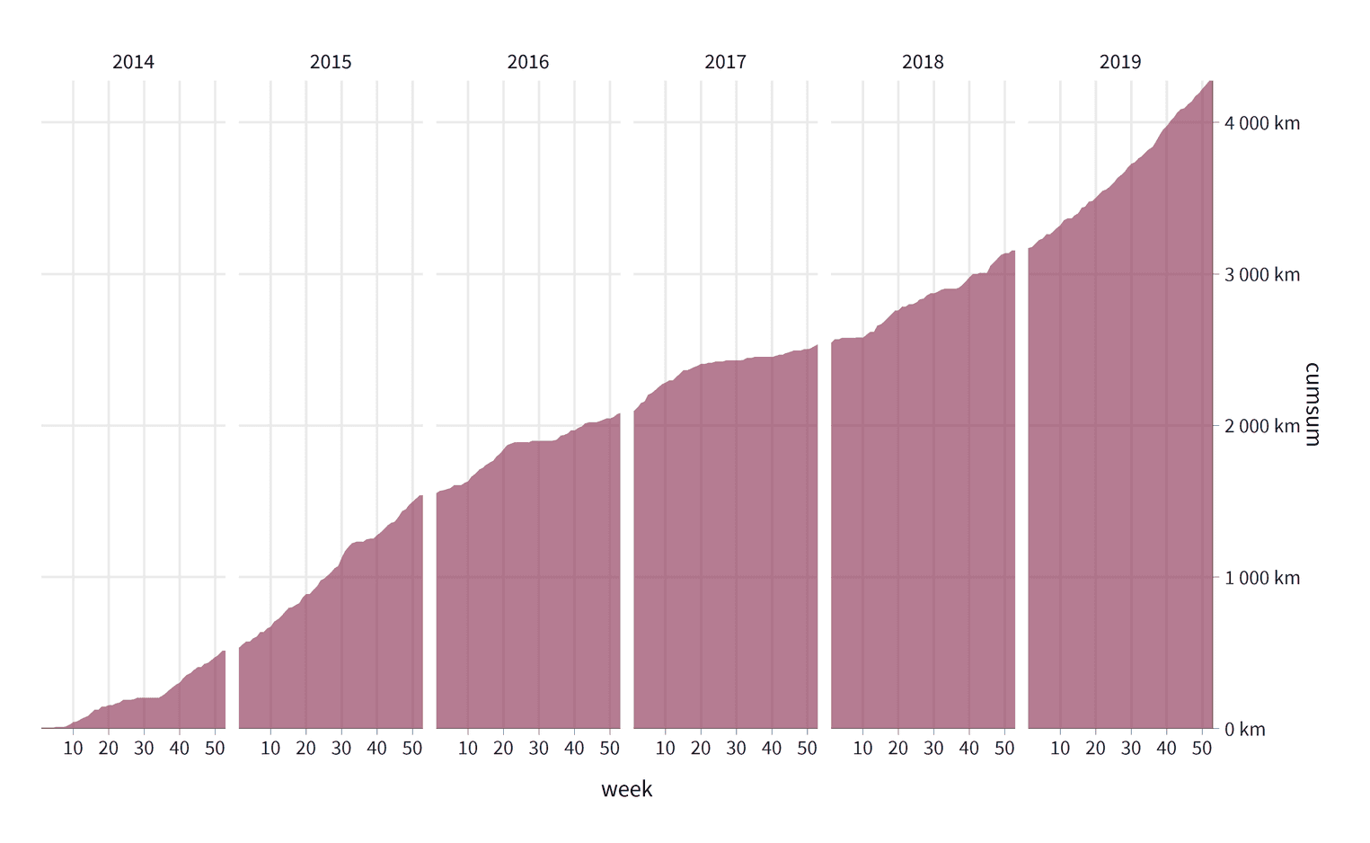
Let's go over these changes. For both scales we have added c(0, 0) to the expandargument. Expand defines the padding around the data. By setting both arguments to zero we remove the padding so that our area chart is directly aligned with the axes. On the x-axis we have specified the breaks argument. The breaks tell ggplot2 the position of the grid lines. In our visualization the breaks are positioned at week ten, twenty, thirty, forty, and fifty. ggplot2 automatically adds the axis labels to these breaks. The y-axis is positioned to the right with the position argument. To format the labels on the y-axis to km, we use the label_number function. If you are not sure what the function does, just create a variable with this function and see what it returns when you add a number as an argument to this function :
km_function <- label_number(suffix = " km")
km_function(10)
[1] "10 km"The label_number function returns another function. The purpose of this function is to create a string with the suffix km at the end of the string.
Our visualization is still not fully comprehensible. Every visualization needs a title and sometimes a subtitle that tells the readers what the visualization is about. We also need to clarify the meaning of the axes. Currently, the title of the y-axis is cumsum, which is meaningless to most readers. Why not name it by what it is: Accumulated kilometers. Let's add these changes:
accumulated_mileage %>%
  ggplot(aes(week, cumsum)) +
  geom_area(fill = "#84254a", alpha = .6) +
  facet_grid(cols = vars(year)) +
  scale_x_continuous(expand = c(0, 0),
                     breaks = seq(10, 50, by = 10)) +
  scale_y_continuous(expand = c(0, 0), position = "right",
                     label = label_number(suffix = " km")) +
  labs(    title = str_wrap(paste0("Kilometers in the legs. The accumulated number",                             " of kilometers I have run since 2014"), 50),    subtitle = str_wrap(paste0("The visualization depicts the total amount ",                               "of kilometers I have run since 2014. ",                               "The steeper the area is the more I ",                               "ran in a given time. In 2015 for example, ",                               "I ran a lot between week 30 and 35."), 70),    x = "Week of the year",    y = "Accumulated kilometers\n",    caption = "Visualization by Christian Burkhart\ndata: Runtastic"  )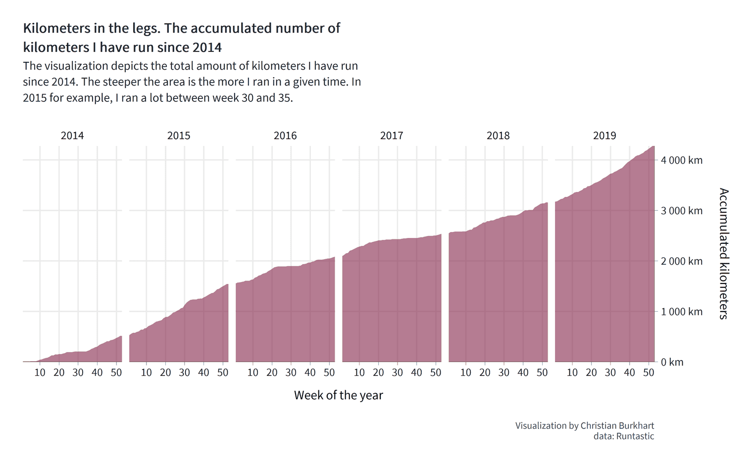
Some interesting things are happening here. For the title and the subtitle I used the function str_wrap. str_wrap wraps longer text sections in lines by a predefined line length. For the title, for example, I decided to define a line length of 50 characters for the subtitle 70 characters. It is much more convenient to let the function define the line breaks than to do it by hand. If you do this manually, you will have to set the line breaks every time you change the title text. I used another trick for the y-axis title. At the end of the title you can see a line break: '\n'. Somehow I couldn't change the distance between title and axis text with the theme function (more on this in a second). Fortunately I found this simple solution from Adam B on stackoverflow.
Still, I am not entirely happy with the visualization. It is, for example, difficult to distinguish the years from one another. Readers will want to know how their accumulated mileage has changed in a particular year. The only visual marker to differentiate years is the white space in between the area chart and the label of the years at the top of the visualization. We can solve this problem by the Gestalt principle of enclosure. A simple solution would be to add a background color to each year. The readers will then be able to perceive the individual years more easily.
The second problem is that we have an uneccessary large gap between the years. The purpose of the visualization is to see how the mileage has accumulated over the years. A gap between the area chart will make it diffcult to track the accumulation of kilometers. It is therefore important to reduce the gap. Let's apply these changes:
accumulated_mileage %>%
  ggplot(aes(week, cumsum)) +
  geom_area(fill = "#84254a", alpha = .6) +
  facet_grid(cols = vars(year)) +
  scale_x_continuous(expand = c(0, 0),
                     breaks = seq(10, 50, by = 10)) +
  scale_y_continuous(expand = c(0, 0), position = "right",
                     label = label_number(suffix = " km")) +
  labs(
    title = str_wrap(paste0("Kilometers in the legs. The accumulated number",
                            " of kilometers I have run since 2014"), 50),
    subtitle = str_wrap(paste0("The visualization depicts the total amount ",
                               "of kilometers I have run since 2014. ",
                               "The steeper the area is the more I ",
                               "ran in a given time. In 2015 for example, ",
                               "I ran a lot between week 30 and 35."), 70),
    x = "Week of the year",
    y = "Accumulated kilometers\n",
    caption = "Visualization by Christian Burkhart\ndata: Runtastic"
  ) +
theme( strip.background = element_rect(fill = "#e5e5e5", color = "#e5e5e5"), strip.text = element_text(size = 13), panel.spacing = unit(0.15, "cm"), panel.background = element_rect(fill = "#f4f3f3", color = "#f4f3f3") ) 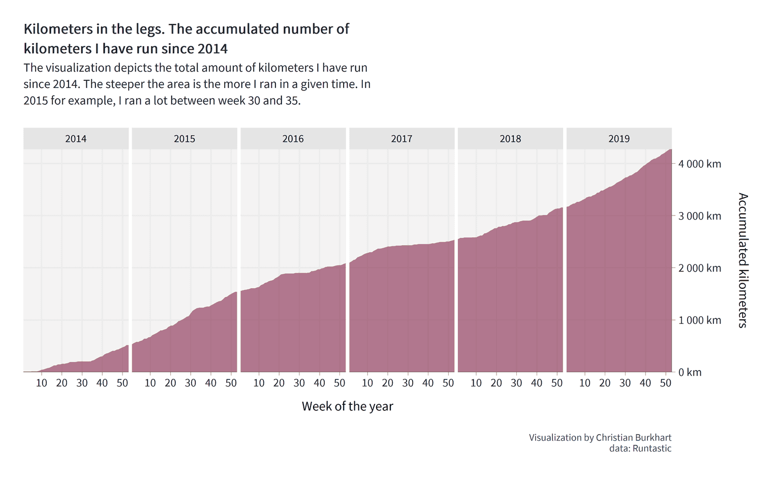
How did we do it? With panel.spacing we can define the spacing around the panels, that is the visualizations we created by the facet_grid function. In this case, we defined that the spacing should be 0.15cm. We have aso added a fill color to the panel and the strip (the strip is the title of each panel; in our case the years).
How much did you run compared to Eliud Kipchoge?
Eliud Kipchoge is the fastest marathon runner ever. You will hardly come anywhere near his weekly mileage. To appreciate how much he runs, let's compare your mileage with his. Let us also try a thought experiment. Imagine you are able to achieve a certain weekly mileage. Maybe you are already pretty good and could run 100km every week. Maybe you are a beginner and could imagine running 10 km every week. No matter where you fall, it would be interesting to see what you could achieve if you maintained this mileage for a few years.
Before we start with the visualization, we need to update our data. What we need is the same dataframe but for three different people: The mileage of Eliud Kipchoge, your better-self mileage of what you could run, and your actual mileage. We already have the latter. Conveniently, we have made sure that our existing dataframe already contains every week for every year. It is therefore very easy to calculate the accumulated mileage for Eliud Kipchoge:
kipchoge_mileage <- accumulated_mileage %>%
  select(week, year) %>%
  mutate(
    sum = 170,
    cumsum = cumsum(sum),
    person = "kipchoge"
  )
From our existing dataset, we simply select the week and year variable and create three new variables with the weekly mileage of Kipchoge (170km), his accumulated mileage over time (cumsum(sum)) and his name. We do exactly the same for your better-self data:
better_self_data <- accumulated_mileage %>%
  select(week, year) %>%
  mutate(
    sum = 30,
    cumsum = cumsum(sum),
    person = "my better self"
  )
The only thing that changes is the name ("my better self") and the weekly constant mileage (30km). In a last step we combine these datasets with the bind_rows function:
combined_mileage <- kipchoge_mileage %>%
  bind_rows(better_self_data) %>%
  bind_rows(accumulated_mileage %>%
              mutate(person = "me")) %>%
  mutate(
    person = person %>% as_factor %>%
      fct_relevel("kipchoge", "my better self", "me")
  )
You will also see that we used the fct_relevel function at the end of the code snippet. When we create the next visualization, we need to order the fill color of several areas. For this we need to know in which order the names of the three people are stored. Whenever you have nominal data like names, it is a good idea to store these variables as a factor and define the levels of each factor level. So we first converted the name variable (which is a string) to a factor and then releveled the factor levels.
The visualization is straight forward since we have essentially already created most of the code. However, I highlighted each major change in the code:
combined_mileage %>%
  ggplot(aes(week, cumsum, group = person, fill = person)) +  geom_area(alpha = .4, position = "identity") +  facet_grid(~ year) +
  scale_fill_manual(values = c('grey60', "#b57c92", "#84254a")) +  scale_x_continuous(limits = c(1, 53), expand = c(0, 0),
                     breaks = seq(10, 50, by = 10)) +
  scale_y_continuous(expand = c(0, 0), position = "right",
                     label = label_number(suffix = " km")) +
  labs(
    title = str_wrap(paste0("Me against my better self and Eliot Kipchoge"), 50),
    subtitle = str_wrap(paste0("The visualization depicts the accumulated kilometers ",
                               "Eliot Kipchoge probably ran from 2014 (170km per week), the ",
                               "accumulated kilometers I could have run ",
                               "if I kept a consistent mileage of 30km per week ",
                               "and the actual kilometers I ran since 2014 (~ 10.2km per week)"), 80),
    x = "Week of the year",
    y = "Accumulated kilometers\n",
    fill = "Person",
    caption = "Visualization by Christian Burkhart\ndata: Runtastic"
  )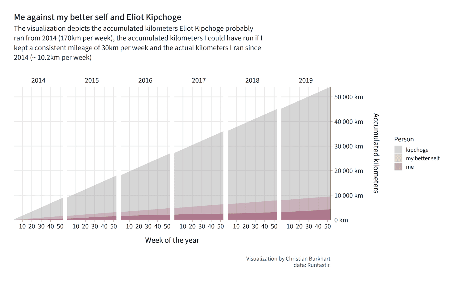
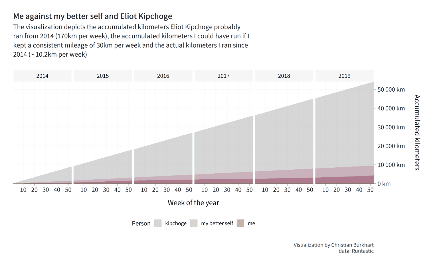
There are some important steps that we have to go through. First, we defined the fill aestethic in the second line. Since we want to adjust the fill color for each person, the person variable must be mapped to the fill color. Second, we use the argument position = identity for the geom geom_area. Try to remove this argument and see what happens. If you miss this argument, the area charts will be stacked on top of each other. The basic message would be: "What is the combined mileage of all three runners?". This is not the question we want to answer. Instead, the values on the y-axis should represent exactly the accumulated mileage for each of the three people. position = identity will do that for us. Also remember that we have defined the order of the factor levels earlier. Since we know in which order the factors appear, we can manually set the fill color for each area chart. To achieve this, we use the scale_fill_manual function.
We have succeeded in visualizing our message. Eliud Kipchoge runs a hell of many kilometers. Look at the dark red area at the bottom of the visualization. That's me. From the visualization I can see immediately that Eliud has run approximately 50,000 km more than I did in a period of six years. I can also see that with a little more dedication I could have doubled my total mileage from 4,000km to almost 10,000km. So, our visualization provides us with some interesting information.
Yet, I am stil not entirely satisfied. Two things are problematic. First, the legend of the fill color is on the right side. The result of this design decision is that we use less ink for the actual data (the area charts). However, it is always important to maximize the data ink. Or, as Edward Tufte would put it: "Above all, show the data". It is therefore better to position the legend below the x-axis. I also want people to see the years more clearly. At the moment, the years are not very salient and could be overlooked by our readers. A little grey background makes them stand out a little more. However, compared to the other visualization, I will not add a grey background to the individual panels for each year. Why? Because the grey would interfere with the grey of Eliud Kipchoge's area. Once again: "Above all, show the data". The background is no data. Let's finish the visualization:
combined_mileage %>%
  ggplot(aes(week, cumsum, group = person, fill = person)) +
  geom_area(alpha = .4, position = "identity") +
  facet_grid(~ year) +
  scale_fill_manual(values = c('grey60', "#b57c92", "#84254a")) +
  scale_x_continuous(limits = c(1, 53), expand = c(0, 0),
                     breaks = seq(10, 50, by = 10)) +
  scale_y_continuous(expand = c(0, 0), position = "right",
                     label = label_number(suffix = " km")) +
  theme(    strip.background = element_rect(fill = "#f6f6f6",                                     color = "#fafafa"),    strip.text = element_text(size = 13,                               color = "black"),    legend.position = "bottom",    panel.spacing = grid::unit(0.15, "cm"),    panel.grid.major = element_line(color = "#fafafa"),    panel.background = element_rect(fill = "white", color = "white"),  ) +  labs(
    title = str_wrap(paste0("Me against my better self and Eliot Kipchoge"), 50),
    subtitle = str_wrap(paste0("The visualization depicts the accumulated kilometers ",
                               "Eliot Kipchoge probably ran from 2014 (170km per week), the ",
                               "accumulated kilometers I could have run ",
                               "if I kept a consistent mileage of 30km per week ",
                               "and the actual kilometers I ran since 2014 (~ 10.2km per week)"), 80),
    x = "Week of the year",
    y = "Accumulated kilometers\n",
    fill = "Person",
    caption = "Visualization by Christian Burkhart\ndata: Runtastic"
  )
That's it. I hope you have learned a lot of new things with this tutorial. In the upcoming weeks I will add two more tutorials that answer different questions from the data. For example, we will use violin plots to show the distribution of all your runs over the years and create a visualization that shows the progression of your records over the 5km, 10km and half marathon distance. See you then.

