A common problem for many who try to create sample distributions in ggplot2 is adding areas under a curve. I guess the main reason for this problem is that plotting areas under a curve works a little differently than plotting histograms, bar charts, or line charts because there is no specific geom for that purpose. Thus, the aim of this tutorial is to show you how to create sampling distributions in ggplot2 that highlight specific areas under the curve. For example, you may want to show your students the critical area of a standard normal distribution. Or you may want to visualize type I and type II errors. In this tutorial I will focus on the standard normal and F-distributions. However, the techniques presented here can be applied to any type of sampling distribution.
Visualizing functions in ggplot2
First we need to know how to visualize functions in ggplot2. A very neat way to solve the problem is to use the functionstat_function. stat_function allows you to visualize arbitrary functions. For example, we could draw a simple polynomial on an empty plot:
ggplot(data.frame(x = c(-20, 20)), aes(x)) +
  stat_function(fun = function(x) { x**3 },
                geom = "line")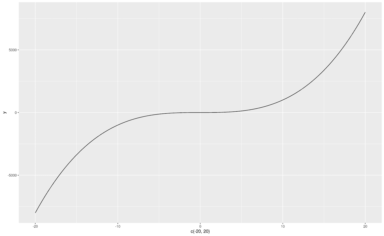
As you can see, since we do not have any data, I created a dataframe that defines the limits of the visualization. The first argument of stat_function is fun, which obviously stands for function. You can can make up your own functions from scratch (as in the example above) or use predefined functions like dnorm to visualize the normal distribution:
ggplot(data.frame(x = c(-3, 3)), aes(x)) +
  stat_function(fun = dnorm,
                geom = "line")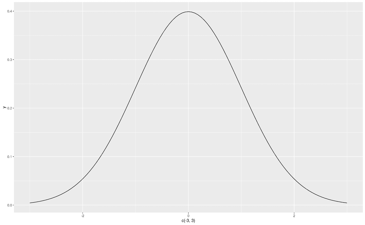
Creating areas under a curve
Now that we know what the fun argument does, let's look at the geom argument. With geom you tell ggplot how to visualize your function. The most common visualizations are probably an area, a line or points. Since we are interested in areas under the curve, let's do that:
ggplot(data.frame(x = c(-3, 3)), aes(x)) +
  stat_function(fun = dnorm,
                geom = "area")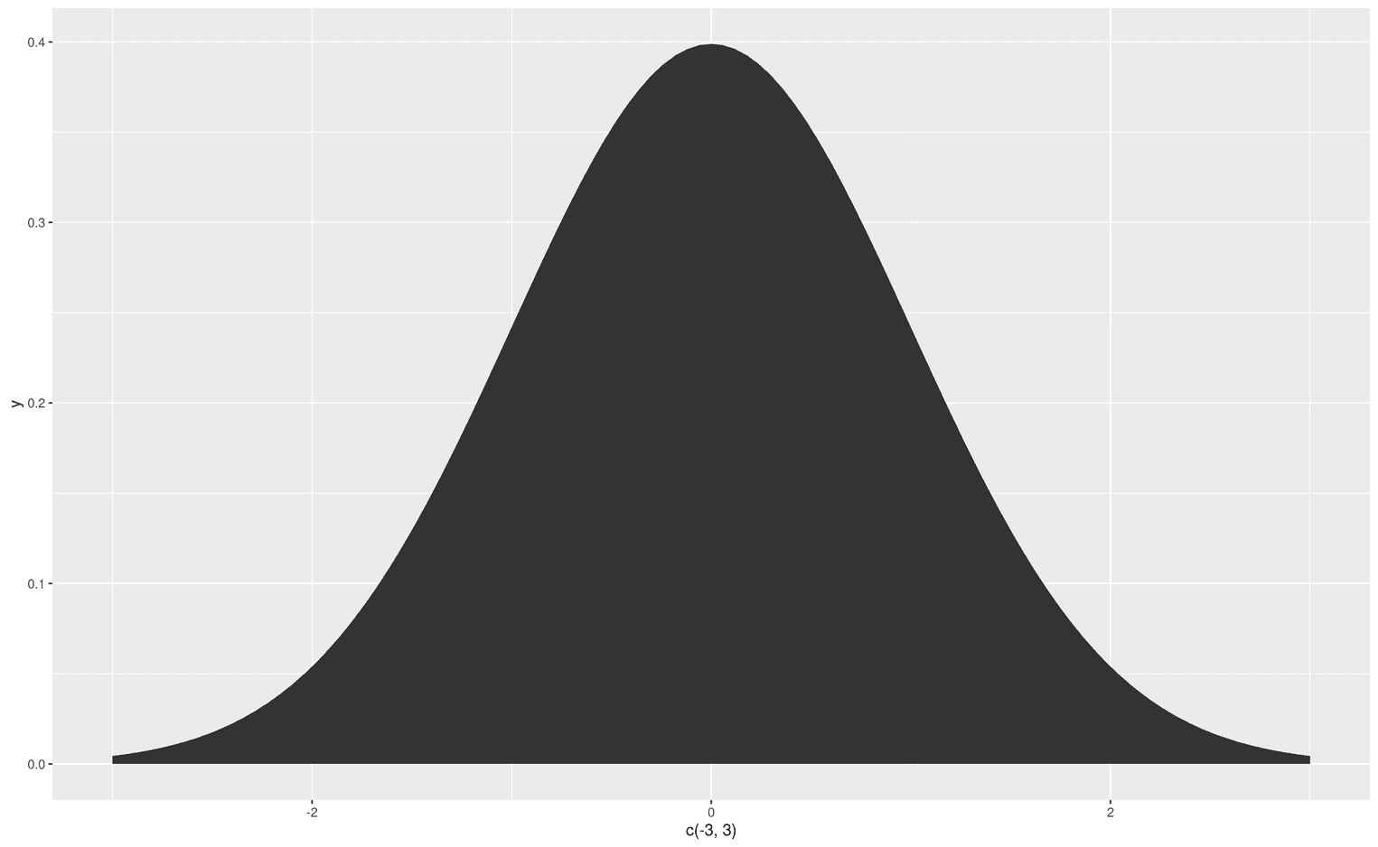
Now that we are able to create an area under the entire curve, we might want to change the color of that area. Since we don't have an aesthetic mapping, we can simply add the argument fill and assign any color to that argument. For example, steelblue:
ggplot(data.frame(x = c(-3, 3)), aes(x)) +
  stat_function(fun = dnorm,
                geom = "area",
                fill = "steelblue")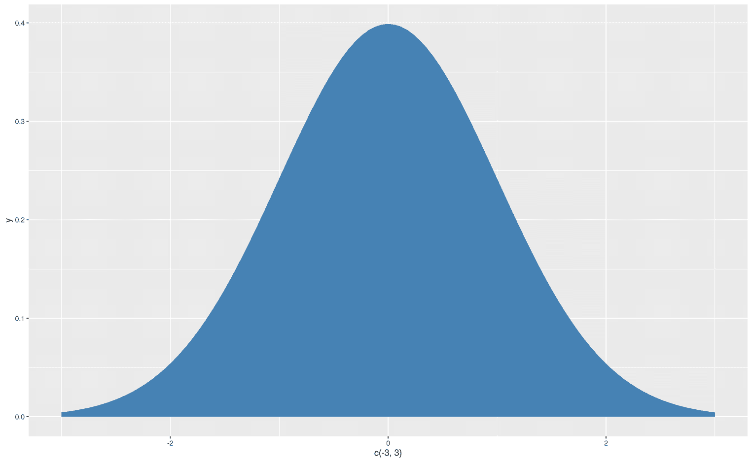
Visualize functions with arguments
But now you might say, that’s all fine, however, some functions have arguments, where should I put them? For such a problem stat_function comes with the args argument:
ggplot(data.frame(x = c(20, 180)), aes(x)) +
  stat_function(fun = dnorm,
                geom = "area",
                fill = "steelblue",
                args = list(
                  mean = 100,
                  sd = 20
                ))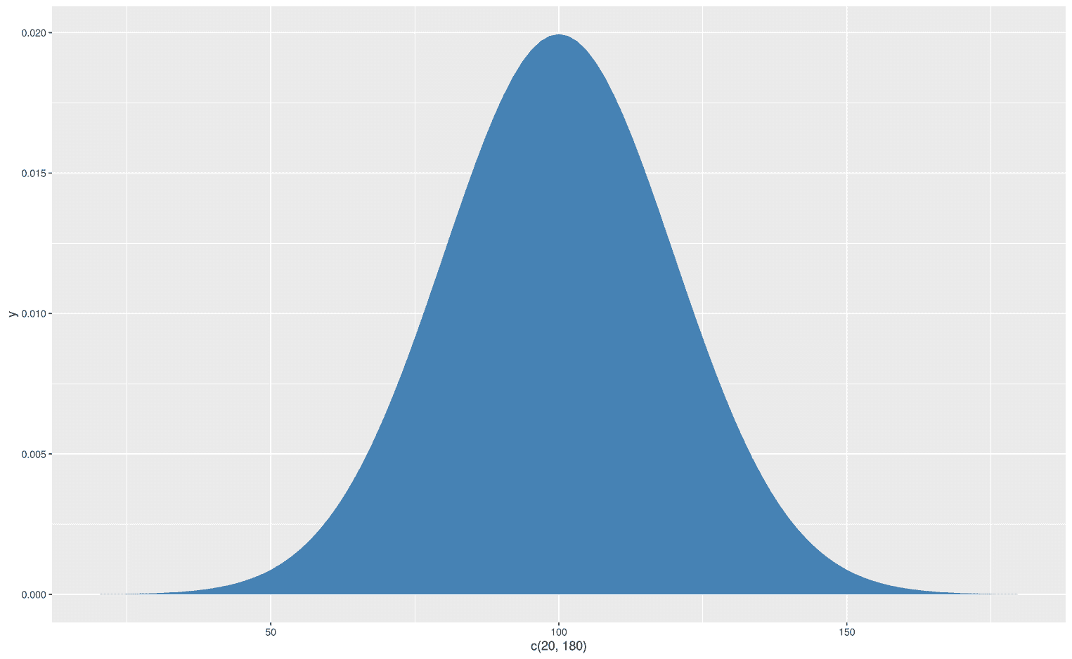
Let's go back a little to understand what happened here. The dnorm function has the arguments, x, mean, and sd (write ?dnorm in your console):
dnorm(x, mean = 0, sd = 1, log = FALSE)Basically, you can set a mean value and standard deviation (sd) for your normal distribution and shift and squeeze them as you wish. To add these arguments to stat_function, you use the args argument, which takes a list. Note that there may be different arguments for each function. In this case, dnorm requires the mean and sd arguments. To change these, we simply add our values to the list.
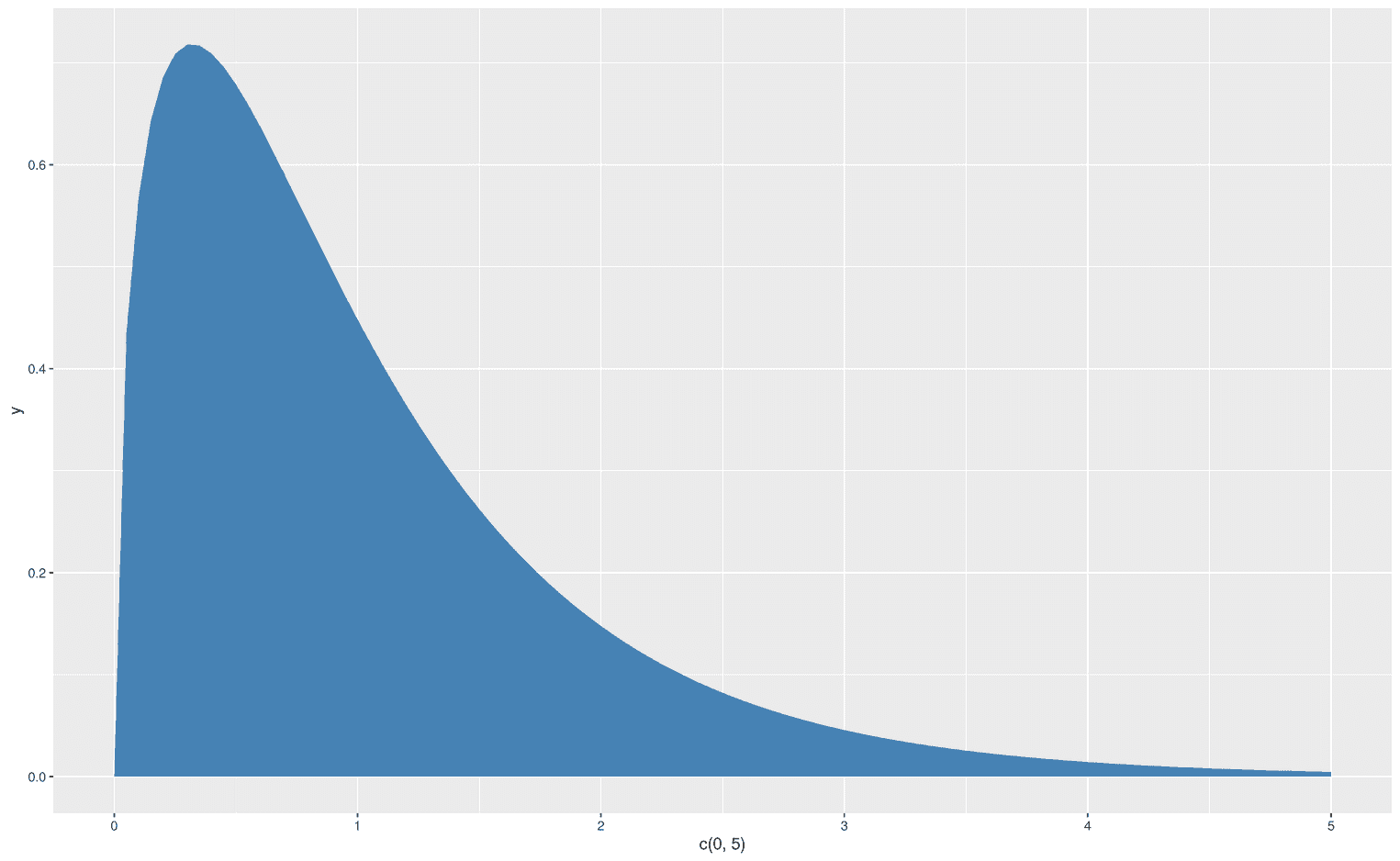
Let's create another example with another function to extrapolate what we have learned. With the function df you can create an F-distribution. Each F-distribution requires at least three arguments, x, df1 and df2:
df(x, df1, df2, ncp, log = FALSE)When we create a particular F distribution with stat_function, we don't need to explicitly add the x argument because it is already provided by the limits of our x axis:
ggplot(data.frame(x = c(0, 5)), aes(x)) +
  stat_function(fun = df,
                geom = "area",
                fill = "steelblue",
                args = list(
                  df1 = 3,
                  df2 = 47
                ))
Adding multiple functions
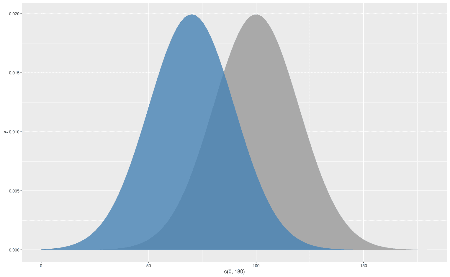
Since ggplot2 follows the grammar of graphics, we can easily stack functions on top of each other. Let's stick to our F-distribution example and add another F-distribution with some other degrees of freedom:
ggplot(data.frame(x = c(0, 5)), aes(x)) +
  stat_function(fun = df,
                geom = "area",
                fill = "darkgrey",
                alpha = 1,
                args = list(
                  df1 = 3,
                  df2 = 47
                )) +
  stat_function(fun = df,
                geom = "area",
                fill = "steelblue",
                alpha = .6,
                args = list(
                  df1 = 4,
                  df2 = 37
                ))
As you can see, I have added an alpha level to the upper distribution to make the lower distribution visible. We could also display two normal distributions with different mean values:
ggplot(data.frame(x = c(0, 180)), aes(x)) +
  stat_function(fun = dnorm,
                geom = "area",
                fill = "darkgrey",
                args = list(
                  mean = 100,
                  sd = 20
                )) +
  stat_function(fun = dnorm,
                geom = "area",
                fill = "steelblue",
                alpha = .8,
                args = list(
                  mean = 70,
                  sd = 20
                ))
But what about specific areas under the curve not the whole curve?
True, sometimes we are only interested in the area under a curve for certain limits on the x-axis. For this we need a simple twist, the xlim argument:
ggplot(data.frame(x = c(-3, 3)), aes(x)) +
  stat_function(fun = dnorm,
                geom = "area",
                fill = "steelblue",
                xlim = c(0, 3))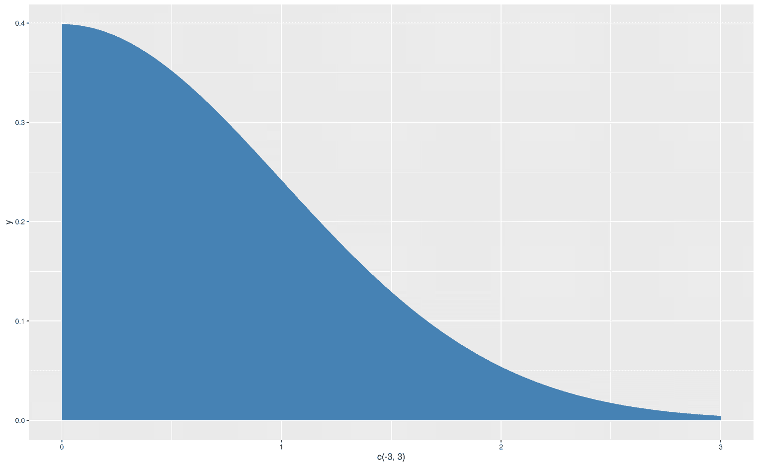
Oh, that didn't work. Somehow ggplot ignored the negative values on my x-axis. But we can easily fix it with the function xlim:
ggplot(data.frame(x = c(-3, 3)), aes(x)) +
  stat_function(fun = dnorm,
                geom = "area",
                fill = "steelblue",
                xlim = c(0, 3)) +
  xlim(-3, 3)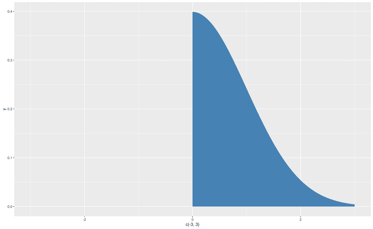
Wow, it worked. We created an area under a curve for certain limits. Let's get more fancy and visualize the left part of the normal distribution, but with a line from -3 to 0:
ggplot(data.frame(x = c(-3, 3)), aes(x)) +
  stat_function(fun = dnorm,
                geom = "line",
                xlim = c(-3, 0)) +
  stat_function(fun = dnorm,
                geom = "area",
                fill = "steelblue",
                xlim = c(0, 3)) +
  xlim(-3, 3)
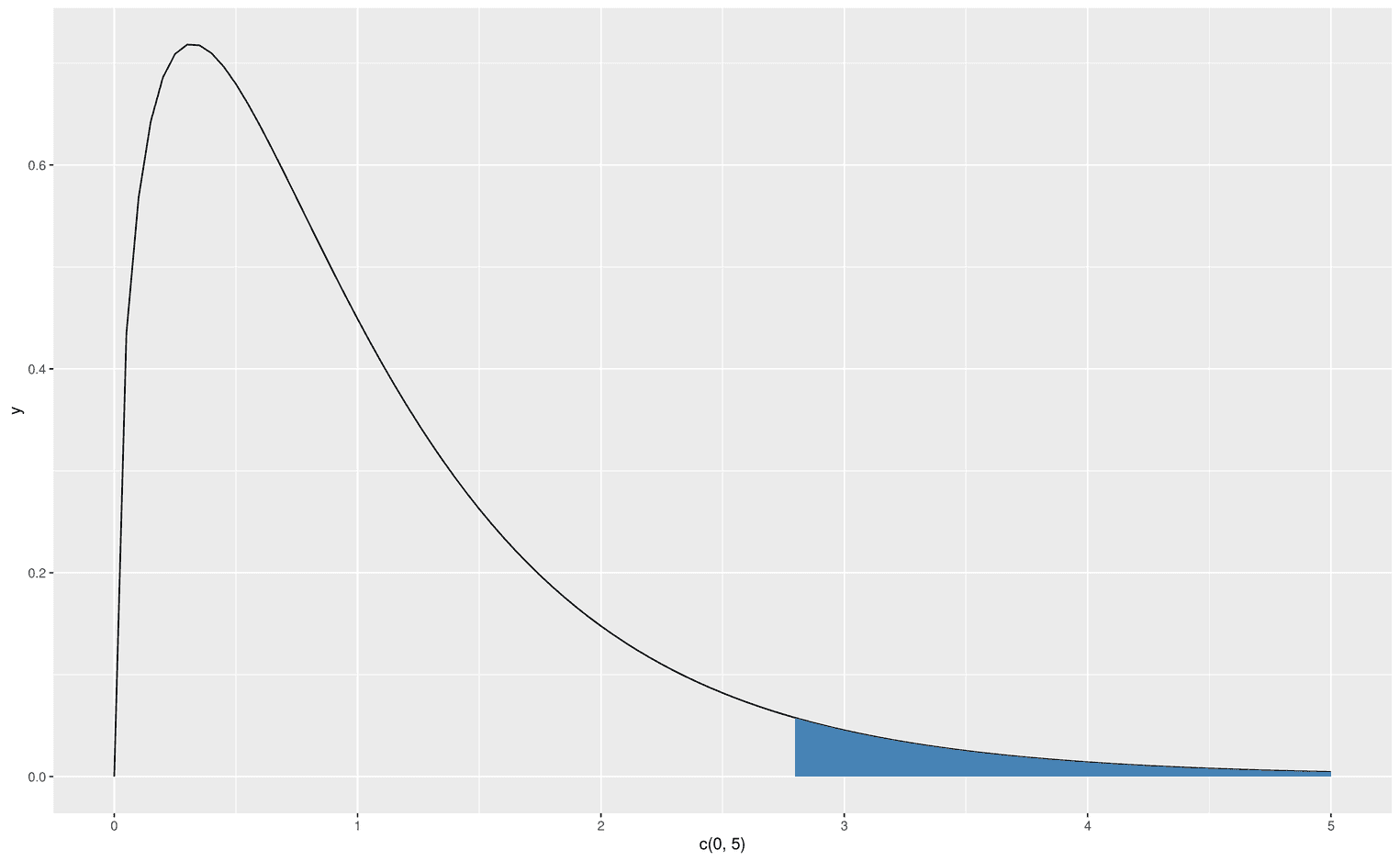
We now have the skillset to create an F-distribution that visualizes its critical area, which leads us to reject the null hypothesis. Let's create an F-distribution with df1 = 3 and d2 = 48. First, we have to find the critical F-value that defines alpha 5%:
(critical_f <- qf(.95, df1 = 3, df2 = 48))[1] 2.798061Now we are ready to visualize the critical area in the F-distribution:
ggplot(data.frame(x = c(0, 5)), aes(x)) +
  stat_function(fun = df,
                geom = "line",
                args = list(
                  df1 = 3,
                  df2 = 49
                )) +
  stat_function(fun = df,
                geom = "area",
                fill = "steelblue",
                xlim = c(critical_f, 5),
                args = list(
                  df1 = 3,
                  df2 = 49
                ))
Visualizing type I and type II errors
At the end of this tutorial we want to tackle an even more difficult problem. In statistics courses, teachers usually have a tough time explaining the concepts of type I and type II errors to their students. While type I errors refer to the false rejection of the null hypothesis given the null hypothesis is true, type II errors refers to the false rejection of the alternative hypothesis given the alternative hypothesis is true. The most difficult thing to understand is to mentally focus on one of these particular hypotheses. While the underlying assumption of the type I error is that the null hypothesis is true, the underlying assumption of the type II error is that the alternative hypothesis is true. We can visualize this fact by adding an area to the true hypothesis and using a more subtle line for the other hypothesis. First, let's visualize the type I error in a standard normal distribution:
ggplot(data.frame(x = c(-3, 5)), aes(x)) +
  stat_function(
    fun = dnorm,
    geom = "area",
    fill = "steelblue",
    alpha = .3
  ) +
  stat_function(
    fun = dnorm,
    geom = "area",
    fill = "steelblue",
    xlim = c(qnorm(.95), 4)
  ) +
  stat_function(
    fun = dnorm,
    geom = "line",
    linetype = 2,
    alpha = .5,
    args = list(
      mean = 2
    )
  ) +
  labs(
    title = "Type I Error",
    x = "z-score",
    y = "Density"
  )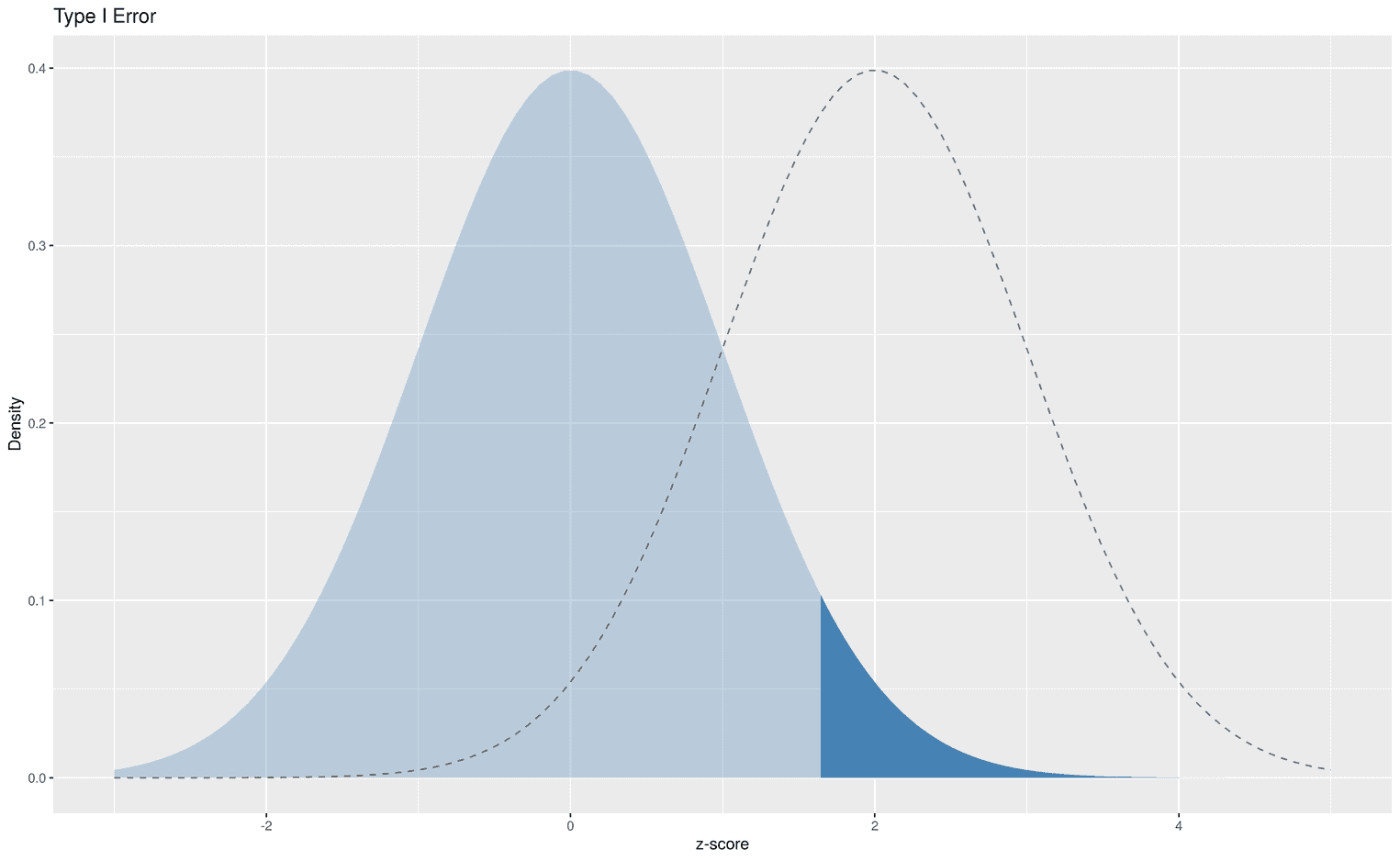
Nothing is really new here, except that we have calculated the critical value that leads us to reject the null hypothesis with the function qnorm. qnorm takes an argument p (for percentile), and returns the corresponding statistic. In this case we have defined an alpha level of 5%, qnorm(.95).
The dark blue area shows all z scores that would lead to a wrong statistical decision, i.e. to prefer the alternative hypothesis over the null hypothesis. We can also visualize the type II error:
ggplot(data.frame(x = c(-3, 5)), aes(x)) +
  stat_function(
    fun = dnorm,
    geom = "line",
    linetype = 2
  ) +
  stat_function(
    fun = dnorm,
    geom = "area",
    fill = "orange",
    args = list(
      mean = 2
    ),
    xlim = c(-2, qnorm(.95))
  ) +
  stat_function(
    fun = dnorm,
    geom = "area",
    linetype = 2,
    fill = "orange",
    alpha = .3,
    args = list(
      mean = 2
    )
  ) +
  labs(
    title = "Type II Error",
    x = "z-score",
    y = "Density"
  )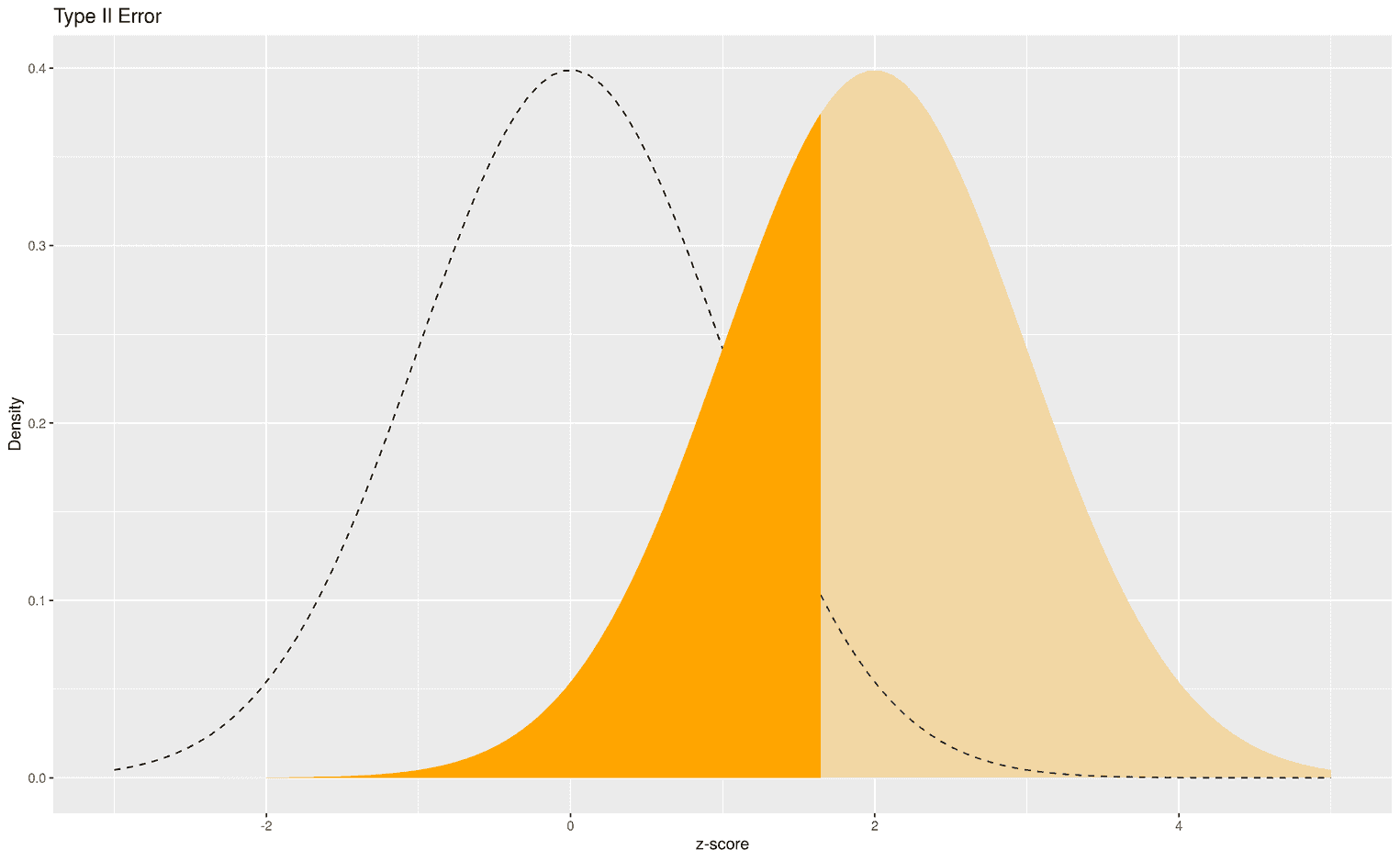
The dark orange area shows all z scores that would lead us to favor the alternative hypothesis over the null hypothesis. This decision would be wrong because the alternative hypothesis is true. So again, we would make a wrong statistical decision based on our empirically calculated z score.
Now you should have enough knowledge to create your own distributions. For example, you could try to visualize the critical area in a t-distribution, or use annotate to add an empirical t-value to the distribution to show whether the result of your experiment is significant or not.
