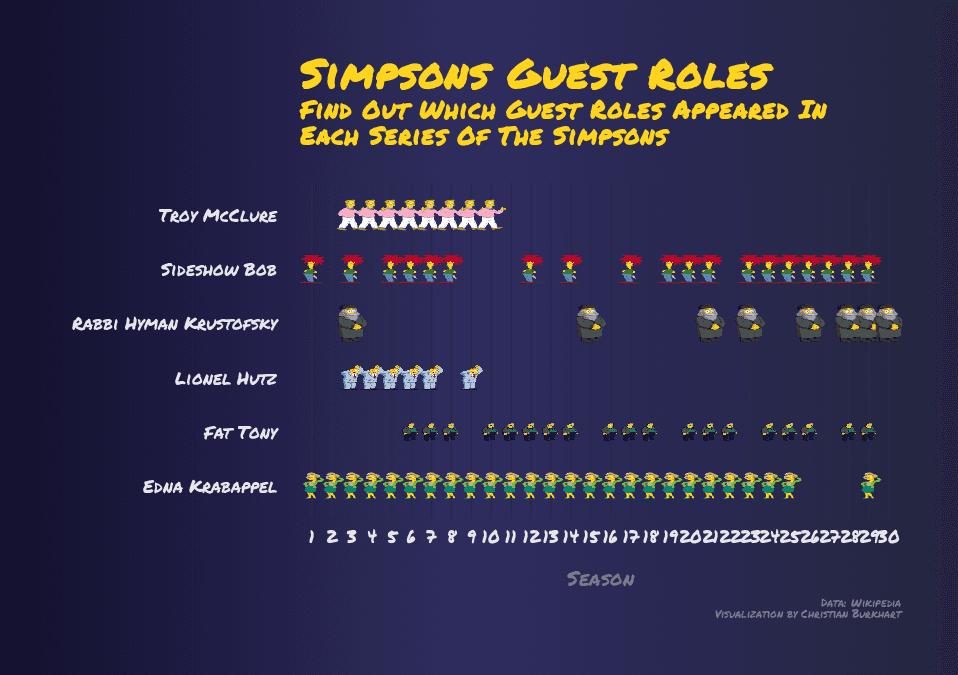
Sometimes images tell a more compelling story than points, lines or barcharts. In this tutorial, we will explore how you can add custom images as geoms to a ggplot. This would not be possible were it not for Gunagchuang Yu who developed the package ggimage. Our goal is to visualize which guest roles appeared in which series of The Simpsons.
The dataset for this visualization comes from the weekly tidytuesday project. The visualization was inspired by visualizations of Gil Henriques and Maggie Wanjiru.
Load data
We need the tidyverse package and the ggimage package to create the visualization:
library(tidyverse)
library(ggimage)
Let's load the data:
simpsons <- readr::read_delim("https://raw.githubusercontent.com/rfordatascience/tidytuesday/master/data/2019/2019-08-27/simpsons-guests.csv", delim = "|", quote = "")
glimpse(simspons, width = 50)
Observations: 1,386
Variables: 6
$ season <chr> "1", "1", "1", "1", "...
$ number <chr> "002–102", "003–103",...
$ production_code <chr> "7G02", "7G03", "7G03...
$ episode_title <chr> "Bart the Genius", "H...
$ guest_star <chr> "Marcia Wallace", "Sa...
$ role <chr> "Edna Krabappel; Ms....Data cleaning
The dataset contains 6 variables. Since we want to visualize in which series the guest roles appeared, we need to count these occurences:
simpsons %>%
  count(season, role, sort = TRUE)
# A tibble: 851 x 3
season role n
<chr> <chr> <int>
1 22 Himself 21
2 14 Himself 19
3 11 Himself 18
4 10 Himself 17
5 23 Himself 17
6 28 Himself 17
7 11 Edna Krabappel 15
8 19 Himself 15
9 21 Himself 15
10 9 Edna Krabappel 14
# ... with 841 more rowsThe only problem is that Himself is not really a telling guest role. It turns out that there are some other guest roles which do not make much sense. Hence, we use the filter function to exclude these rows from the dataset. Mind that in the next code chunk I inserted a ! at the beginning of the filter function. Otherwise we would filter the rows we wish not to include.
simpsons %>%
  filter(!role %in% c("Himself", "Herself",                       "Themselves", "Additional vocals",                      "Dancer"),         season != "Movie") %>%   count(season, role, sort = TRUE)
# A tibble: 779 x 3
season role n
<chr> <chr> <int>
1 11 Edna Krabappel 15
2 9 Edna Krabappel 14
3 12 Edna Krabappel 10
4 21 Edna Krabappel 9
5 10 Edna Krabappel 8
6 14 Edna Krabappel 8
7 20 Edna Krabappel 8
8 3 Edna Krabappel 8
9 5 Edna Krabappel 8
10 15 Edna Krabappel 7
# ... with 769 more rowsThat looks much better. At this point there is a problem that you will encounter only when you plot the visualization. That is, we want to plot the series on the x-axis. Since the variable season is a character, we have to make sure that this variable is a factor and that the levels are in the right order. To do that, we use the fct_inseq function and assign the variable guest_roles_per_season to the dataframe:
guest_roles_per_season <- simpsons %>%   filter(!role %in% c("Himself", "Herself",
                      "Themselves", "Additional vocals",
                      "Dancer"),
         season != "Movie") %>%
  count(season, role, sort = TRUE) %>%
  mutate(    season = season %>% as.factor %>% fct_inseq  )
guest_roles_per_season$season # Levels: 1 2 3 4 5 6 7 ...
We could begin with our visualization, however, we would then run into the following problem:
ggplot(guest_roles_per_season, aes(x = season, y = role))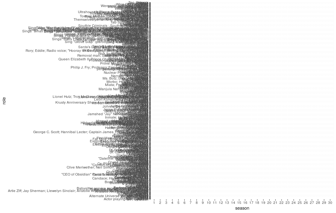
There were just too many guest roles. We need to restrict our visualization to some main guest roles:
guest_roles_per_season <- simpsons %>%
  filter(!role %in% c("Himself", "Herself",
                      "Themselves", "Additional vocals",
                      "Dancer"),
         season != "Movie") %>%
  count(season, role, sort = TRUE) %>%
  mutate(
    season = season %>% as.factor %>% fct_inseq
  ) %>%
  filter(role %in% c("Rabbi Hyman Krustofsky",                     "Lionel Hutz",                     "Troy McClure",                     "Sideshow Bob",                     "Fat Tony",                     "Edna Krabappel"))
Adding images to the dataset
ggimage has a function geom_image. geom_image works just like any other geom but with an extra aesthetic called image. The image can either be an url or a path to an image from the current working directory. Let's add these images with the case_when function:
guest_roles_per_season <- simpsons %>%
  filter(!role %in% c("Himself", "Herself",
                      "Themselves", "Additional vocals",
                      "Dancer"),
         season != "Movie") %>%
  count(season, role, sort = TRUE) %>%
  mutate(
    season = season %>% as.factor %>% fct_inseq
  ) %>%
  filter(role %in% c("Rabbi Hyman Krustofsky",
                     "Lionel Hutz",
                     "Troy McClure",
                     "Sideshow Bob",
                     "Fat Tony",
                     "Edna Krabappel")) %>%
  mutate(    image = case_when(      role == "Rabbi Hyman Krustofsky" ~ "rabbi_small.png",      role == "Lionel Hutz" ~ "hutz_small.png",      role == "Troy McClure" ~ "troy_small.png",      role == "Sideshow Bob" ~ "bob_small.png",      role == "Fat Tony" ~ "fat_tony_small.png",      role == "Edna Krabappel" ~ "edna_small.png"    )  )
I tried to make the images small, otherwise rendering the plot would cause a delay. Now we can start creating the visualization.
First visualization
Let's start with the simplest visualization. We define the x- and y-axis and add an empty plot:
ggplot(guest_roles_per_season, aes(x = season, y = role)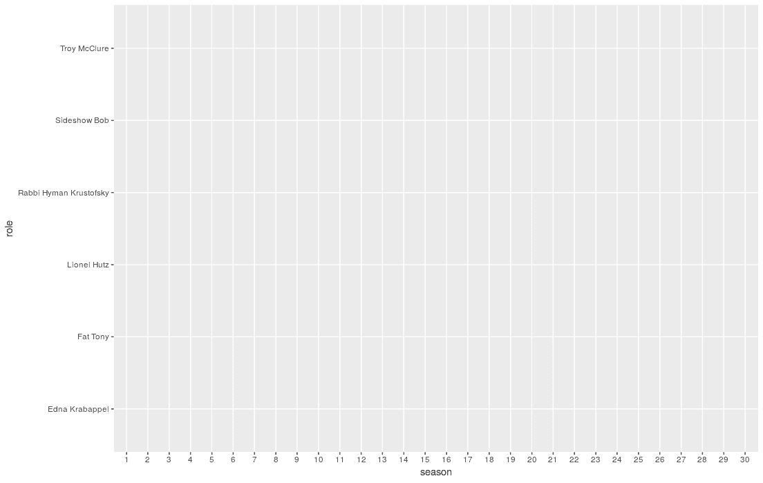
The order of the x-axis is correct and we can find the labels of our guest roles on the y-axis. Next, we add the images of our guest roles:
ggplot(guest_roles_per_season, aes(x = season, y = role)) +
geom_image(aes(image = image)) 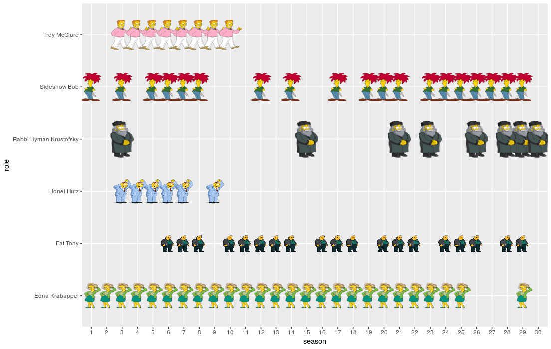
The images are not of the same height. You could do with some other software. For now let's agree that the images could be better in terms of their size and carry on.
Adding labels
Next, we need the title, axis titles, caption and subtitle of your plot. In the following code chunk you can see some interesting details. First, I used the str_to_title function to convert each first character of a word to uppercase. I also used the \n command within the subtitle string to enforce a line break.
ggplot(guest_roles_per_season, aes(x = season, y = role)) +
  geom_image(aes(image = image)) +
theme_minimal() + labs( title = "Simpsons Guest Roles", subtitle = str_to_title("Find out which guest roles appeared in\neach series of the Simpsons"), caption = "Data: Wikipedia\nVisualization by Christian Burkhart", x = "Season", y = "" ) 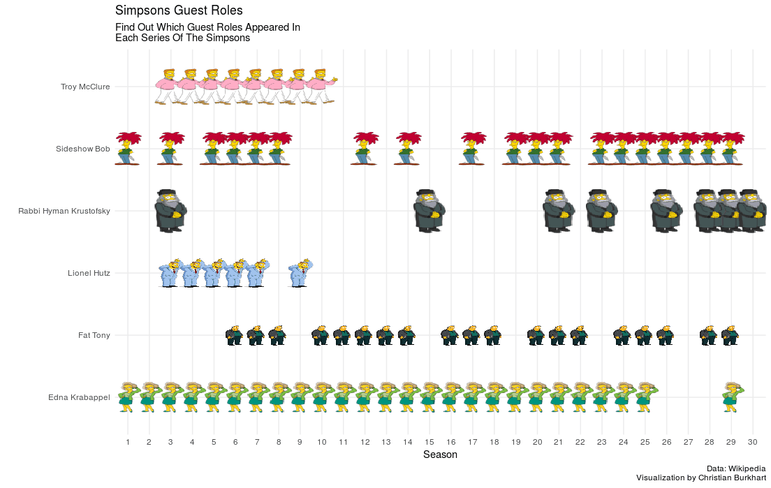
Changing the font
The Simpsons use a handwritten font. I did some research online and found that the font Permanent Marker resembles the Simpsons font a little bit. Download the font and then add the font family to your plot using the theme function. In addition, let's change the size of the fonts to make them more readable. In addition, let's make the title and the subtitle bold:
ggplot(guest_roles_per_season, aes(x = season, y = role)) +
  geom_image(aes(image = image)) +
  theme_minimal() +
  labs(
    title = "Simpsons Guest Roles",
    subtitle = str_to_title("Find out which guest roles appeared in\neach series of the Simpsons"),
    caption = "Data: Wikipedia\nVisualization by Christian Burkhart",
    x = "Season",
    y = ""
  ) +
theme( plot.title = element_text(size = 30, face = "bold", family = "Permanent Marker"), plot.subtitle = element_text(size = 18, face = "bold", family = "Permanent Marker"), plot.caption = element_text(size = 8, family = "Permanent Marker"), axis.text = element_text(family = "Permanent Marker", size = 13), axis.title.x = element_text(size = 15, family = "Permanent Marker") ) 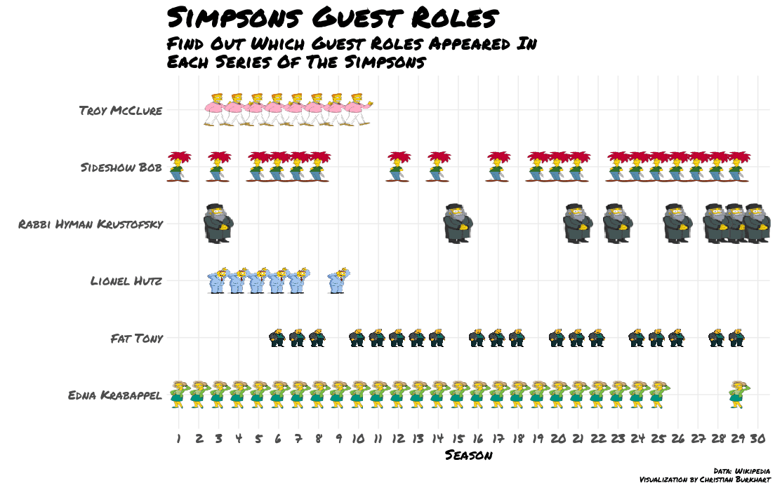
Add space
The visualization still looks a little bit cluttered. With the theme function we can also add some margin to every element of the visualization. The margin function allows us to set a top, bottom, left, and right margin to each element. Let's do that:
ggplot(guest_roles_per_season, aes(x = season, y = role)) +
  geom_image(aes(image = image)) +
  theme_minimal() +
  labs(
    title = "Simpsons Guest Roles",
    subtitle = str_to_title("Find out which guest roles appeared in\neach series of the Simpsons"),
    caption = "Data: Wikipedia\nVisualization by Christian Burkhart",
    x = "Season",
    y = ""
  ) +
  theme(
    plot.margin = unit(rep(1.5, 4), "cm"),    plot.title = element_text(size = 30,
                              face = "bold",
                              family = "Permanent Marker",
                              margin = margin(b = 5)),    plot.subtitle = element_text(size = 18,
                                 face = "bold",
                                 family = "Permanent Marker",
                                 margin = margin(b = 25)),    axis.text = element_text(family = "Permanent Marker",
                             size = 13),
    axis.text.y = element_text(margin = margin(r = 15)),    axis.text.x = element_text(margin = margin(t = 5, b = 15)),    axis.title.x = element_text(size = 15,
                                family = "Permanent Marker"),
    plot.caption = element_text(size = 8,
                                family = "Permanent Marker")
) 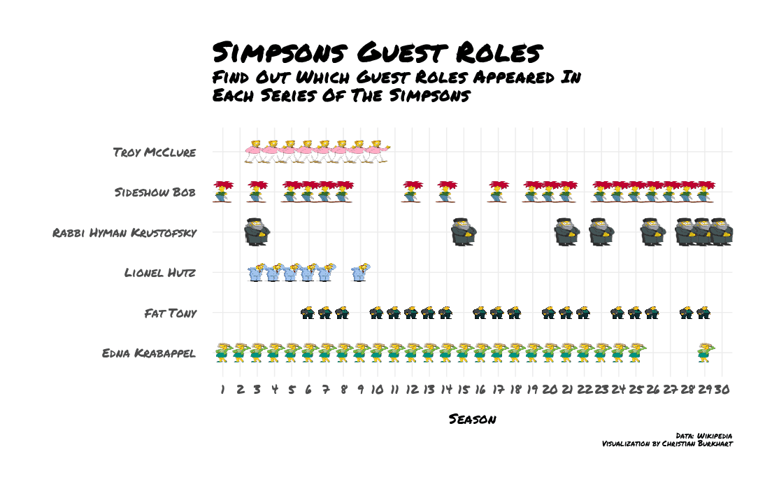
Mind that I also added a margin to the whole plot: plot.margin = unit(rep(1.5, 4), "cm"). You could also write plot.margin = margin(1.5, 1.5, 1.5, 1.5, "cm"). Since I am lazy I used the rep function so I did not have to repeat 1.5 five times.
Adding a background
If you google Simpsons images you find that many have a blue blackground. This time I did not want to add a single uniform background color. Instead I wanted to add a gradient as a background. An easy way to do that is to use the ggbackground function of ggimage. ggbackground takes an ggplot object and then adds a backround image to the whole visulization. I borrowed the gradient from the uiGradients website and took a screenshot.
p <- ggplot(guest_roles_per_season, aes(x = season, y = role)) +  geom_image(aes(image = image)) +
  theme_minimal() +
  # Insert labs from previous visualization here
  theme(
    plot.margin = unit(rep(1.5, 4), "cm"),
    plot.title = element_text(size = 30,
                              face = "bold",
                              family = "Permanent Marker",
                              margin = margin(b = 5)),
    plot.subtitle = element_text(size = 18,
                                 face = "bold",
                                 family = "Permanent Marker",
                                 margin = margin(b = 25)),
    axis.text = element_text(family = "Permanent Marker",
                             size = 13),
    axis.text.y = element_text(margin = margin(r = 15)),
    axis.text.x = element_text(margin = margin(t = 5, b = 15)),
    axis.title.x = element_text(size = 15,
                                family = "Permanent Marker"),
    plot.caption = element_text(size = 8,
                                family = "Permanent Marker")
  )

ggbackground(p, "gradientblue.png", by = "width")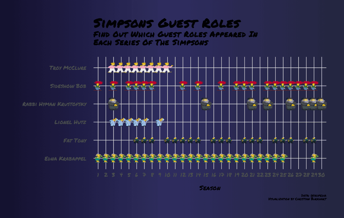
Adjusting colors
Finally, we need to adjust the colors. A visualization about The Simpsons must have a yellow color. There are some color palettes online. I really liked this yellow. A common mistake is to make axis colors straight black or white. However, it is usually more appealing to add a tiny shade of the background color to a text. Hence, I used a subtle blue to the axis text. In addition, we can remove the horizontal grid lines since it is very easy to spot which guest role belongs to which image. To do it you can just remove the horizontal grid lines: panel.grid.major.y = element_blank(). Let's apply these changes:
p <- ggplot(guest_roles_per_season, aes(x = season, y = role)) +
  geom_image(aes(image = image)) +
  theme_minimal() +
  # Insert labs from previous visualization here
  theme(
    plot.margin = unit(rep(1.5, 4), "cm"),
    plot.title = element_text(size = 30,
                              face = "bold",
                              family = "Permanent Marker",
                              margin = margin(b = 5),
                              color = "#FED41D"),    plot.subtitle = element_text(size = 18,
                                 face = "bold",
                                 family = "Permanent Marker",
                                 margin = margin(b = 25),
                                 color = "#FED41D"),    panel.grid.major.y = element_blank(),    panel.grid.major.x = element_line(color = "#2f2c4c"),    axis.text = element_text(family = "Permanent Marker",
                             size = 13,
                             color = "#e8e7eb"),    axis.text.y = element_text(margin = margin(r = 15)),
    axis.text.x = element_text(margin = margin(t = 5, b = 15)),
    axis.title.x = element_text(size = 15,
                                family = "Permanent Marker",
                                color = "#757288"),    plot.caption = element_text(size = 8,
                                family = "Permanent Marker",
                                color = "#757288")  )

ggbackground(p, "gradientblue.png", by = "width")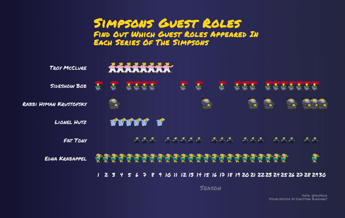
We made it. I hope you learned a lot with this tutorial. Happy coding.
