When we communicate through visualizations, we usually want to make certain ideas understandable. For example, we might want to show a result of an experiment where we found out that groups differ in a certain variable. Traditionally, we use the mean or the median of a variable to do that. Such summary statistics help our users to compare categorical variables like groups by distinct values. Think of the comparison of life expectancy between countries. We do not need to know every single person to communicate the fact that countries' life expectancies differ.
We are very familiar with such summary statistics. Campaign results are usually communicated in relative frequencies. Party A got 37% of the votes, while party B got 18% of the votes. In science we always use summary statistics at conferences to communicate our results. However, experienced conference attendees usually expect not only individual summary statistics, but also measures of uncertainty such as confidence intervals or standard deviations. These measures of uncertainty allow users to understand how much our variables vary. For example, there are countries with a low variation in life expectancy, while in other countries the variation is very high.
Although summary statistics are probably the most natural and common form of communication for scientific and non-scientific results, they are not easy to implement in ggplot2 if you don't know how. For example, I often used to create my own dataframes of summary statistics in order to visualize them as a bar chart:
diamonds %>%
  group_by(cut) %>%
  summarise(mean = mean(price)) %>%
  ggplot(aes(x = cut, y = mean)) +
  geom_col()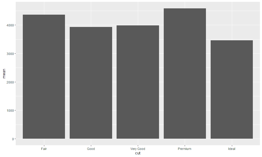
This approach works, but it is not the most efficient. First, I create code that I wouldn't need if I could do the calculations directly with ggplot2. On the other hand, the calculation can become relatively complex, especially if I want to visualize confidence intervals.
Point estimates with stat_summary
Fortunately, the developers of ggplot2 have thought about the problem of how to visualize summary statistics deeply. The solution is the function stat_summary. Even if you don't know the function yet, you've encountered a similar implementation before. Imagine you want to visualize a bar chart. To visualize a bar chart, we will use the gapminder dataset, which contains data on peoples' life expectancy in different countries.
library(tidyverse)
library(gapminder)

gapminder
# A tibble: 1,704 x 6
country continent year lifeExp pop gdpPercap
<fct> <fct> <int> <dbl> <int> <dbl>
1 Afghanistan Asia 1952 28.8 8425333 779.
2 Afghanistan Asia 1957 30.3 9240934 821.
3 Afghanistan Asia 1962 32.0 10267083 853.
4 Afghanistan Asia 1967 34.0 11537966 836.
5 Afghanistan Asia 1972 36.1 13079460 740.
6 Afghanistan Asia 1977 38.4 14880372 786.
7 Afghanistan Asia 1982 39.9 12881816 978.
8 Afghanistan Asia 1987 40.8 13867957 852.
9 Afghanistan Asia 1992 41.7 16317921 649.
10 Afghanistan Asia 1997 41.8 22227415 635.
# … with 1,694 more rowsgapminder %>%
ggplot(aes(x = year, y = lifeExp)) +
geom_col()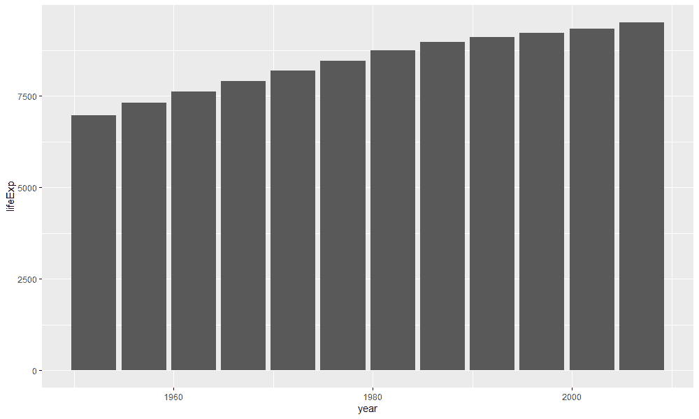
As you can see, life expectancy has increased in recent decades. However, the bar chart does not show the mean or median life expectancy for all countries, but the sum of life expectancies for each country and year. This sum was not calculated by you, but by ggplot2 in the background.
However, there is a possibility to calculate the average life expectancy of countries for each year using geom_bar. All we have to do is specify a function that we want to calculate for the variable on the y-axis and additionally specify the argument stat = "summary" (find the link to this tip here).
gapminder %>%
  ggplot(aes(x = year, y = lifeExp)) +
  geom_bar(fun = "mean", stat = "summary")
But our hands are tied with this implementation. For example, we cannot display the data as points or lines because they were created with the geom_bar. That's why stat_summary is so powerful. stat_summary allows us to display any kind of summary statistics through different visualizations. No matter if we want to visualize points, lines, or areas. For example, take a look at the next visualization, which yields the same result as the previous visualization.
gapminder %>%
  ggplot(aes(x = year, y = lifeExp)) +
  stat_summary(fun = "mean", geom = "bar")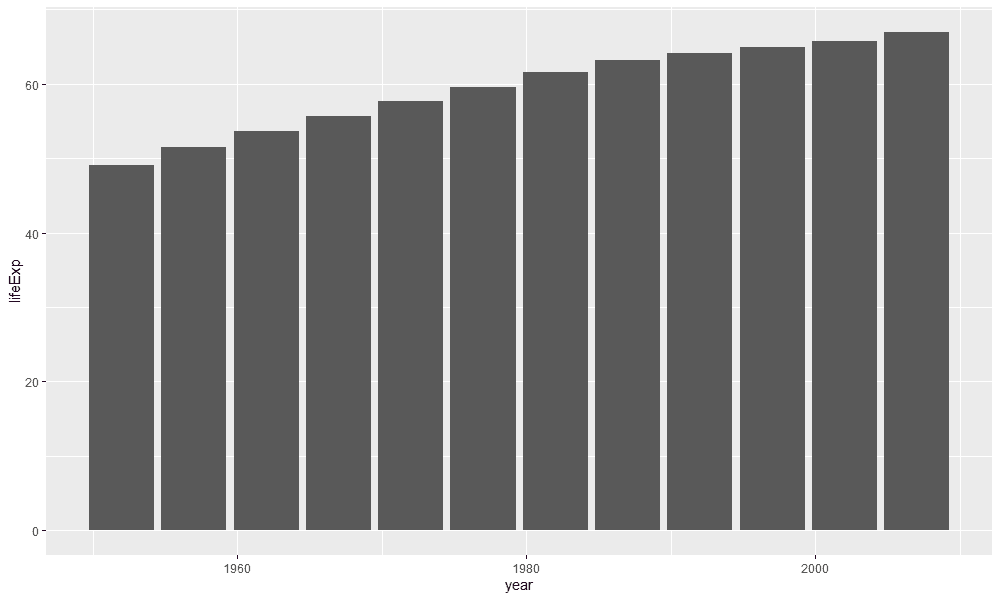
In this example, we passed two arguments to the stat_summary function. First, we told stat_summary with fun.y = mean that we want to calculate the mean value for the variable lifeExp. Using the argument geom = "bar" we told stat_summary to display the mean value as a bar chart. So we are no longer bound to a certain form of encoding and therefore have more freedom.
We might as well say we want to create a line chart instead of a bar chart and add individual points of the mean for each year to improve the readability of the visualization:
gapminder %>%
  ggplot(aes(x = year, y = lifeExp)) +
  stat_summary(fun = "mean", geom = "point") +
stat_summary(fun = "mean", geom = "line") 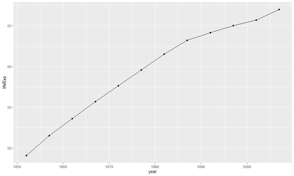
From this example you can see that we can also merge several stat_summaries together. The only change compared to the previous example is that we changed the geom. Instead of bar we now use point and line.
Another idea is that we can change the summary statistics. Perhaps life expectancy varies very widely between countries and we would therefore like to represent the median rather than the mean:
gapminder %>%
  ggplot(aes(x = year, y = lifeExp)) +
  stat_summary(fun = "median", geom = "bar")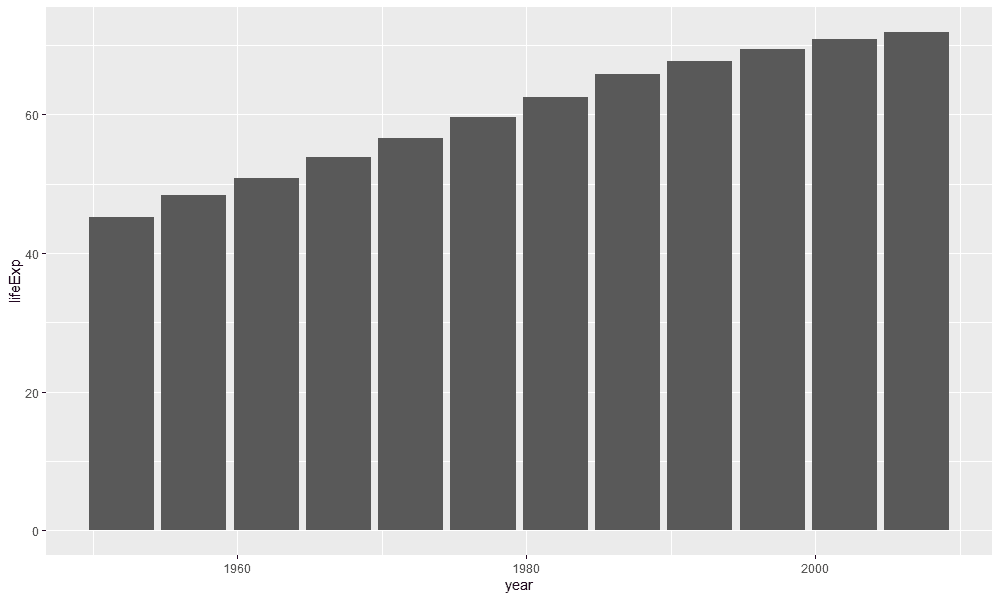
You could also use stat_summary to display an area instead of a line and a point:
gapminder %>%
  mutate(year = as.integer(year)) %>%
  ggplot(aes(x = year, y = lifeExp)) +
  stat_summary(fun = "mean", geom = "area",
               fill = "#EB5286",
               alpha = .5) +
  stat_summary(fun = "mean", geom = "point",
color = "#6F213F") 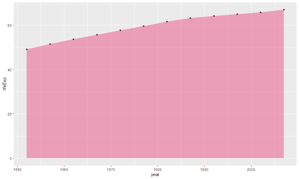
Minimum and maximum
With point estimates we could already create visualizations that we can show at conferences or in magazines. However, individual summary_statistics are only a part of the whole truth. Each distribution varies. Not all people have the same height for example. To visualize uncertainty in the data, errorbars are usually displayed. In science, confidence intervals or standard deviations are very popular, while in other areas the maximum and minimum values are of interest.
Let's start with an example. You want to visualize the average life expectancy of countries per year and at the same time the highest and lowest life expectancy per year:
gapminder %>%
  ggplot(aes(x = year, y = lifeExp)) +
  stat_summary(fun = mean,
               geom = "pointrange",
               fun.min = min,
               fun.max = max)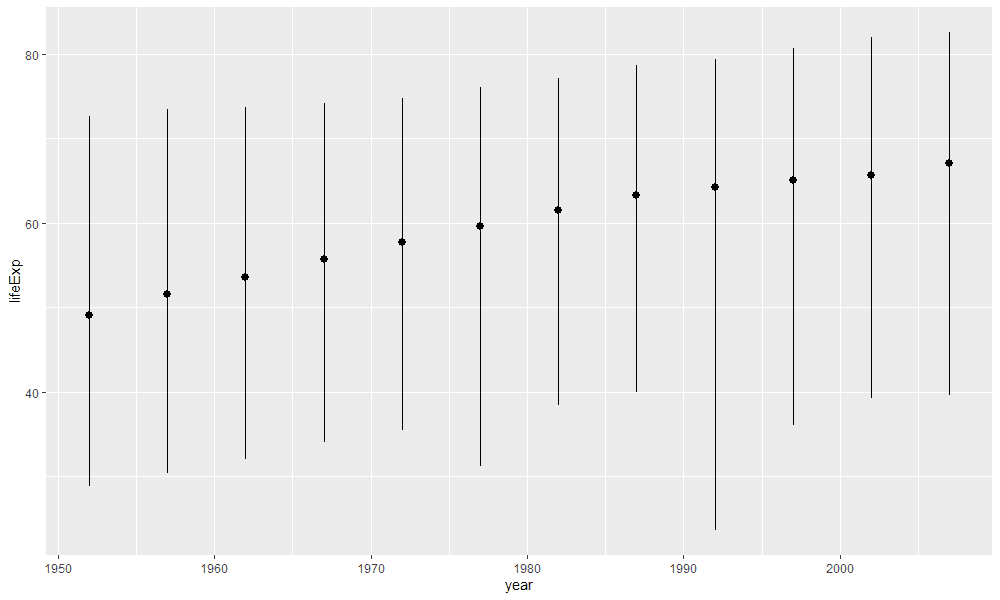
We have to make three changes to display the maximum and minimum values. First, we need to determine what we display at the bottom of the distribution. In this example, we specify that we want to display the minimum value of the distribution: fun.ymin = min. We also specify the maximum value with fun.ymax = max. You might not know the geom pointrange. Pointranges indicate variation by strokes with a dot in the middle.
We could also use a classic errorbar to display the maximum and minimum values:
gapminder %>%
  ggplot(aes(x = year, y = lifeExp)) +
  stat_summary(geom = "errorbar",
               width = 1,
               fun.min = min,
               fun.max = max)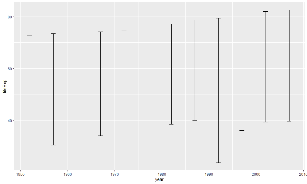
The only difference is that now we can use the geom errorbar and do not need the function fun.y because errorbars do not include points at the center. In addition, with width = 1 we specify how wide the horizontal lines on the errorbar should be.
Standard deviations, standard errors, and confidence intervals
Traditionally, however, we do not represent minimum and maximum values, but the standard deviation, the standard error or confidence intervals. We can display these just as easily. Look at the following example where we have presented the standard deviation of life expectancy per year:
gapminder %>%
  ggplot(aes(x = year, y = lifeExp)) +
  stat_summary(fun.data = "mean_sdl",
               fun.args = list(
                 mult = 1
               ))
A few things have changed in this example. First we no longer use the arguments fun.y, fun.ymax or fun.ymin. Instead we have an argument called fun.data. We add a function to the argument fun.data. This function takes the data and creates a new dataframe with approximately the following structure:
# A tibble: 12 x 4
    year     y  ymin  ymax
   <int> <dbl> <dbl> <dbl>
 1  1952  49.1  36.8  61.3
 2  1957  51.5  39.3  63.7
 3  1962  53.6  41.5  65.7
 4  1967  55.7  44.0  67.4
 5  1972  57.6  46.3  69.0
 6  1977  59.6  48.3  70.8
 7  1982  61.5  50.8  72.3
 8  1987  63.2  52.7  73.8
 9  1992  64.2  52.9  75.4
10  1997  65.0  53.5  76.6
11  2002  65.7  53.4  78.0
12  2007  67.0  54.9  79.1
However, we don't have to write this function ourselves, since it has already been written by other developers. More precisely, we use functions from the package Hmisc. mean_sdl is one of these functions and calculates the standard deviation of the data. However, mean_sdl calculates the double standard deviation. Which multiple of the standard deviation you want can be specified with the argument mult. The trick here is that we can address the arguments of the function via stat_summary with the argument fun.args. fun.args takes a list of the various arguments and passes them to the mean_sdl function.
However, we could have create the same visualization by calculating the standard deviation ourselves:
gapminder %>%
  ggplot(aes(x = year, y = lifeExp)) +
  stat_summary(fun = mean,
               geom = "pointrange",
               fun.max = function(x) mean(x) + sd(x),
               fun.min = function(x) mean(x) - sd(x))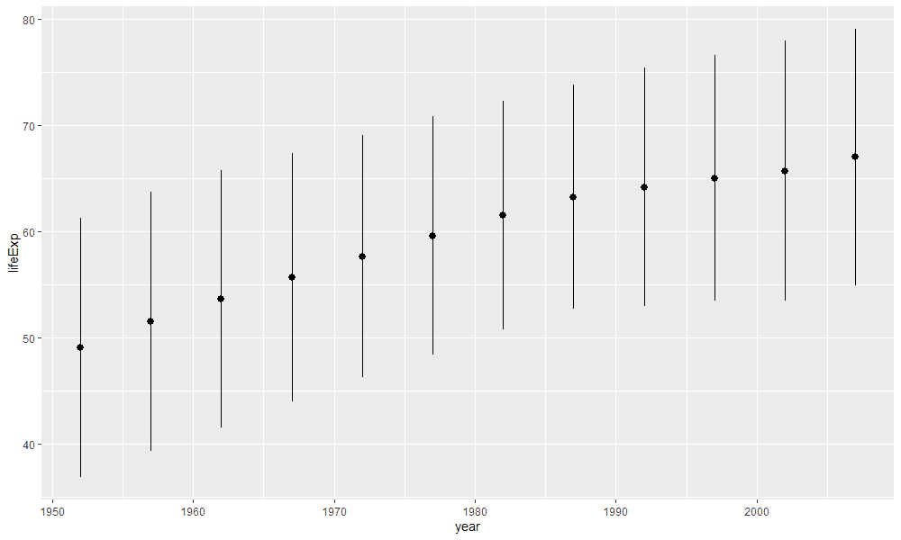
Another typical representation are standard errors. I haven't found a function that we can use to calculate standard errors, but the formula is not very complicated and we can use the same logic to represent the standard error instead of the standard deviation:
gapminder %>%
  ggplot(aes(x = year, y = lifeExp)) +
  stat_summary(fun = mean,
               geom = "pointrange",
               fun.max = function(x) mean(x) + sd(x) / sqrt(length(x)),
               fun.min = function(x) mean(x) - sd(x) / sqrt(length(x)))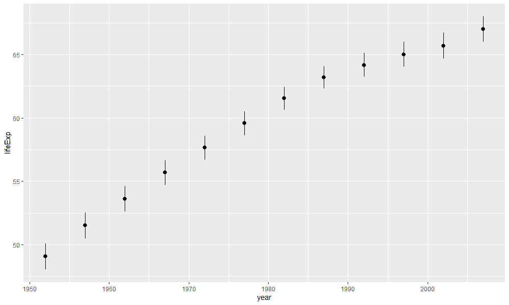
The classic, however, is 95% confidence intervals. Again there is a function in Hmisc with which we can display confidence intervals: mean_cl_normal and mean_cl_boot:
gapminder %>%
  ggplot(aes(x = year, y = lifeExp)) +
  stat_summary(fun.data = "mean_cl_normal")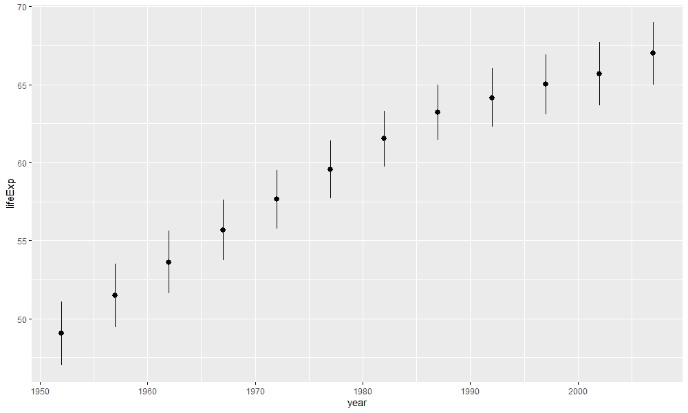
The example also shows that the geom_pointrange is added automatically if we don't display another one. We could just as well display errorbars by changing the geom:
gapminder %>%
  ggplot(aes(x = year, y = lifeExp)) +
  stat_summary(fun.data = "mean_cl_normal",
               geom = "errorbar",
               width = .4) +
  stat_summary(fun = "mean", geom = "point")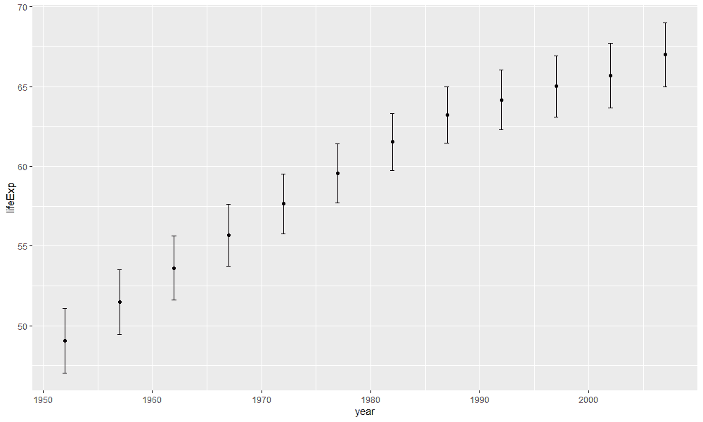
Yet, we do not always trust functions and want to make sure that we calculate the right confidence intervals. So let's try to calculate the confidence intervals by hand first using the critical t-value:
gapminder %>%
  ggplot(aes(x = year, y = lifeExp)) +
  stat_summary(fun = mean,
               geom = "pointrange",
               fun.max = function(x) mean(x) +
                 qt(.975, df = length(x)) * sd(x) / sqrt(length(x)),
               fun.min = function(x) mean(x) -
                 qt(.975, df = length(x)) * sd(x) / sqrt(length(x)))
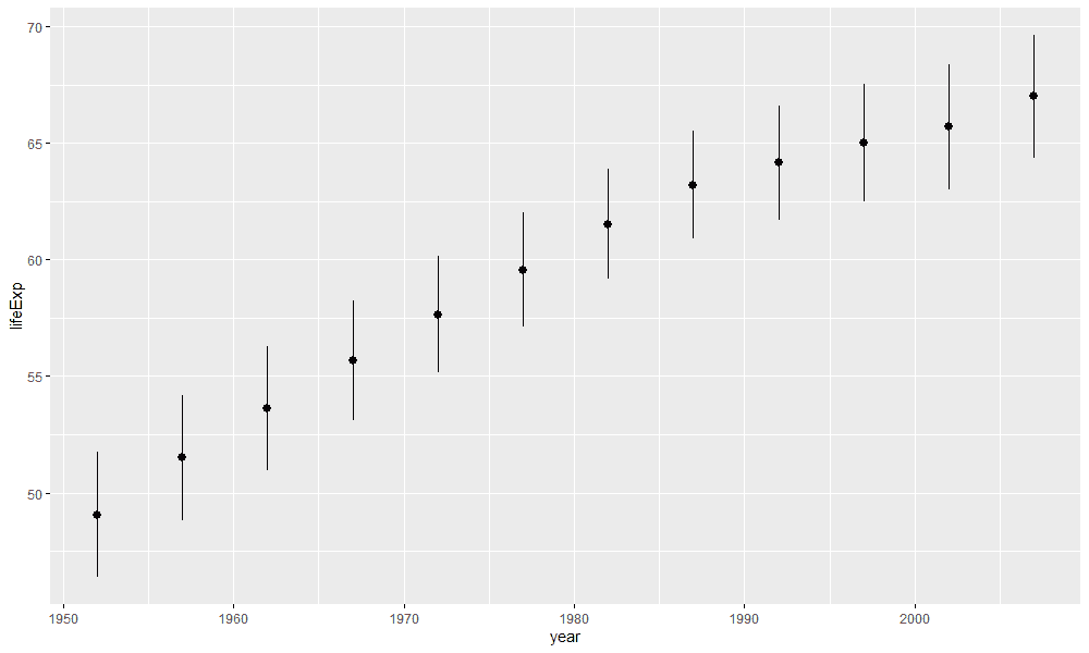
This visualization is identical to the one in which we used mean_cl_normal. The only difference is that we calcluated the confidence intervals by hand. It would be tedious to change the code everytime we want to change the width of the confidence interval. Let's assume you want to display 99% confidence intervals. To do that, you would first need to find the critical t-value associated with a 99% confidence interval and then add the t-value to fun.ymax and fun.ymin. Luckily, the mean_cl_normal function has an argument to change the width of the confidence interval: conf.int:
gapminder %>%
  ggplot(aes(x = year, y = lifeExp)) +
  stat_summary(fun.data = "mean_cl_normal",
               fun.args = list(
                 conf.int = .99
               ))
Combine summary statistics with multiple geoms
We can go one step further by considering how we can combine several of these ideas. The next logical step would be to display bar charts with confidence intervals. This kind of encoding is very popular in science. We don't have to learn anything new to visualize this, we just have use what we have already learned:
gapminder %>%
  filter(year == 2007) %>%
  ggplot(aes(x = continent, y = lifeExp)) +
  stat_summary(fun = "mean", geom = "bar", alpha = .7) +
  stat_summary(fun = "mean", geom = "point",
               size = 1) +
  stat_summary(fun.data = "mean_cl_normal",
               geom = "errorbar",
width = .2) 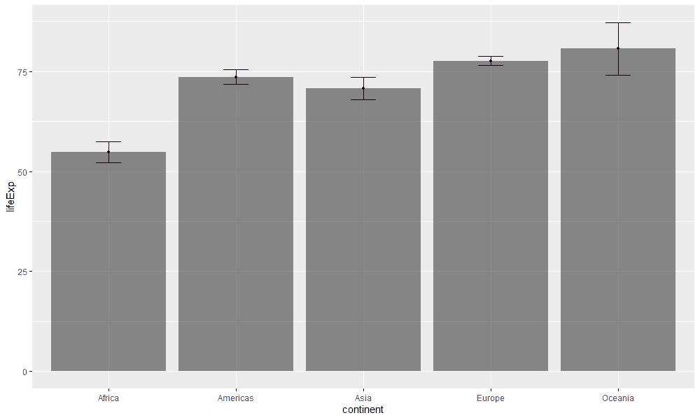
If you are wondering how to change the order of the bars, I recommend the function fct_relevel. Also note that in this visualization we have only shown the life expectancy of the year 2007 (more about the function filter can be found here).
Sometimes, however, one does not want to represent a single factor, such as the continent of a country, but two factors by displaying several bar charts side by side. We can do this by adding the argument fill and displaying the bars side by side with the command position = position_dodge():
gapminder %>%
  mutate(
    year = as.factor(year)
  ) %>%
  ggplot(aes(x = continent, y = lifeExp, fill = year)) +
  stat_summary(fun = "mean", geom = "bar",
               alpha = .7, position = position_dodge(0.95)) +
  stat_summary(fun = "mean", geom = "point",
               position = position_dodge(0.95),
               size = 1) +
  stat_summary(fun.data = "mean_cl_normal",
               geom = "errorbar",
               position = position_dodge(0.95),
width = .2) 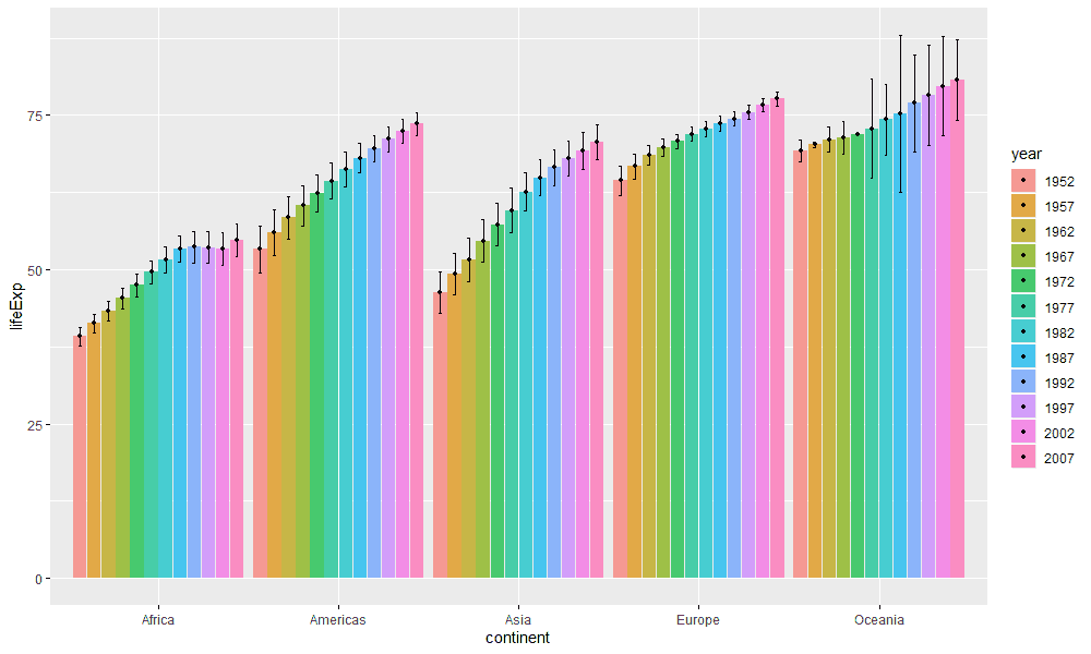
There are some interesing patterns in this visualization. For example, we see that the dispersion of life expectancy on the continent of Oceania has increased in recent years. This may be due to mistakes in the data or maybe something has actually changed in life expectancy. If you want to know more about the position_dodge function, see this page.
Let's last try to gain a real insight from the dataset. The life expectancy of humans is strongly influenced by wars. In war, men in live shorter lives. Hence, we could show the maximum and minimum life expectancy for each country for each continent per year. In Africa, for example, there was the civil war in Rwanda, which ended in agenocide:
gapminder %>%
  filter(year > 1990 & year < 1996,
         continent == "Africa", lifeExp < 35)
# A tibble: 1 x 6
country continent year lifeExp pop gdpPercap
<fct> <fct> <int> <dbl> <int> <dbl>
1 Rwanda Africa 1992 23.6 7290203 737.Another genocide happend in Cambodia in the 1970s, in which more than 1 million people got killed:
gapminder %>%
filter(year > 1975 & year < 1980,
       continent == "Asia", lifeExp < 38)
# A tibble: 1 x 6
country continent year lifeExp pop gdpPercap
<fct> <fct> <int> <dbl> <int> <dbl>
1 Cambodia Asia 1977 31.2 6978607 525.We can visualize these events by showing the minimum and maximum life expectancy of each country within a given year:
gapminder %>%
  ggplot(aes(x = year, y = lifeExp)) +
  stat_summary(fun = mean,
               geom = "ribbon",
               alpha = .3,
               fill = "#EB5286",
               fun.max = min,
               fun.min = max) +
  stat_summary(fun = mean,
               geom = "pointrange",
               fun.max = min,
               fun.min = max) +
  stat_summary(fun = max,
               geom = "line",
               color = "black") +
  stat_summary(fun = min,
               geom = "line",
               color = "black") +
facet_wrap(~ continent) 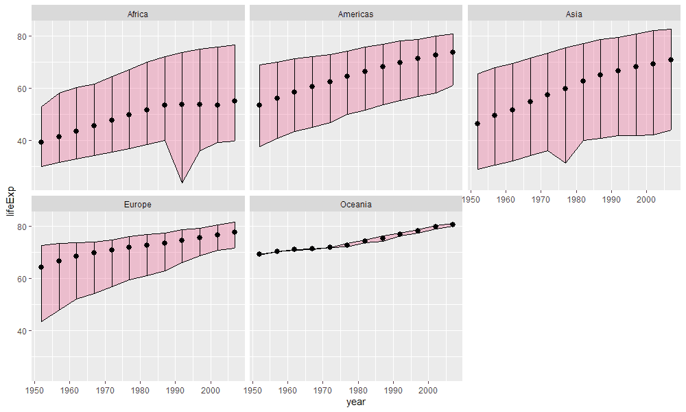
You can easily implement the maximum and minimum value with a pointrange at this point by yourself. However, we also visualized a so called geom_ribbon. geom_ribbons are just like an area chart with the exception that we not only specify the upper values but also the lower values. Since the calculations are the same for every stat_summary function the visual encodings smoothly align. From the visualization you can clearly see the two genocides in Rwanda and Cambodia.
Conclusion
I believe the function stat_summary gives you superpowers to visualize summary statistics flexibly and quickly. It was a revelation to me when I first encountered them. I very much hope you will also find them useful for your own purposes. With this tutorial you should be up and running to create visualizations of summary statistics of your own.
